http://public.tableausoftware.com/views/StateCountyZip/PopulationByZip?:embed=y#2
Inequality in USA, 1990-2011
Free rows from Market Capitalization DV Leader
Last week Tableau increased by 10-fold the capacity of Data Visualizations published with Tableau Public to a cool 1 Million rows of Data, basically to the same amount of rows, which Excel 2007, 2010 and 2013 (often used as data sources for Tableau Public) can handle these days and increased by 20-fold the storage capacity (to 1GB of free storage) of each free Tableau Public Account, see it here:
http://www.tableausoftware.com/public/blog/2013/08/one-million-rows-2072
It means that free Tableau Public Account will have the storage twice larger than Spotfire Silver’s the most expensive Analyst Account (that one will cost you $4500/year). Tableau said: “Consider it a gift from us to you.”. I have to admit that even kids in this country know that there is nothing free here, so please kid me not – we are all witnessing of some kind of investment here – this type of investment worked brilliantly in the past… And all users of Tableau Public are investing too – with their time and learning efforts.
And this is not all: “For customers of Tableau Public Premium, which allows users to save locally and disable download of their workbooks, the limits have been increased to 10 million rows of data at 10GB of storage space” see it here:
http://www.tableausoftware.com/about/press-releases/2013/tableau-software-extends-tableau-public-1-million-rows-data without changing the price of service (of course in Tableau Public Premium price is not fixed and depends on the number of impressions).
Out of 100+ millions of Tableau users only 40000 qualified to be called Tableau Authors, see it here http://www.tableausoftware.com/about/press-releases/2013/tableau-software-launches-tableau-public-author-profiles so they are consuming Tableau Public’s Storage more actively then others. As an example you can see my Tableau’s Author Profile here: http://public.tableausoftware.com/profile/andrei5435#/ .
I will assume those Authors will consume 40000GB of online storage, which will cost to Tableau Software less then (my guess, I am open to correction from blog visitors) $20K/year just for the storage part of Tableau Public Service.
During the last week the other important announcement on 8/8/13 – Quarterly Revenue – came from Tableau: it reported the Q2 revenue of $49.9 million, up 71% year-over-year: http://investors.tableausoftware.com/investor-news/investor-news-details/2013/Tableau-Announces-Second-Quarter-2013-Financial-Results/default.aspx .
Please note that 71% is extremely good YoY growth compare with the entire anemic “BI industry”, but less then 100% YoY which Tableau grew in its private past.
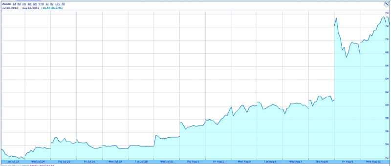
All these announcements above happened simultaneously with some magical (I have no theory why this happened; one weak theory is the investors madness and over-excitement about Q2 revenue of $49.9M announced on 8/8/13?) and sudden increase of the nominal price of Tableau Stock (under the DATA name on NYSE) from $56 (which is already high) on August 1st 2013 (announcement of 1 millions of rows/1GB storage for Tableau public Accounts) to $72+ today:
It means that the Market Capitalization of Tableau Software may be approaching $4B and sales may be $200M/year. For comparison, Tableau’s direct and more mature competitor Qliktech has now the Capitalization below $3B while its sales approaching almost $500M/year. From Market Capitalization point of view in 3 moths Tableau went from a private company to the largest Data Visualization publicly-traded software company on market!
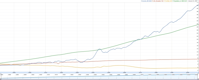
Inflation on USA for last 100 years
Tableau Server is in the Cloud
Competition in Data Visualization market is not only on features, market share and mindshare but also on pricing and lisensing. For example the Qlikview licensing and pricing is public for a while here: http://www.qlikview.com/us/explore/pricing and Spotfire Silver pricing public for a while too: https://silverspotfire.tibco.com/us/silver-spotfire-version-comparison .
Tableau Desktop has 3 editions: Public (Free), Personal ($999) and Professional ($1999), see it here: http://www.tableausoftware.com/public/comparison ; in addition you can have full Desktop (read-only) experience with free Tableau Reader (neither Qlikview nor Spotfire have free readers for server-less, unlimited distribution of Visualizations, which is making Tableau a mind-share leader right away…)
The release of Tableau Server online hosting this month: http://www.tableausoftware.com/about/press-releases/2013/tableau-unveils-cloud-business-intelligence-product-tableau-online heated the licensing competition and may force the large changes in licencing landscape for Data Visualization vendors. Tableau Server existed in the cloud for a while with tremendous success as Tableau Public (free) and Tableau Public Premium (former Tableau Digital with its weird pricing based on “impressions”).
But Tableau Online is much more disruptive for BI market: for $500/year you can get the complete Tableau Server site (administered by you!) in the cloud with (initially) 25 (it can grow) authenticated by you users and 100GB of cloud storage for your visualizations, which is 200 times more then you can get for $4500/year top-of-the line Spotfire Silver “Analyst account”. This Tableau Server site will be managed in the cloud by Tableau Software own experts and require nor IT personnel from your side! You may also compare it with http://www.rosslynanalytics.com/rapid-analytics-platform/applications/qlikview-ondemand .
A hosted by Tableau Software solution is particularly useful when sharing dashboards with customers and partners because the solution is secure but outside a company’s firewall. In the case of Tableau Online users can publish interactive dashboards to the web and share them with clients or partners without granting behind-the-firewall access.
Since Tableau 8 has new Data Extract API, you can do all data refreshes behind your own firewall and republish your TDE files in the cloud anytime (even automatically, on demand or on schedule) you need. Tableau Online has no minimum number of users and can scale as a company grows. At any point, a company can migrate to Tableau Server to manage it in-house. Here is some introductionla video about Tableau Online: Get started with Tableau Online.
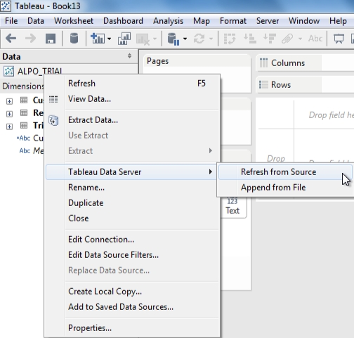
Tableau Server in the cloud provides at least 3 ways to update your data (more details see here: http://www.tableausoftware.com/learn/whitepapers/tableau-online-understanding-data-updates )
- republish Data Source or Workbook;
- Use Command-Line Tools to Schedule Batch Updates Locally and automatically, see more details here: http://onlinehelp.tableausoftware.com/current/pro/online/en-us/help.html#extracting_TDE.html;
- refresh the Tableau Server Data Source using your Tableau Desktop as a proxy between your on-premise Data Source and Tableau Online:
Here is another, more lengthy intro into Tableau BI in Cloud:
Tableau as a Service is a step in right direction, but be cautious: in practice, the architecture of the hosted version could impact performance. Plus, the nature of the product means that Tableau isn’t really able to offer features like pay-as-you-go that have made cloud-based software popular with workers. By their nature, data visualization products require access to data. For businesses that store their data internally, they must publish their data to Tableau’s servers. That can be a problem for businesses that have large amounts of data or that are prevented from shifting their data off premises for legal or security reasons. It could also create a synchronization nightmare, as workers play with data hosted at Tableau that may not be as up-to-date as internally stored data. Depending on the location of the customer relative to Tableau’s data center, data access could be slow.
And finally, the online version requires the desktop client, which costs $2,000. Tableau may implement Tableau desktop analytical features in a browser in the future while continue to support the desktop and on-premise model to meet security and regulations facing some customers.
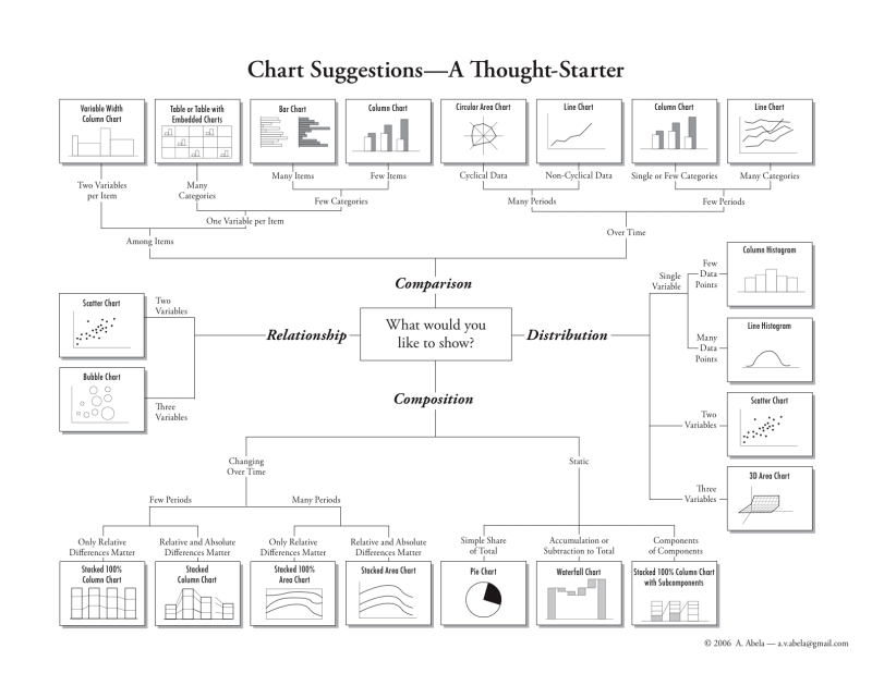
3 oldest Charts: pie, line, bar
Drill-Down Demo, using Tableau Public
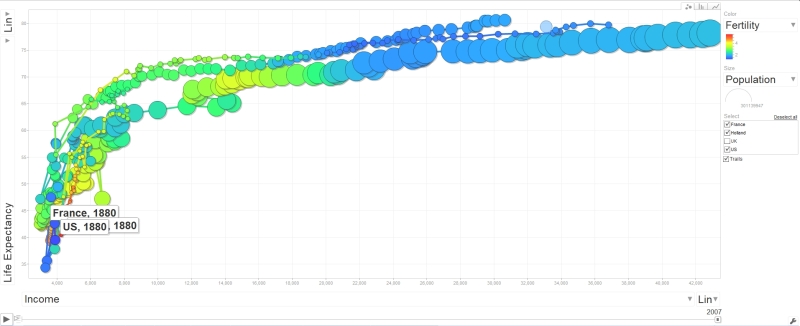
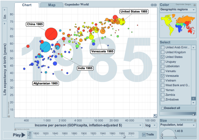
Motion Chart with Tableau
Motion Chart using Tableau; in browser you need to use vertical right bottom handle to see motion; to see automatic motion you need to download free Tableau Reader, then download workbook and open it with Tableau Reader:
http://public.tableausoftware.com/shared/NNP4TKRWB?:display_count=no
Time for Tableau is now: Part 2 – IPO
Tableau Software filed for IPO, on the New York Stock Exchange under the symbol “DATA”. In sharp contrast to other business-software makers that have gone public in the past year, Tableau is profitable, despite hiring huge number of new employees. For the years ended December 31, 2010, 2011 and 2012, Tableau’s total revenue were $34.2 million, $62.4 million and $127.7 million for 2012. Number of full-time employees increased from 188 as of December 31, 2010 to 749 as of December 31, 2012.
Tableau’s biggest shareholder is venture capital firm New Enterprise Associates, with a 38 percent stake. Founder Pat Hanrahan owns 18 percent, while co-founders Christopher Stolte and Christian Chabot, who is also chief executive officer, each own more than 15 percent. Meritech Capital Partners controls 6.4 percent. Tableau recognized three categories of Primary Competitors:
- large suppliers of traditional business intelligence products, like IBM, Microsoft, Oracle and SAP AG;
- spreadsheet software providers, such as Microsoft Corporation
- business analytics software companies: Qlik Technologies Inc. and TIBCO Spotfire.
Update 4/29/13: This news maybe related to Tableau IPO: I understand that Microstrategy’s growth cannot be compared with growth of Tableau or even Qliktech. But to go below of the average “BI market” growth? Or even 6% or 24% decrease? What is going on (?) here : “First quarter 2013 revenues were $130.2 million versus $138.3 million for the first quarter of 2012, a 6% decrease. Product licenses revenues for the first quarter of 2013 were $28.4 million versus $37.5 million for the first quarter of 2012, a 24% decrease.”
Update 5/6/13: Tableau Software Inc. will sell 5 million shares, while shareholders will sell 2.2 million shares, Tableau said in an amended filing with the U.S. Securities and Exchange Commission. The underwriters have the option to purchase up to an additional 1,080,000 shares. It means total can be 8+ millions of shares for sale.
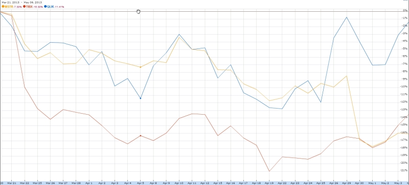
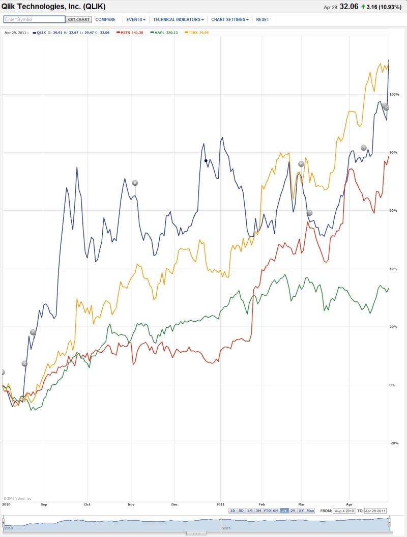
The company expects its initial public offer to raise up to $215.3 million at a price of $23 to $26 per share. If this happened, that will create public company with large capitalization, so Qliktech and Spotfire will have an additional problem to worry about. This is how QLIK (blue line), TIBX (red) and MSTR (orange line) stock behaved during last 6 weeks after release of Tableau 8 and official Tableau IPO announcement:
Update 5/16/13: According to this article at Seeking Alpha (also see S-1 Form) Tableau Software Inc. (symbol “DATA”) is scheduled a $176 million IPO with a market capitalization of $1.4 billion for Friday, May 17, 2013. Tableau’s March Quarter sales were up 60% from the March ’12 quarter. Qliktech’s sales were up only 23% on a similar comparative basis.
According to other article, Tableau raised it IPO price and it may reach capitalization of $2B by end of Friday, 5/17/13. That is almost comparable with capitalization of Qliktech…
Update 5/17/13: Tableau’s IPO offer price was $31 per share, but it started today
with price $47 and finished day with $50.75 (raising $400M in one day) with estimated Market Cap around $3B (or more?). It is hard to understand the market: Tableau Stock (symbol: DATA) finished its first day above $50 with Market Capitalization higher than QLIK, which today has Cap = $2.7B but Qliktech has almost 3 times more of sales then Tableau!
For comparison MSTR today has Cap = $1.08B and TIBX today has Cap = $3.59B. While I like Tableau, today proved that most investors are crazy, if you compare numbers in this simple table:
| Symbol : | Market Cap, $B, as of 5/17/13 | Revenue, $M, as of 3/31/13 (trailing 12 months) | FTE (Full Time Employees) |
| TIBX | 3.59 | 1040 | 3646 |
| MSTR | 1.08 | 586 | 3172 |
| QLIK | 2.67 | 406 | 1425 |
| DATA | between $2B and $3B? | 143 | 834 |
See interview with Co-Founder of Tableau Software Christian Chabot – he discusses taking the company’s IPO with Emily Chang on Bloomberg Television’s “Bloomberg West.” However it makes me sad when Tableau’s CEO is implying that Tableau is ready for big data, which is not true.
 Here are some pictures of the Tableau team at the NYSE: http://www.tableausoftware.com/ipo-photos and here is the announcement about “closing IPO”.
Showing 1000 marks versus 42000 marks in Tableau 8
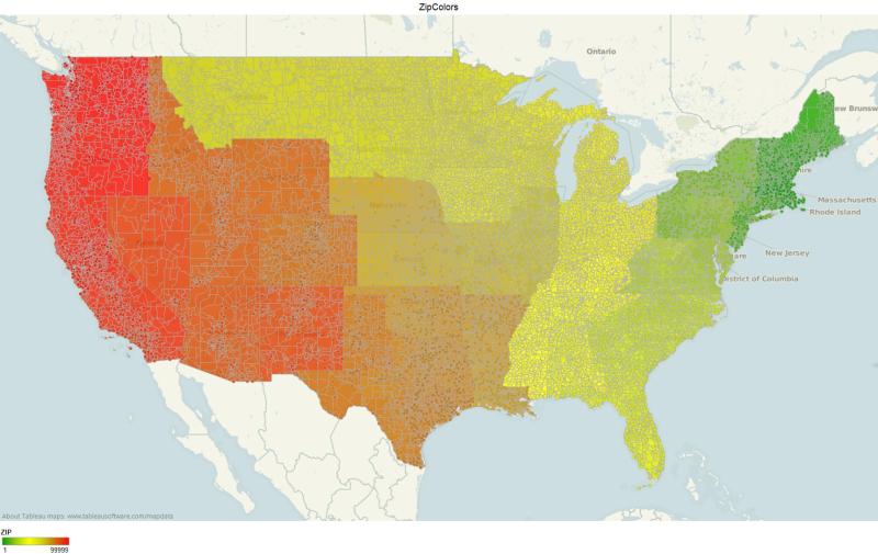
This DataView with all USA Counties can take advantage of Local Rendering (if you have modern Web Browser), because Tableau 8 will switch to it in case if DataView has less then 5000 marks (datapoints):
http://public.tableausoftware.com/views/Zips_0/CountyColors?:embed=y&:display_count=yes
But this DataView with all USA ZIP code areas will be Rendered by Tableau Server, because Tableau 8 will use server-side rendering in case if DataView has more then then 5000 marks (datapoints):
http://public.tableausoftware.com/views/Zips_0/ZipColors?:embed=y&:display_count=yes
For explantion please read this:
http://onlinehelp.tableausoftware.com/current/server/en-us/browser_rendering.htm
Time for Tableau is now…
Today Tableau 8 was released with 90+ new features (actually it may be more than 130) after exhausting 6+ months of Alpha and Beta Testing with 3900+ customers as Beta Testers! I personally expected it it 2 months ago, but I rather will have it with less bugs and this is why I have no problem with delay. During this “delay” Tableau Public achieved the phenomenal Milestone: 100 millions of users…
Tableau 8 introduced:
- web and mobile authoring,
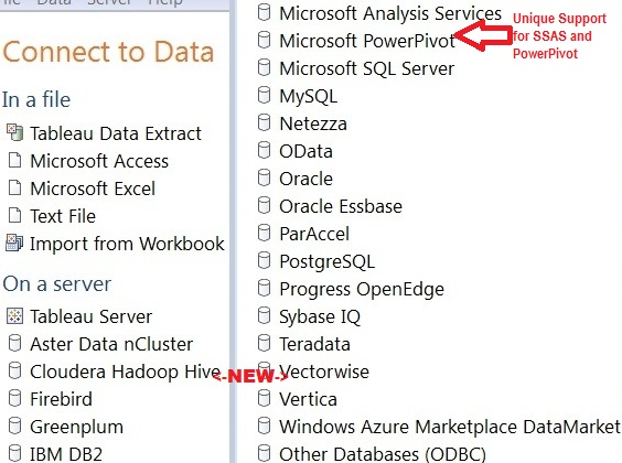
- added access to new data sources: Google Analytics, Salesforce.com, Cloudera Impala, DataStax Enterprise, Hadapt, Hortonworks Hadoop Hive, SAP HANA, and Amazon Redshift.
- New Data Extract API that allows programmers to load data from anywhere into Tableau and make certain parts of Tableau Licensing ridiculous, because consuming part of licensing (for example core licensing) for background tasks should be set free now.
- New JavaScript API enables integration with business (and other web-) applications.
- Local Rendering: leveraging the graphics hardware acceleration available on ordinary computers. Tableau 8 Server dynamically determines where rendering will complete faster – on the server or in the browser. Also – and acts accordingly. Also Dashboards now render views in parallel when possible.
Tableau Software plans to add in next versions (after 8.0) some very interesting and competitive features, like:
- Direct query of large databases, quick and easy ETL and data integration.
- Tableau on a Mac and Tableau as a pure Cloud offering.
- Make statistical & analytical techniques accessible (I wonder if it means integration with R?).
- Tableau founder Pat Hanrahan recently talked about “Showing is Not Explaining”, so Tableau planned to add features that support storytelling by constructing visual narratives and effective communication of ideas.
I did not see on Tableau’s roadmap some very long overdue features like 64-bit implementation (currently even all Tableau Server processes, except one, are 32-bit!), Server implementation on Linux (we do not want to pay Windows 2012 Server CAL taxes to Bill Gates) and direct mentioning of integration with R like Spotfire does – I how those planning and strategic mistakes will not impact upcoming IPO.
I personally think that Tableau has to stop using its ridiculous practice when 1 core license used per each 1 Backgrounder server process and since Tableau Data Extract API is free so all Tableau Backgrounder Processes should be free and have to be able to run on any hardware and even any OS.
Tableau 8 managed to get the negative feedback from famous Stephen Few, who questioned Tableau’s ability to stay on course. His unusually long blog-post “Tableau Veers from the Path” attracted enormous amount of comments from all kind of Tableau experts. I will be cynical here and notice that there is no such thing as negative publicity and more publicity is better for upcoming Tableau IPO.
to DV or to D3 – that is the question
The most popular (among business users) approach to visualization is to use a Data Visualization (DV) tool like Tableau (or Qlikview or Spotfire), where a lot of features already implemented for you. Recent prove of this amazing popularity is that at least 100 million people (as of February 2013), used Tableau Public as their Data Visualization tool of choice, see
http://www.tableausoftware.com/about/blog/2013/2/crossing-100-million-milestone-21304
However, to make your documents and stories (and not just your data visualization applications) driven by your data, you may need the other approach – to code visualization of your data into your story and visualization libraries like popular D3 toolkit can help you. D3 stands for “Data-Driven Documents”. The Author of D3 Mr. Mike Bostock designs interactive graphics for New York Times – one of latest samples is here:
and NYT allows him to do a lot of Open Source work which he demonstartes at his website here:
https://github.com/mbostock/d3/wiki/Gallery .
Mike was a “visualization scientist” and a computer science PhD student at #Stanford University and member of famous group of people, now called “Stanford Visualization Group”:
http://vis.stanford.edu/people/
This Visualization Group was a birthplace of Tableau’s prototype – sometimes they called it “a Visual Interface” for exploring data and other name for it is Polaris:
http://www.graphics.stanford.edu/projects/polaris/
and we know that creators of Polaris started Tableau Software. One of other Group’s popular “products” was a graphical toolkit (mostly in JavaScript, as oppose to Polaris, written in C++) for Visualization, called ProtoVis:
http://mbostock.github.com/protovis/
– and Mike Bostock was one of ProtoViz’s main co-authors. Less then 2 years ago Visualization Group suddenly stopped developing ProtoViz and recommended to everybody to switch to D3 library
authored by Mike. This library is Open Source (only 100KB in ZIP format) and can be downloaded from here:
In order to use D3, you need to be comfortable with HTML, CSS, SVG, Javascript programming, DOM (and other Web Standards); understanding of jQuery paradigm will be useful too. Basically if you want to be at least partially as good as Mike Bostock, you need to have a mindset of a programmer (I guess in addition to business user mindset), like this D3 expert:
Most of successful early D3 adopters combining even 3+ mindsets: programmer, business analyst, data artist and even sometimes data storyteller. For your programmer’s mindset you may be interested to know that D3 has a large set of Plugins, see:
https://github.com/d3/d3-plugins
and rich #API, see https://github.com/mbostock/d3/wiki/API-Reference
You can find hundreds of D3 demos, samples, examples, tools, products and even a few companies using D3 here: https://github.com/mbostock/d3/wiki/Gallery
5000 Points: Local Rendering is here
Human eye cannot process effectively more than a few (thousands) datapoints per View.
Additionally, in Data Visualization you have other restrictions:
- number of pixels on your screen (may be 2-3 millions maximum) available for your View (Chart or Dashboard).
- time to render millions of Datapoints can be too long and may create a bad User Experience (too much waiting).
- time to load your Datapoints into your View; if you wish to have a good User Experience, than 2-3 seconds is maximum user can wait for. If you have a live connection to datasource, than 2-3 seconds mean a few thousands of Datapoints maximum.
- again, more Datapoints you will put in your View, more crowded it will be and less useful and less understandable your View will be for your users.
Recently, some Vendors started to add new reason for you (called Local Rendering) to restrict yourself in terms of how much of Datapoints you need to put into your DataView: usage of Client-side hardware (especially its Graphical Hardware) for so called “Local Rendering”.
Local rendering means that Data Visualization Server will send DataPoints instead of Images to Client and Rendering of Image will happened on Client-side, using capability of modern Web Browsers (to use Client’s Hardware) and HTML5 Canvas technology.
For example, the new feature in Tableau Server 8 will automatically switch to Local Rendering if number of DataPoints in your DataView (Worksheet with your Chart or Dashboard) is less then 5000 DataPoints (Marks in Tableau Speak). In addition to faster rendering it means less round-trips to Server (for example when you hover your mouse over Datapoint, in old world it means round-trip to Server) and faster Drill-down, Selection and Filtering operations.
Update 3/19/13: James Baker from Tableau Software explains why Tableau 8 Dashboards in Web Browser feel more responsive:
http://www.tableausoftware.com/about/blog/2013/3/quiet-revolution-rendering-21874
James explained that “HTML5’s canvas element” is used as drawing surface. He underscored that it’s much faster to send images rather than data because image size does not scale up linearly. James included a short video shows incremental filtering in a browser, one of the features of Local Rendering.
DV Album @Picasa
Tableau Readings, January 2013
Best of the Tableau Web… December 2012:
http://www.tableausoftware.com/about/blog/2013/1/best-tableau-web-december-2012-20758
Top 100 Q4 2012 from Tableau Public:
http://www.tableausoftware.com/public/blog/2013/01/top-100-q4-2012-1765
eBay’s usage of Tableau as the front-end for big data, Teradata and Hadoop with 52 petabytes of
data on everything from user behavior to online transactions to customer shipments and much more:
http://www.infoworld.com/d/big-data/big-data-visualization-big-deal-ebay-208589
Why The Information Lab recommends Tableau Software:
http://www.theinformationlab.co.uk/2013/01/04/recommend-tableau-software/
Fun with #Tableau Treemap Visualizations
http://tableaulove.tumblr.com/post/40257187402/fun-with-tableau-treemap-visualizations
Talk slides: Tableau, SeaVis meetup & Facebook, Andy Kirk’s Facebook Talk from Andy Kirk
http://www.visualisingdata.com/index.php/2013/01/talk-slides-tableau-seavis-meetup-facebook/
Usage of RAM, Disk and Data Extracts with Tableau Data Engine:
http://www.tableausoftware.com/about/blog/2013/1/what%E2%80%99s-better-big-data-analytics-
memory-or-disk-20904
Migrating Tableau Server to a New Domain
https://www.interworks.com/blogs/bsullins/2013/01/11/migrating-tableau-server-new-domain
SAS/Tableau Integration
http://www.see-change.co/services/sastableau-integration/
IFNULL – is not “IF NULL”, is “IF NOT NULL”
http://tableaufriction.blogspot.com/2012/09/isnull-is-not-is-null-is-is-not-null.html
Worksheet and Dashboard Menu Improvements in Tableau 8:
http://tableaufriction.blogspot.com/2013/01/tv8-worksheet-and-dashboard-menu.html
Jittery Charts – Why They Dance and How to Stop Them:
http://tableaufriction.blogspot.com/2013/01/jittery-charts-and-how-to-fix-them.html
Tableau Forums Digest #8
http://shawnwallwork.wordpress.com/2013/01/06/67/
Tableau Forums Digest #9
http://shawnwallwork.wordpress.com/2013/01/14/tableau-forums-digest-9/
Tableau Forums Digest #10
http://shawnwallwork.wordpress.com/2013/01/19/tableau-forums-digest-10/
Tableau Forums Digest #11
http://shawnwallwork.wordpress.com/2013/01/26/tableau-forums-digest-11/
implementation of bandlines in Tableau by Jim Wahl (+ Workbook):
http://community.tableausoftware.com/message/198511
Advizor Visual Discovery, Part 2
This is the Part 2 of the guest blog post: the Review of Visual Discovery products from Advizor Solutions, Inc., written by my guest blogger Mr. Srini Bezwada (his profile is here: http://www.linkedin.com/profile/view?id=15840828 ), who is the Director of Smart Analytics, a Sydney based professional BI consulting firm that specializes in Data Visualization solutions. Opinions below belong to Mr. Srini Bezwada.
ADVIZOR Technology
ADVIZOR’s Visual Discovery™ software is built upon strong data visualization tools technology spun out of a distinguished research heritage at Bell Labs that spans nearly two decades and produced over 20 patents. Formed in 2003, ADVIZOR has succeeded in combining its world-leading data visualization and in-memory-data-management expertise with extensive usability knowledge and cutting-edge predictive analytics to produce an easy to use, point and click product suite for business analysis.
ADVIZOR readily adapts to business needs without programming and without implementing a new BI platform, leverages existing databases and warehouses, and does not force customers to build a difficult, time consuming, and resource intensive custom application. Time to deployment is fast, and value is high.
With ADVIZOR data is loaded into a “Data Pool” in main memory on a desktop or laptop computer, or server. This enables sub-second response time on any query against any attribute in any table, and instantaneously update all visualizations. Multiple tables of data are easily imported from a variety of sources.
With ADVIZOR, there is no need to pre-configure data. ADVIZOR accesses data “as is” from various data sources, and links and joins the necessary tables within the software application itself. In addition, ADVIZOR includes an Expression Builder that can perform a variety of numeric, string, and logical calculations as well as parse dates and roll-up tables – all in-memory. In essence, ADVIZOR acts like a data warehouse, without the complexity, time, or expense required to implement a data warehouse! If a data warehouse already exists, ADVIZOR will provide the front-end interface to leverage the investment and turn data into insight.
Data in the memory pool can be refreshed from the core databases / data sources “on demand”, or at specific time intervals, or by an event trigger. In most production deployments data is refreshed daily from the source systems.
Data Visualization
ADVIZOR’s Visual Discovery™ is a full visual query and analysis system that combines the excitement of presentation graphics – used to see patterns and trends and identify anomalies in order to understand “what” is happening – with the ability to probe, drill-down, filter, and manipulate the displayed data in order to answer the “why” questions. Conventional BI approaches (pre-dating the era of interactive Data Visualization) to making sense of data have involved manipulating text displays such as cross tabs, running complex statistical packages, and assembling the results into reports.
ADVIZOR’s Visual Discovery™ making the text and graphics interactive. Not only can the user gain insight from the visual representation of the data, but now additional insight can be obtained by interacting with the data in any of ADVIZOR’s fifteen (15) interactive charts, using color, selection, filtering, focus, viewpoint (panning, zooming), labeling, highlighting, drill-down, re-ordering, and aggregation.
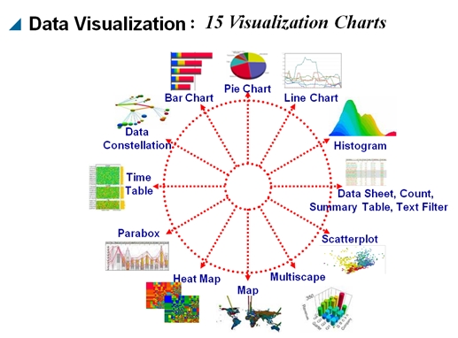
Visual Discovery empowers the user to leverage his or her own knowledge and intuition to search for patterns, identify outliers, pose questions and find answers, all at the click of a mouse.
Flight Recorder – Track, Save, Replay your Analysis Steps
The Flight Recorder tracks each step in a selection and analysis process. It provides a record of those steps, and be used to repeat previous actions. This is critical for providing context to what and end-user has done and where they are in their data. Flight records also allow setting bookmarks, and can be saved and shared with other ADVIZOR users.
The Flight Recorder is unique to ADVIZOR. It provides:
• A record of what a user has done. Actions taken and selections from charts are listed. Small images of charts that have been used for selection show the selections that were made.
• A place to collect observations by adding notes and capturing images of other charts that illustrate observations.
• A tool that can repeat previous actions, in the same session on the same data or in a later session with updated data.
• The ability to save and name bookmarks, and share them with other users.
Predictive Analytics Capability
The ADVIZOR Analyst/X is a predictive analytic solution based on a robust multivariate regression algorithm developed by KXEN – a leading-edge advanced data mining tool that models data easily and rapidly while maintaining relevant and readily interpretable results.
Visualization empowers the analyst to discover patterns and anomalies in data by noticing unexpected relationships or by actively searching. Predictive analytics (sometimes called “data mining”) provides a powerful adjunct to this: algorithms are used to find relationships in data, and these relationships can be used with new data to “score” or “predict” results.
Predictive analytics software from ADVIZOR don’t require enterprises to purchase platforms. And, since all the data is in-memory, the Business Analyst can quickly and easily condition data and flag fields across multiple tables without having to go back to IT or a DBA to prep database tables. The interface is entirely point-and-click, there are no scripts to write. The biggest benefit from the multi-dimensional visual solution is how quickly it delivers analysis, solving critical business questions, facilitating intelligence-driven decision making, providing instant answers to “what if?” questions.
Advantages over Competitors:
• The only product in the market offering a combination of Predictive Analytics + Data Visualisation + In memory data management within one Application.
• The cost of entry is lower than the market leading data visualization vendors for desktop and server deployments.
• Advanced Visualizations like Parabox, Network Constellation in addition to normal bar charts, scatter plots, line charts, Pie charts…
• Integration with leading CRM vendors like Salesforce.com, Blackbaud, Ellucian, Information Builder
• Ability to provide sub-second response time on query against any attribute in any table, and instantaneously update all visualizations.
• Flight recorder that lets you track, replay, and save your analysis steps for reuse by yourself or others.
Update on 5/1/13 (by Andrei): Avizor 6.0 is available now with substantial enhancements: http://www.advizorsolutions.com/Bnews/tabid/56/EntryId/215/ADVIZOR-60-Now-Available-Data-Discovery-and-Analysis-Software-Keeps-Getting-Better-and-Better.aspx
Advizor Visual Discovery, Part 1
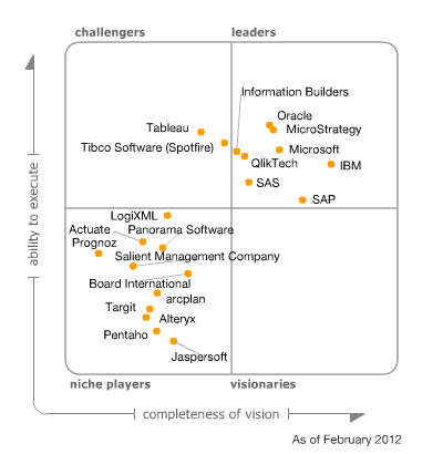
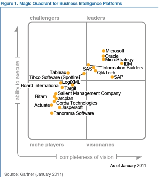
If you visited my blog before, you know that my classification of Data Visualization and BI vendors are different from researchers like Gartner. In addition to 3 DV Leaders – Qlikview, Tableau, Spotfire – I rarely have time to talk about other “me too” vendors.
However, sometimes products like Omniscope, Microstrategy’s Visual Insight, Microsoft BI Stack (Power View, PowerPivot, Excel 2013, SQL Server 2012, SSAS etc.), Advizor, SpreadshetWEB etc. deserve attention too. However, it takes so much time, so I am trying to find guest bloggers to cover topics like that. 7 months ago I invited volunteers to do some guest blogging about Advizor Visual Discovery Products:
http://apandre.wordpress.com/2012/06/22/advizor-analyst-vs-tableau-or-qlikview/
So far nobody in USA or Europe committed to do so, but recently Mr. Srini Bezwada, Certified Tableau Consultant and Advizor-trained expert from Australia contacted me and submitted the article about it. He also provided me with info about how Advizor can be compared with Tableau, so I will do it briefly, using his data and opinions. Mr. Bezwada can be reached at
sbezwada@smartanalytics.com.au , where he is a director at
http://www.smartanalytics.com.au/
Below is quick comparison of Advizor with Tableau. Opinions below belong to Mr. Srini Bezwada. Next blog post will be a continuation of this article about Advizor Solutions Products, see also Advizor’s website here:
http://www.advizorsolutions.com/products/
| Criteria | Tableau | ADVIZOR | Comment |
| Time to implement | Very Fast | Fast, ADVIZOR can be implemented within Days | Tableau Leads |
| Scalability | Very Good | Very Good | Tableau: virtual RAM |
| Desktop License | $1,999 | $ 1,999 | $3,999 for AnalystX with Predictive modeling |
| Server License/user | $1K, min 10 users, 299 K for Enterprise | Deployment license for up to 10 named users $8 K | ADVIZOR is a lot cheaper for Enterprise Deployment $75 K for 500 Users |
| Support fees / year |
20% |
20% |
1st year included |
| SaaS Platform | Core or Digital | Offers Managed Hosting | ADVIZOR Leads |
| Overall Cost | Above Average | Competitive | ADVIZOR Costs Less |
| Enterprise Ready | Good for SMB | Cheaper cost model for SMB | Tableau is expensive for Enterprise Deployment |
| Long-term viability | Fastest growth | Private company since 2003. | Tableau is going IPO in 2013 |
| Mindshare | Tableau Public | Growing Fast | Tableau stands out |
| Big Data Support | Good | Good | Tableau is 32-bit |
| Partner Network | Good | Limited Partnerships | Tableau Leads |
| Data Interactivity | Excellent | Excellent | |
| Visual Drilldown | Very Good | Very Good | |
| Offline Viewer | Free Reader | None | Tableau stands out |
| Analyst’s Desktop | Tableau Professional | Advizor has Predictive Modeling | ADVIZOR is a Value for Money |
| Dashboard Support | Excellent | Very Good | Tableau Leads |
| Web Client | Very Good | Good | Tableau Leads |
| 64-bit Desktop | None | Very Good | Tableau still a 32-bit app |
| Mobile Clients | Very Good | Very Good | |
| Visual Controls | Very Good | Very Good | |
| Data Integration | Excellent | Very Good | Tableau Leads |
| Development | Tableau Pro | ADVIZOR Analyst | |
| 64-bit in-RAM DB | Good | Excellent | Advizor Leads |
| Mapping support | Excellent | Average | Tableau stands out |
| Modeling, Analytics | Below Average | Advanced Predictive Modelling | ADVIZOR stands out |
| Predictive Modeling | None | Advanced Predictive Modeling Capability with Built in KXEN algorithms | ADVIZOR stands out |
| Flight Recorder | None | Flight recorder lets you track, replay, save your analysis steps for reuse by yourself or others. | ADVIZOR stands out |
| Visualization | 22 Chart types | All common charts like bar charts, scatter plots, line charts, Pie charts are supported | Advizor has Advanced Visualizations like Parabox, Network Constellation |
| Third party integration | Many Data Connectors, see Tableau’s drivers page | ADVIZOR integrates well with CRM software: Salesforce.com, Ellucian, Blackbaud and others. | ADVIZOR leads in CRM area |
| Training | Free Online and paid Classroom | Free Online and paid via company trainers & Partners | Tableau Leads |
Happy New 2013!
My best wishes for 2013!
2012 was extraordinary for Data Visualization community and I expect 2013 will be even more interesting than 2012. For Data Visualization vendors 2012 was unusual YEAR and surprised many people.
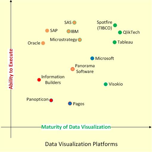
We can start with Qliktech, which grew only about 18% in 2012 (while in 2011 it was 42% and in 2010 it was 44%) and QLIK stock lost a lot… Spotfire on other hand grew faster then that and Tableau grew even faster than Spotfire. Tableau doubled its workforce and its sales now more than $100M per year. Together the sales of Qlikview, Spotfire and Tableau totaled to almost $600M in 2012 and I expect it may reach even $800M in 2013. All other vendors becoming less and less visible on market. While it is still possible to have a breakthrough from companies like Microsoft, Microstrategy, Visokio and Pagos, it is highly unlikely.
If you will search in web for wishes or wishlists for Qlikview or Tableau or Spotfire, you can find plenty of wishes, including even very technical. I will partially repeat myself, because some of my best wishes are still wishes and may be some of them will be never implemented. I will restrict myself to 3 best wishes per vendor.
Let me start with Spotfire, as the most mature product. I will use analogy: EMC did spin-off VMWare and (today) market capitalization of VMWare is close $40B, about 75% (!) of Market Capitalization of its parent company EMC! I wish that TIBCO will do the same to Spotfire as EMC did to VMWare. Compare with this wish all other wishes look minimal, like making Free Spotfire Desktop Reader (similar to what Tableau has) and make part of Spotfire Silver is completely Public and Free similar to … Tableau Public.
For Qliktech I really wish them to stop bleeding capitalization-wise (did they lost $1B of MktCap during last 9 months?) and sales-wise (growing only 18% in 2012 compare with 42% in 2011). May be 2013 is good time for IBM to buy Qliktech? And yes, I wish Qlikview Server on Linux (I do not like new licensing terms of Windows 2012 Server) and I wish (for many years!) free Qlikview Desktop Viewer/Reader (similar … to Tableau Reader) in 2013 to enable server-less distribution of Qlikview-based Data Visualizations!
For Tableau I wish a very successful IPO in 2013 and I wish them to grow in 2013 as fast as they did in 2012! I really wish Tableau (and all its processes like VizQL, Application Server, Backgrounder etc.) to became 64-bit in 2013 and of course I wish Tableau Server on Linux (see my wish for Qlikview above).
Since I still have my best wishes for Microsoft (I guess they will never listen me anyway), I wish them to stop in 2013 using the dead product (Silverlight) with Power View (just complete the switch to HTML5 already), to make it completely separate from SharePoint and make it equal part of Office (integrated with PowerPivot on Desktop) the same way as Visio and Access are parts of Office and as a result I wish Microsoft to have a Power View (Data Visualization) Server (integrated with SQL Server 2012 of course) as well.
Also here are Flags of 21 countries from where this blog got most visitors in 2012:

Data Visualization set on Flickr
https://plus.google.com/photos/113652689655125910498/albums/5481981245951662737?banner=pwa
New Tableau 8 Server features
In my previous post http://apandre.wordpress.com/2012/11/16/new-tableau-8-desktop-features/ (this post is the continuation of it) , I said that Tableau 8 introduced 130+ new features, 3 times more then Tableau 7 did. Many of these new features are in Tableau 8 Server and this post about those new Server features (this is a repost from my Tableau blog: http://tableau7.wordpress.com/2012/11/30/new-tableau-8-server-features/ ).
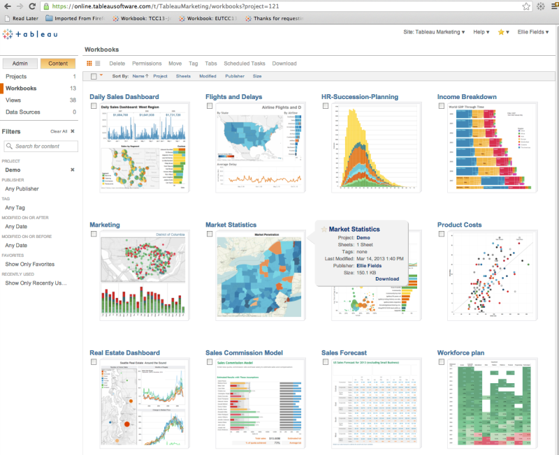
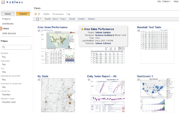
The Admin and Server pages have been redesigned to show more info quicker. In list view the columns can be resized. In thumbnail view the grid dynamically resizes. You can hover over a thumbnail to see more info about visualization. The content search is better too:
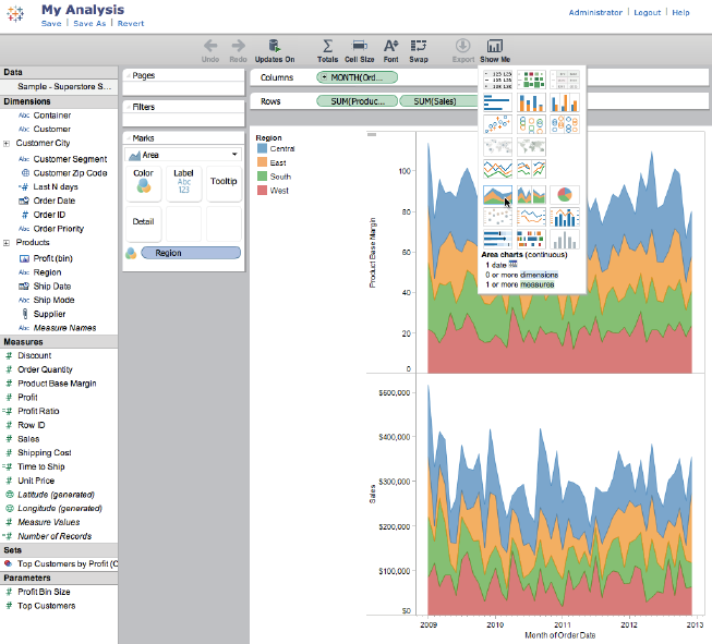
Web authoring (even mobile) introduced by Tableau 8 Server. Change dimensions, measures, mark types, add filters, and use Show Me are all directly in a web browser and can be saved back to the server as a new workbook or if individual permissions allow, to the original workbook:
Subscribing to a workbook or worksheet will automatically notify about the dashboard or view updates to your email inbox. Subscriptions deliver image and link.
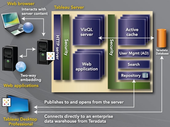
Tableau 8 Data Engine is more scalable now, it can be distributed between 2 nodes, 2nd instance of it now can be configured as Active, Synced and Available for reading if Tableau Router decided to use it (in addition Fail-over function as before)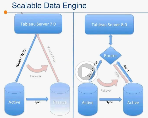 Tableau 8 Server now supports Local Rendering, using graphic ability of local devices, modern browsers and HTML5. No-round-trip to server while rendering using latest versions of chrome 23+, Firefox 17+, Safari , IE 9+. Tableau 8 (both Server and Desktop, computing each view in Parallel. PDF files, generated by Tableau 8 up to 90% smaller and searchable. And Performance Recorder works on both Server and Desktop.
Tableau 8 Server introducing Shared sessions allows more concurrency, more caching. Tableau 7 uses 1 session per viewer. Tableau 8 using one session per many viewers, as long as they do no change state of filters and don’t do other altering interaction. If interaction happened, Tableau 8 will clone the session for appropriate Interactor and apply his/her changes to new session: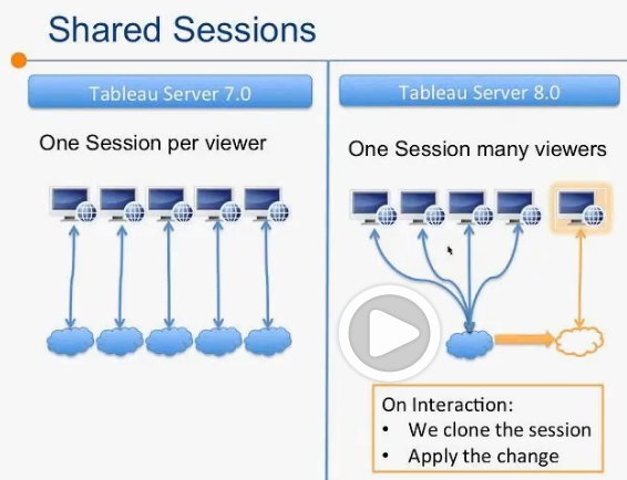 Finally Tableau getting API, 1st part of it I described in previous blog post about TDesktop – TDE API (C/C++, Python, Java on both Windows AND Linux!).
For Web Development Tableau has now brand new JavaScript API to customize selection, filtering, triggers to events, custom toolbar, etc. Tableau 8 has own JavaScript API WorkBench, which can be used right from you browser: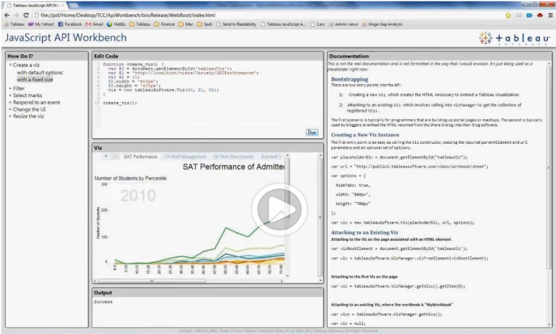
TDE API allows to build own TDE on any machine with Python, C/C++ and Java (see 24:53 at http://www.tableausoftware.com/tcc12conf/videos/new-tableau-server-8 ). Additionally Server API (REST API) allows programmatically create/enable/suspend sites and add/remove users to sites.
In addition to Faster Uploads andPublishing Data Sources, users can Publish Filters as Set and User Filters. Data Sources can be Refreshed or Appended instead of republishing – all from Local Sources. Such Refreshes can scheduled using Windows Task Scheduler or other task scheduling software on client devices – this is a real TDE proliferation!
My wishlist for Tableau 8 Server: all Tableau Server processes needs to be 64-bit (and they still 32-bit, see it here: http://onlinehelp.tableausoftware.com/v7.0/server/en-us/processes.htm ; they are way overdue to be the 64-bit; Linux version of Tableau Server (Microsoft recently changed very unfavorably the way they charge users for each Client Access) is needed, I wish integration with R Library (Spotfire has it for years), I want Backgrounder Processes (mostly doing data extracts on server) will not consume core licenses etc…
And yes, I found in San Diego even more individuals who found the better way to spend their time compare with attending Tableau 2012 Customer Conference and I am not here to judge:
New Tableau 8 Desktop features
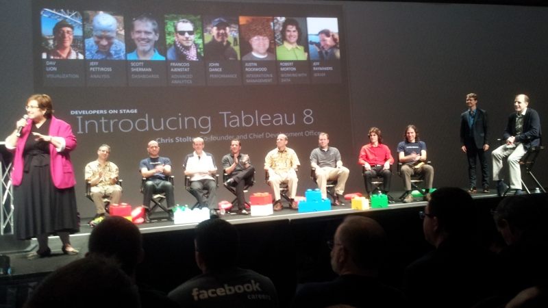
I left Tableau 2012 conference in San Diego (where Tableau 8 was announced) a while ago with enthusiasm which you can feel from this real-life picture of 11 excellent announcers:
Conference was attended by 2200+ people and 600+ Tableau Software employees (Tableau almost doubled the number of employees in a year) and it felt like a great effort toward IPO (see also article here: http://www.bloomberg.com/news/2012-12-12/tableau-software-plans-ipo-to-drive-sales-expansion.html ). See some video here: TCC12 Keynote . Tableau 8 introduce 130+ new features, 3 times more then Tableau 7 did. Almost half of these new features are in Tableau 8 Desktop and this post about those new Desktop features (this is a repost from my Tableau Blog: http://tableau7.wordpress.com/2012/11/16/new-tableau-8-desktop-features/). New Tableau 8 Server features deserved a separate blog post which I will publish a little later after playing with Beta 1 and may be Beta 2.
A few days after conference the Tableau 8 Beta Program started with 2000+ participants. One of the most promising features is new rendering engine and I build special Tableau 7 visualization (and its port to Tableau 8) with 42000 datapoints: http://public.tableausoftware.com/views/Zips_0/Intro?:embed=y to compare the speed of rendering between versions 7 and 8:
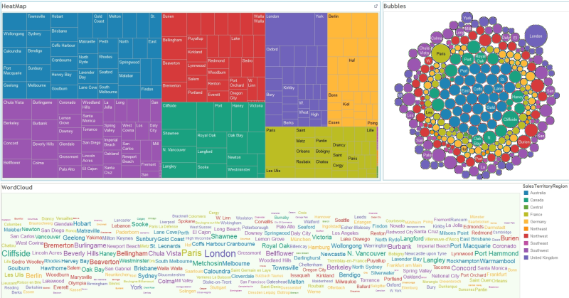
Among new features are new (for Tableau) visualization types: Heatmap, “Packed” Bubble Chart and Word Cloud, and I build simple Tableau 8 Dashboard to test it (all 3 are visualizing the 3-dimensional set where 1 dimension used as list of items, 1 measure used for size and 2nd measure used for color of items):
List of new features includes improved Sets (comparing members vs. non-members, adding/removing members, combining Sets: all-in-both, shared-by-both, left-except-right, right-except-left), Custom SQL with parameters, Freeform Dashboards (I still prefer MDI UI where each Chart/View Sheet has own Child Window as oppose to Pane), ability to add multiple fields to Labels, optimized label placement, built-in statistical models for visual Forecasting, Visual Grouping based on your data selection, Redesigned Mark Card (for Color, Size, Label, Detail and Tooltip Shelves).
New Data features include data blending without mandatory linked field in a view and with ability to filter data in secondary data sources; refreshing server-based Data Extracts can be done from local data sources; Data Filters (in addition be either local or global) can be shared now among selected set of worksheets and dashboards. Refresh of Data Extract can be done using command prompt for Tableau Desktop, for example
>tableau.exe refreshremoteextract
Tableau 8 has (finally) API (C/C++, Python, Java) to directly create a Tableau Data Extract (TDE) file, see example here: http://ryrobes.com/python/building-tableau-data-extract-files-with-python-in-tableau-8-sample-usage/
Tableau 8 (both Desktop and Server) can then connect to this extract file natively! Tableau provides new native connection for Google Analytics and Saleforce.com. TDE files now much smaller (especially with text values) – up to 40% smaller compare with Tableau 7.
Tableau 8 has performance enhancements, such as the new ability to use hardware accelerators (of modern graphics cards), computing views within dashboard in parallel (in Tableau 7 it was consecutive computations) and new performance recorder allows to estimate and tune a workload of various activities and functions and optimize the behavior of workbook.
I still have a wishlist of features which are not implemented in Tableau and I hope some them will be implemented later: all Tableau processes are 32-bit (except 64-bit version of data engine for server running on 64-bit OS) and they are way overdue to be the 64-bit; many users demand MAC version of Tableau Desktop and Linux version of Tableau Server (Microsoft recently changed very unfavorably the way they charge users for each Client Access), I wish MDI UI for Dashboards where each view of each worksheet has own Window as oppose to own pane (Qlikview does it from the beginning of the time), I wish integration with R Library (Spotfire has it for years), scripting languages and IDE (preferably Visual Studio), I want Backgrounder Processes (mostly doing data extracts on server) will not consume core licenses etc…
Despite the great success of the conference, I found somebody in San Diego who did not pay attention to it (outside was 88F, sunny and beautiful):
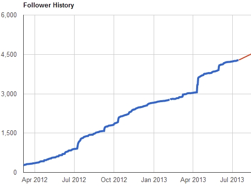
Google+ extension of this blog: 4277+ followers
On May 3rd of 2012 the Google+ extension http://tinyurl.com/VisibleData of this Data Visualization blog reached 500+ followers, on July 9 it got 1000+ users, on October 11 it had already 2000+ users, 11/27/12 my G+ Data Visualization Page has 2190+ followers and still growing every day (updated as of 12/01/12: 2500+ followers.
One of reasons of course is just a popularity of Data Visualization related topics and other reason covered in interesting article here:
http://www.computerworld.com/s/article/9232329/Why_I_blog_on_Google_And_how_ .
In any case, it helped me to create a reading list for myself and other people, base on feedback I got. According to CicleCount, as of 11/13/12 update, my Data Visualization Google+ Page ranked as #178 most popular page in USA. Thank you G+ !
Update 5/25/13: G+ extension of this blog now has 3873+ followers and as of 7/15/13 as of 4277+ followers):
Qlikview can go outside RAM, finally
Qlikview 10 was released around 10/10/10, Qlikview 11 – around 11/11/11, so I expected Qlikview 12 to be released on 12/12/12 but “instead” we are getting Qlikview 11.2 with Direct Discovery in December 2012, which supposedly provides a “hybrid approach so business users can get the QlikView associative experience even with data that is not stored in memory”
This feature demanded by users (me included) for a long time, but I think noise around so called Big Data and competition forced Qliktech to do it. Spotfire has it for a longtime (as well as 64-bit implementation) and Tableau has something like that for a while (unfortunately Tableau still 32-bit) . You can test Beta of it, if you have time: http://community.qlikview.com/blogs/technicalbulletin/2012/10/22/qlikview-direct-discovery-beta-registration-is-open
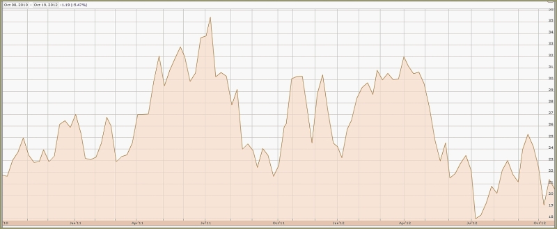
Just 8 months ago Qliktech estimated its sales for 2012 as $410M and suddenly 3 months ago it changed its estimates down to $381M, just 19% over 2011, which is in huge contrast with Qliktech’s previous speed of growth and way behind the current speed of growth of Tableau and even less then current speed of growth of Spotfire. During last 2 years QLIK stock unable to grow significantly:
and all of the above forcing Qliktech to do something outside of gradual improvements – new and exciting functionality needed and Direct Discovery may help!
QlikView Direct Discovery enables users to perform visual analysis against “any amount of data, regardless of size”. With the introduction of this unique hybrid approach, users can associate data stored within big data sources directly alongside additional data sources stored within the QlikView in-memory model. QlikView can “seamlessly connect to multiple data sources together within the same interface”, e.g. Teradata to SAP to Facebook allowing the business user to associate data across the data silos. Data outside of RAM can be joined with the in-memory data with the common field names. This allows the user associatively navigate both on the direct discovery and in memory data sets.
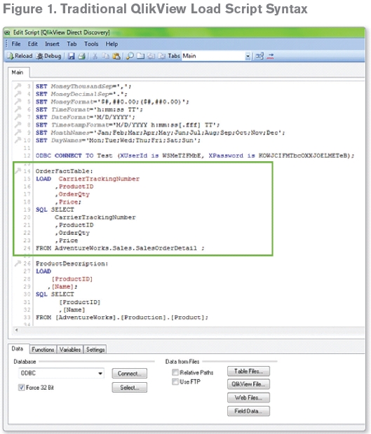
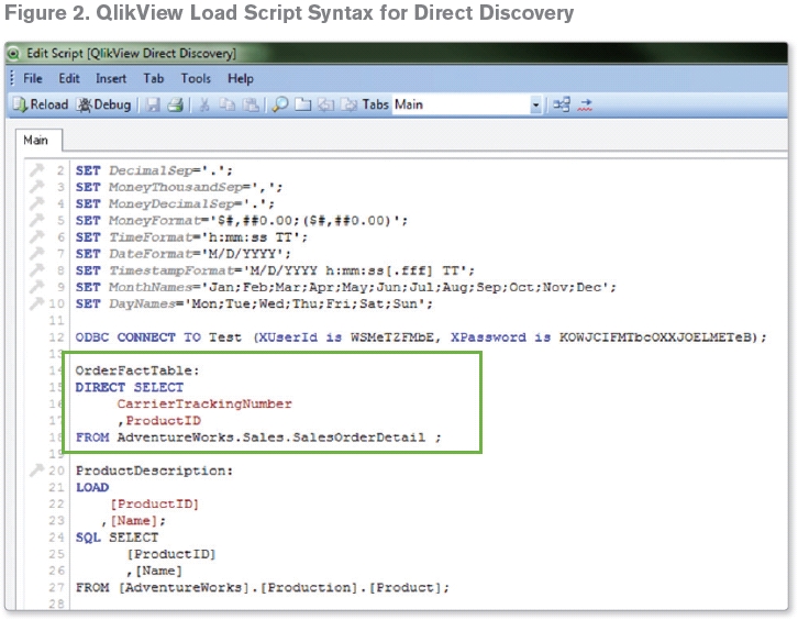
QlikView developer should setup the Direct Discovery table on the QlikView application load script to allow the business users to query the desired big data source. Within the script editor a new syntax is introduced to connect to data in direct discovery form. Traditionally the following syntax is required to load data from a database table:
To invoke the direct discovery method, the keyword “SQL” is replaced with “DIRECT”.
In the example above only column CarrierTrackingNumber and ProductID are loaded into QlikView in the traditional manner, other columns exist in the data table within the Database including columns OrderQty and Price. OrderQty and Price fields are referred as “IMPLICIT” fields. An implicit field is a field that QlikView is aware of on a “meta level”. The actual data of an implicit field resides only in the database but the field may be used in QlikView expressions. Looking at the table view and data model of the direct discovery columns are not within the model (on the OrderFact table):
Once the direct discovery structure is established, the direct discovery data can be joined with the in-memory data with the common field names (Figure 3). In this example, “ProductDescription” table is loaded in-memory and joined to direct discovery data with the ProductID field. This allows the user to associatively navigate both on the “direct discovery” and in memory data sets.
Direct Discovery will be much slow then in-memory processing and this is is expected, but it will take away from Qlikview its usual claim that is is faster then competitors. QlikView Direct Discovery can only be used against SQL compliant data sources. The following data sources are supported;
• ODBC/OLEDB data sources – All ODBC/OLEDB sources are supported, including SQL Server, Teradata and Oracle.
• Custom connectors which support SQL – Salesforce.com, SAP SQL Connector, Custom QVX connectors for SQL compliant data stores.
Due to the interactive and SQL syntax specific nature of the Direct Discovery approaches a number of limitations exist. The following chart types are not supported;
• Pivot tables
• Mini charts
And the following QlikView features are not supported:
• Advanced aggregation
• Calculated dimensions
• Comparative Analysis (Alternate State) on the QlikView objects that use Direct
Discovery fields
• Direct Discovery fields are not supported on Global Search
• Binary load from a QlikView application with Direct Discovery table
Here is a some preliminary video about Direct Discovery, published by Qliktech:
It was interesting to me that just 2 days after Qliktech pre-anounced Direct Discovery it also partners with Teradata. Tableau partners with Teradata for a while and Spotfire did it a month ago, so I guess Qliktech trying to catchup in this regard as well. I mentioned it only to underscore the point of this blog post: Qliktech realized that it behind its competitors in some areas and it has to follow ASAP.
Spotfire 5 is announced
Today TIBCO announced Spotfire 5, which will be released in November 2012. Two biggest news are the access to SQL Server Analysis Services cubes and the integration with Teradata “by pushing all aggregations, filtering and complex calculations used for interactive visualization into the (Teradata) database”.
Spotfire team “rewrote” its in-memory engine for v. 5.0 to take advantage of high-capacity, multi-core servers. “Spotfire 5 is capable of handling in-memory data volumes orders of magnitude greater than the previous version of the Spotfire analytics platform” said Lars Bauerle, vice president of product strategy at TIBCO Spotfire.
Another addition is “in-database analysis” which allows to apply analytics within the database platforms (such as Oracle, Microsoft SQL Server and Teradata) without extracting and moving data, while handling analyses on Spotfire server and returning result sets back to the database platform.
Spotfire added new Tibco Enterprise Runtime for R, which embeds R runtime engine into the Spotfire statistical server. TIBCO claims that Spotfire 5.0 scales to tens of thousands of users! Spotfire 5 is designed to leverage the full family of TIBCO business optimization and big data solutions, including TIBCO LogLogic®, TIBCO Silver Fabric, TIBCO Silver® Mobile, TIBCOBusinessEvents®, tibbr® and TIBCO ActiveSpaces®.
Data Visualization Seminar at MassTLC 9/20/12
The Mass Technology Leadership Council (MassTLC) organized today the Data Visualization Panel in their series of “Big Data Seminars”:
http://www.masstlc.org/events/event_details.asp?id=243502
and they invited me to be a Speaker and Panelist together with Irene Greif (Fellow @IBM) and Martin Leach (CIO @Broad Institute). Most interesting about this event was that it was sold out and about 150 people came to participate, even it was most productive time of the day (from 8:30am until 10:30am). Compare with what I observed just a few years ago, I sensed the huge interest to Data Visualization, base on multiple, very interesting and relevant questions I got from event participants.
Power View in Excel 2013
I doubt that Microsoft is paying attention to my blog, but recently they declared that Power View now has 2 versions: one for SharePoint (thanks, but no thanks) and one for Excel 2013. In other words, Microsoft decided to have own Desktop Visualization tool. In combination with PowerPivot and SQL Server 2012 it can be attractive for some Microsoft-oriented users but I doubt it can compete with Data Visualization Leaders – too late.
Most interesting is the note about Power View 2013 on Microsoft site: “Power View reports in SharePoint are RDLX files. In Excel, Power View sheets are part of an Excel XLSX workbook. You can’t open a Power View RDLX file in Excel, and vice versa. You also can’t copy charts or other visualizations from the RDLX file into the Excel workbook.“
But most amazing is that Microsoft decided to use the dead Silverlight for Powerview: “Both versions of Power View need Silverlight installed on the machine.” And we know that Microsoft switched to HTML5 from Silverlight and no new development planned for Silverlight! Good luck with that…
And yes, you can add now maps (Bing of course), see it here:
LinkedIn Stats about Data Visualization tools
I used LinkedIn for years to measure of how many people mentioning Data Visualization tools on their profiles, of how many LinkedIn groups dedicated to those DV tools and what group membership is. Recently these statistics show dramatic changes in favor of Qlikview and Tableau as undisputed leaders in people’s opinions.
Here is how many people mentioned specific tools (statistics were updated on 9/4/12 and numbers changing every day) on their profiles:
- Tableau – 18584,
- Qlikview – 17471,
- Spotfire – 3829,
- SAS+JMP – 3443,
- PowerPivot – 2335
Sample of “People” search URL: http://www.linkedin.com/search/fpsearch?type=people&keywords=Tableau or http://www.linkedin.com/search/fpsearch?type=people&keywords=SAS+JMP
Here is how many groups dedicated to [in brackets a “pessimistic” estimate of total non-overlapping membership]:
- Qlikview – 169 [13000+],
- Tableau – 76 [6000+],
- Spotfire – 29 [2000+],
- SAS (+AND+) JMP – 23 [2000+],
- PowerPivot – 16 [2000+]
Sample of “Group” search URL: http://www.linkedin.com/search-fe/group_search?pplSearchOrigin=GLHD&keywords=Qlikview
Advizor Analyst vs. Tableau or Qlikview…
I feel guilty for many months now: I literally do not have time for project I wish to do for a while: to compare Advizor Analyst and other Visual Discovery products from Advizor Solutions, Inc. with leading Data Visualization products like Tableau or Qlikview. I am asking visitors of my blog to volunteer and be a guest blogger here; the only pre-condition here is: a guest blogger must be the Expert in Advizor Solutions products and equally so in on of these 3: Tableau, Qlikview or Spotfire.
ADVIZOR’s Visual Discovery™ software is built upon strong data visualization technology spun out of a research heritage at Bell Labs that spans nearly two decades and produced over 20 patents. Formed in 2003, ADVIZOR has succeeded in combining its world-leading data visualization and in-memory-data-management expertise with predictive analytics to produce an easy to use, point and click product suite for business analysis.
Advizor has many Samples, Demos and Videos on its site: http://www.advizorsolutions.com/gallery/ and some web Demos, like this one
http://webnav.advizorsolutions.net/adv/Projects/demo/MutualFunds.aspx but you will need the Silverlight plugin for your web browser installed.
If you think that Advizor can compete with Data Visualization leaders and you have interesting comparison of it, please send it to me as MS-Word article and I will publish it here as a guest blog post. Thank you in advance…
Tableau as the front-end for Big Data
(this is a repost from my other blog: http://tableau7.wordpress.com/2012/06/09/tableau-and-big-data/ )
Big Data can be useless without multi-layer data aggregations, hierarchical or cube-like intermediary Data Structures, when ONLY a few dozens, hundreds or thousands data-points exposed visually and dynamically every single viewing moment to analytical eyes for interactive drill-down-or-up hunting for business value(s) and actionable datum (or “datums” – if plural means data). One of best expression of this concept (at least how I interpreted it) I heard from my new colleague who flatly said:
“Move the function to the data!”
I got recently involved with multiple projects using large data-sets for Tableau-based Data Visualizations (100+ millions of rows and even Billions of records!). Some of largest examples of their sizes I used were: 800+ millions of records and other was 2+ billions of rows.
So this blog post is to express my thoughts about such Big Data (in average examples above have about 1+ KB per CSV record before compression and other advanced DB tricks, like columnar Databases used by Data Engine of Tableau) as back-end for Tableau.
Here are some Factors involved into Data Delivery from main and designated Database (Back-ends like Teradata, DB2, SQL Server or Oracle) for Tableau-based Big Data Visualizations) into “local” Tableau Visualizations (many people still trying to use Tableau as a Reporting tool as oppose to (Visual) Analytical Tool:
-
Queuing thousands of Queries to Database Server. There is no guarantee your Tableau query will be executed immediately; in fact it WILL be delayed.
-
Speed of Tableau Query when it will start to be executed depends on sharing CPU cycles, RAM and other resources with other queries executed SIMULTANEOSLY with your query.
-
Buffers, pools and other resources available for particular user(s) and queries at your Database Server are different and depends on privileges and settings given to you as a Database User
-
Network speed: between some servers it can be 10Gbits (or even more), in most cases it is 1Gbit inside server rooms, outside of server rooms I observed in many old buildings (over wired Ethernet) max 100Mbits coming into user’s PC; in case if you using Wi-Fi it can be even less (say 54 Mbits?). If you are using internet it can be even less (I observed speed in some remote offices as 1 Mbit or so over old T-1 lines); if you using VPN it will max out at 4Mbits or less (I observed it in my home office).
-
Utilization of network. I use Remote Desktop Protocol – RDP to VM (from my workstation or notebook; (VM or VDI Virtual Machine, sitting in server room) and connected to servers with network speed of 1Gbit, but it still using maximum 3% of network speed (about 30 MBits, which is about 3 Megabytes of data per second, which is probably about few thousands of records per seconds.
That means that network may have a problem to deliver 100 millions of records to “local” report overnight (say 10 hours, 10 millions of records per hour, 3000 records per second) – partially and probably because of factors 4 above.
On top of those factors please keep in mind that Tableau is a set of 32-bit applications (with exception of one out of 7 processes on Server side), which is restricted to 2GB of RAM; if data-set cannot fit into RAM, than Tableau Data Engine will use the disk as Virtual RAM, which is much, much slower and for some users such disk space actually not local to his/her workstation and mapped to some “remote” network file server.
Tableau desktop is using in many cases 32-bit ODBC drivers, which may even add more delay into data delivery into local “Visual Report”. As we learned from Tableau support itself, even with latest Tableau Server 7.0.X, the RAM allocated for one user session restricted to 3GB anyway.
Unfortunate Update: Tableau 8.0 will be 32-bit application again, but may be follow up version 8.x or 9 (I hope) will be ported to 64-bits… It means that Spotfire, Qlikview and even PowerPivot will keep some advantages over Tableau for a while…
Data Visualization tool is a Presentation Tool
(this is a repost from my other Data Visualization blog: http://tableau7.wordpress.com/2012/05/31/tableau-as-container/ )
Often I used small Tableau (or Spotfire or Qlikview) workbooks instead of PowerPoint, which are proving at least 2 concepts:
-
Good Data Visualization tool can be used as the Web or Desktop Container for Multiple Data Visualizations (it can be used to build a hierarchical Container Structures with more then 3 levels; currently 3: Container-Workbooks-Views)
-
It can be used as the replacement for PowerPoint; in example below I embedded into this Container 2 Tableau Workbooks, one Google-based Data Visualization, 3 image-based Slides and Textual Slide: http://public.tableausoftware.com/views/TableauInsteadOfPowerPoint/1-Introduction
-
Tableau (or Spotfire or Qlikview) is better then PowerPoint for Presentations and Slides
-
Tableau (or Spotfire or Qlikview) is the Desktop and the Web Container for Web Pages, Slides, Images, Texts
-
Good Visualization Tool can be a Container for other Data Visualizations
-
Sample Tableau Presentation above contains the Introductory Textual Slide
-
Sample Tableau Presentation above contains a few Tableau Visualization:This Tableau Presentation contains a Web Page with the Google-based Motion Chart Demo
-
The Drill-down Demo
-
The Motion Chart Demo ( 6 dimensions: X,Y, Shape, Color, Size, Motion in Time)
-
-
This Tableau Presentation contains a few Image-based Slides:
-
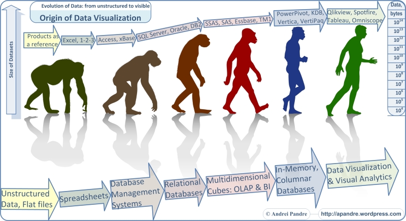
The Quick Description of Origins and Evolution of Software and Tools used for Data Visualizations during last 30+ years
-
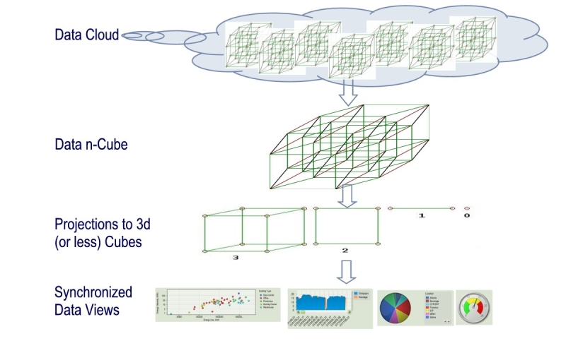
The Description of Multi-level Projection from Multidimensional Data Cloud to Datasets, Multidimensional Cubes and to Chart
-
The Description of 6 stages of Software Development Life Cycle for Data Visualizations
-
Spotfire 4.5 is announced
TIBCO said Spotfire 4.5 will be available later this month (May 2012).
Among news and additions to Spotfire: it will include ADS connector to Hadoop, integration with SAS, Mathworks and Attivio engines and new deployment kit for iPad.
Tableau vs. Qlikview
Some people pushing me to answer on recent Donald Farmer’s comments on my previous post, but I need more time to think about it.
Meanwhile today Ted Cuzzillo published an interesting comparison of Qlikview vs. Tableau here:
http://datadoodle.com/2012/04/24/tableau-qlikview/
named “The future of BI in two words” which made me feel warm and fuzzy about both products and unclear about what Ted’s judgement is?
Fortunately I had a more “digitized” comparison of these 2 Data Visualization Leaders, which I did a while ago for a different reason. So I modified it a little to bring it up-to-date and you can see it for yourself below. Funny thing is that even I used 30+ criterias to measure and compare those two brilliant products, final score is almost identical for both of them, so it is still warm and fuzzy.
Basically conclusion is simple: each product is better for certain customers and for certain projects, there is no universal answer (yet?):
Power View: 3rd strike and Microsoft out?
The short version of this post: as far as Data Visualization is a concern, the new Power View from Microsoft is the marketing disaster, the architectural mistake and the generous gift from Microsoft to Tableau, Qlikview, Spotfire and dozens of other vendors.
For the long version – keep reading.
Assume for a minute (OK, just for a second) that new Power View Data Visualization tool from Microsoft SQL Server 2012 is almost as good as Tableau Desktop 7. Now let’s compare installation, configuration and hardware involved:
Tableau:
- Hardware: almost any modern Windows PC/notebook (at least dual-core, 4GB RAM).
- Installation: a) one 65MB setup file, b) minimum or no skills
- Configuration: 5 minutes – follow instructions on screen during installation.
- Price – $2K.
Power View:
- Hardware: you need at least 2 server-level PCs (each at least quad-core, 16GB RAM recommended). I will not recommend to use 1 production server to host both SQL Server and SharePoint; if you desperate, at least use VM(s).
- Installation: a) Each Server needs Windows 2008 R2 SP1 – 3GB DVD; b) 1st Server needs SQL Server 2012 Enterprise or BI Edition – 4GB DVD; c) 2nd Server needs SharePoint 2010 Enterprise Edition – 1GB DVD; d) A lot of skills and experience
- Configurations: Hours or days plus a lot of reading, previous knowledge etc.
- Price: $20K or if only for development it is about $5K (Visual Studio with MSDN subscription) plus cost of skilled labor.
As you can see, Power View simply cannot compete on mass market with Tableau (and Qlikview and Spotfire) and time for our assumption in the beginning of this post is expired. Instead now is time to remind that Power View is 2 generations behind Tableau, Qlikview and Spotfire. And there is no Desktop version of Power View, it is only available as a web application through web browser.
Power View is a Silverlight application packaged by Microsoft as a SQL Server 2012 Reporting Services Add-in for Microsoft SharePoint Server 2010 Enterprise Edition. Power View is (ad-hoc) report designer providing for user an interactive data exploration, visualization, and presentation web experience. Microsoft stopped developing Silverlight in favor of HTML5, but Silverlight survived (another mistake) within SQL Server team.
Previous report designers (still available from Microsoft: BIDS, Report Builder 1.0, Report Builder 3.0, Visual Studio Report Designer) are capable to produce only static reports, but Power View enables users to visually interact with data and drill-down all charts and Dashboard similar to Tableau and Qlikview.
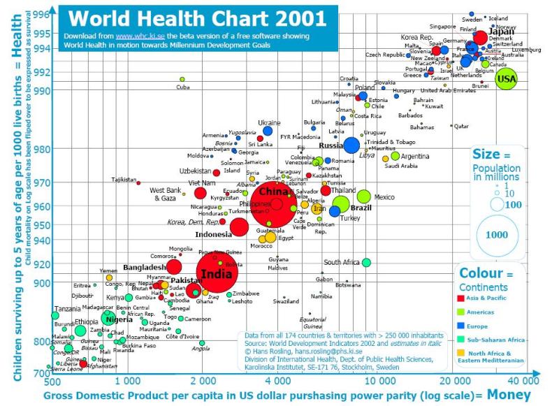
Power View is a Data Visualization tool, integrated with Microsoft ecosystem. Here is a Demo of how the famous Hans Rosling Data Visualization can be reimplemented with Power View:
Compare with previous report builders from Microsoft, Power View allows many new features, like Multiple Views in a Single Report, Gallery preview of Chart Images, export to PowerPoint, Sorting within Charts by measures and Categories, Multiple Measures in Charts, Highlighting of selected data in reports and Charts, Synchronization of Slicers (Cross-Filtering), Measure Filters, Search in Filters (convenient for a long lists of categories), dragging data fields into Canvas (create table) or Charts (modify visualization), convert measures to categories (“Do Not Summarize”), and many other features.
As with any of 1st releases from Microsoft, you can find some bugs from Power View. For example, KPIs are not supported in Power View in SQL Server 2012, see it here: http://cathydumas.com/2012/04/03/using-or-not-using-tabular-kpis/
Power View is not the 1st attempt to be a full player in Data Visualization and BI Market. Previous attempts failed and can be counted as Strikes.
Strike 1: The ProClarity acquisition in 2006 failed, there have been no new releases since v. 6.3; remnants of ProClarity can be found embedded into SharePoint, but there is no Desktop Product anymore.
Strike 2: Performance Point Server was introduced in November, 2007, and discontinued two years later. Remnants of Performance Point can be found embedded into SharePoint as Performance Point Services.
Both failed attempts were focused on the growing Data Visualization and BI space, specifically at fast growing competitors such as Qliktech, Spotfire and Tableau. Their remnants in SharePoint functionally are very behind of Data Visualization leaders.
Path to Strike 3 started in 2010 with release of PowerPivot (very successful half-step, since it is just a backend for Visualization) and xVelocity (originally released under name VertiPaq). Power View is continuation of these efforts to add a front-end to Microsoft BI stack. I do not expect that Power View will gain as much popularity as Qlikview and Tableau and in my mind Microsoft will be a subject of 3rd strike in Data Visualization space.
One reason I described in very beginning of this post and the 2nd reason is absence of Power View on desktop. It is a mystery for me why Microsoft did not implement Power View as a new part of Office (like Visio, which is a great success) – as a new desktop application, or as a new Excel Add-In (like PowerPivot) or as a new functionality in PowerPivot or even as a new functionality in Excel itself, or as new version of their Report Builder. None of these options preventing to have a Web reincarnation of it and such reincarnation can be done as a part of (native SSRS) Reporting Services – why involve SharePoint (which is – and I said it many times on this blog – basically a virus)?
I am wondering what Donald Farmer thinking about Power View after being the part of Qliktech team for a while. From my point of view the Power View is a generous gift and true relief to Data Visualization Vendors, because they do not need to compete with Microsoft for a few more years or may be forever. Now IPO of Qliktech making even more sense for me and upcoming IPO of Tableau making much more sense for me too.
Yes, Power View means new business for consulting companies and Microsoft partners (because many client companies and their IT departments cannot handle it properly), Power View has a good functionality but it will be counted in history as a Strike 3.
Palettes and Colors
(this is a repost from my Tableau blog: http://tableau7.wordpress.com/2012/04/02/palettes-and-colors/ )
I was always intrigued with colors and their usage, since my mom told me that may be ( just may be, there is no direct prove of it anyway) Ancient Greeks did not know what the BLUE color is – that puzzled me.
Later in my live, I realized that Colors and Palettes are playing the huge role in Data Visualization (DV) and it eventually led me to attempt to understand of how it can be used and pre-configured in advanced DV tools to make Data more Visible and to express the Data Patterns better. For this post I used Tableau to produce some palettes, but similar technique can be found in Qlikview, Spotfire etc.
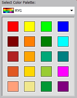
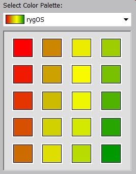
Tableau published the good article of how to create customized palettes here: http://kb.tableausoftware.com/articles/knowledgebase/creating-custom-color-palettes and I followed it below. As this article recommended, I modified default Preferences.tps file; see it below with images of respective Palettes embedded.
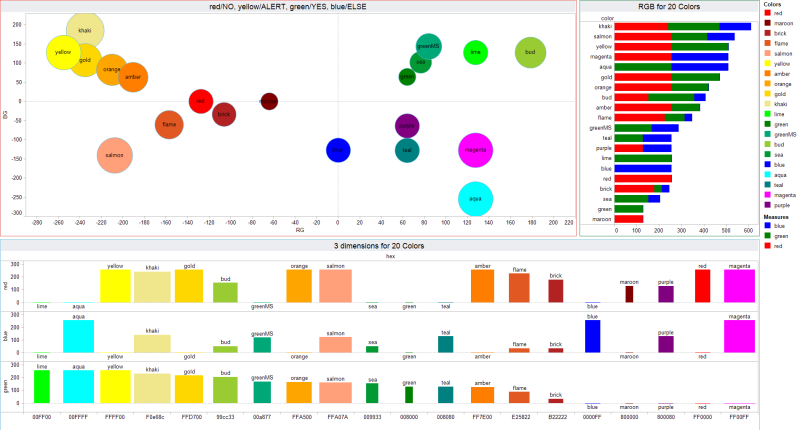
For the first, regular Red-Yellow-Green-Blue Palette with known colors with well-established names, I created even a Visualization in order to compare their Red-Green-Blue components and I even tried to placed respective Bubbles on 2-dimensional surface, even originally it is clearly a 3 dimensional Dataset (click on image to see it in full size):
For the 2nd Red-Yellow-Green-NoBlue Ordered Sequential Palette, I tried to implement the extended “Set of Traffic Lights without any trace of BLUE Color” (so Homer and Socrates will understand it the same way as we are) while trying to use only web-safe colors. Please keep in mind, that Tableau does not have a simple way to have more than 20 colors in one Palette, like Spotfire does.
Other 5 Palettes below are useful too as ordered-diverging almost “mono-chromatic” (except Red-Green Diverging, since it can be used in Scorecards when Red is bad and Green is good). So see below Preferences.tps file with my 7 custom palettes.
<?xml version=’1.0′?> <workbook> <preferences>
<color-palette name=”RegularRedYellowGreenBlue” type=”regular”>
<color>#FF0000</color> <color>#800000</color> <color>#B22222</color>
<color>#E25822</color> <color>#FFA07A</color> <color>#FFFF00</color>
<color>#FF7E00</color> <color>#FFA500</color> <color>#FFD700</color>
<color>#F0e68c</color> <color>#00FF00</color> <color>#008000</color>
<color>#00A877</color> <color>#99cc33</color> <color>#009933</color>
<color>#0000FF</color> <color>#00FFFF</color> <color>#008080</color>
<color>#FF00FF</color> <color>#800080</color>
<color-palette name=”RedYellowGreenNoBlueOrdered” type=”ordered-sequential” >
<color>#ff0000</color> <color>#cc6600</color> <color>#cccc00</color>
<color>#ffff00</color> <color>#99cc00</color> <color>#009900</color>
</color-palette>
<color-palette name=”RedToGreen” type=”ordered-diverging” >
 <color>#ff0000</color> <color>#009900</color> </color-palette>
<color-palette name=”RedToWhite” type=”ordered-diverging” >
 <color>#ff0000</color> <color>#ffffff</color></color-palette>
<color-palette name=”YellowToWhite” type=”ordered-diverging” >
 <color>#ffff00</color> <color>#ffffff</color></color-palette>
<color-palette name=”GreenToWhite” type=”ordered-diverging” >
 <color>#00ff00</color> <color>#ffffff</color></color-palette>
<color-palette name=”BlueToWhite” type=”ordered-diverging” >
 <color>#0000ff</color> <color>#ffffff</color> </color-palette>
</preferences> </workbook>
In case if you wish to use the colors you like, this site is very useful to explore the properties of different colors: http://www.perbang.dk/rgb/
Free Tableau Reader enables Server-less Visualization!
(this is a repost from http://tableau7.wordpress.com/2012/03/31/tableau-reader/ )
Tableau made a couple of brilliant decisions to completely outsmart its competitors and gained extreme popularity, while convincing millions of potential, future and current customers to invest own time to learn Tableau. 1st reason of course is Tableau Public (we discuss it in separate blog post) and other is a Free Tableau Reader, which provides full desktop user experience and interactive Data Visualization without any Tableau Server (and any other server) involved and with better performance and UI then Server-based Visualizations.
While designing Data Visualizations is done with Tableau Desktop, most users got their Data Visualizations served by Tableau Server to their Web Browser. However in the large and small organizations that usage pattern is not always the best fit. Below I am discussing a few possible use cases, where the usage of Free Tableau Reader can be appropriate, see it here: http://www.tableausoftware.com/products/reader .
1. Tableau Application Server serves Visualizations well, but not as well as Tableau Reader, because Tableau Reader delivers a truly desktop User Experience and UI. Most known example of it is a Motion Chart: you can see automatic motion with Tableau Reader but Web Browser will force user to manually emulate motion. In cases like that user advised to download workbook, copy .TWBX file to his/her workstation and open it with Tableau Reader.
Here is an example of the Motion Chart, done in Tableau, similar to famous Hans Rosling’s presentation of Gapminder’s Motion Chart (an you need the free Tableau Reader or license to Tableau Desktop to see the automatic motion of the 6-dimensional dataset with all colored bubbles, resizing over time):
http://public.tableausoftware.com/views/MotionChart_0/Motion?:embed=y
Please note that the same Motion Chart using Google Spreadsheets will run in browser just fine (I guess because Google “bought” Gapminder and kept its code intact):
https://docs.google.com/spreadsheet/ccc?key=0AuP4OpeAlZ3PdC14OXU1RGJsV05uaDlxRV9GLXlTZXc#gid=2
2. When you have hundreds or thousands of Tableau Server users and more then couple of Admins (users with Administrative privileges), each of Admins can override viewing privileges for any workbook, regardless of designated for that workbook Users and User Groups. In such situation there is a risk for violation of privacy and confidentiality of data involved, for example for HR Analytics and HR Dashboards and other Visualizations where private, personal and confidential data used.
Tableau Reader enables additional complementary method of delivering Data Visualizations through private channels like password-protected portals, file servers and FTP servers and in certain cases even by-passing Tableau Server entirely.
3. Due popularity of Tableau and ease of use, many groups and teams are considering Tableau as vehicle to delivering of hundreds and even thousands of Visual Reports to hundreds and may be even thousands of users. That can slow down Tableau Server, decrease user experience and create even more confidentiality problems, because it may expose confidential data to unintended users, like report for one store to users from another store.
4. Many small (and not so small either) organizations trying to save on Tableau Server licenses (at least initially) and they still can distribute Tableau-based Data Visualizations; developer(s) will have Tableau Desktop (relatively small investment) and users, clients and customers will use Tableau Reader, while all TWBX files can be distributed over FTP, portals or file servers or even by email. In my experience, when Tableau-based business will grow enough, it will pay by itself for buying licenses for Tableau Server, so usage of Tableau Reader in n o way is threat to Tbaleau Software bottom line!
Update (12/12/12) for even more happy usage of Tableau Reader: in upcoming Tableau 8 all Tableau Data Extracts – TDEs – can be created and used without any Tableau Server involved. Instead Developer can create/update TDE either with Tableau in UI mode or using Tableau Command Line Interface and script TDEs in batch mode or programmatically with new TDE API (Python, C/C++, Java). It means that Tableau workbooks can be automatically refreshed with new data without any Tableau Server and re-delivered to Tableau Reader users over … FTP, portals or file servers or even by email.
Panopticon partners with Qliktech
In unusual, interesting (what it means? is it promising or what?) move the two Data Visualization leaders (Panopticon and Qliktech) partners today, see
“to offer enhanced, real-time visualization capabilities for the QlikView Business Discovery platform”.
Panopticon’s press-release looks overly submissive to me:
“As a member of QlikTech’s Qonnect Partner Program for Technology Partners, Panopticon supports QlikView desktop, web, and mobile interactive dashboards and allows users to filter and interact directly with real-time data. By integrating Panopticon into their systems, QlikView users can:
-
Federate reference and real-time streaming data as well as conflated time series data sets;
-
Connect to virtually any relational or column-oriented database, including tick databases;
-
Connect to real-time message queues;
-
Connect to Complex Event Processing (CEP) engines; and
-
Make full use of Panopticon’s library of visualizations designed specifically to analyze financial data.
The combined Panopticon-QlikView platform is now available for immediate installation.”
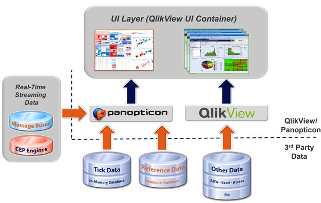 Panopticon integration into QlikView dashboards utilizes QlikView UI extension objects within the web browser. The extension object calls Panopticon “web parts” and creates a Panopticon extension object with a number of pre-defined properties. The defined context/data is passed into the Panopticon extension object. The Panopticon “web parts” call a Panopticon EX Java applet and renders the requested Panopticon visualization workbook within the context defined by the QlikView user. The Panopticon component executes parameterized URL calls and parameterized JavaScripts to update the parent QlikView display.
Qliktech is trying to be politically correct and its Michael Saliter, Senior Director Global Market Development – Financial Services at QlikTech said, “Our partnership with Panopticon allows us to incorporate leading real-time visualization capabilities into our QlikView implementations. We recognize the importance of providing our clients with truly up-to-date information, and this new approach supports that initiative. Our teams share a common philosophy about proper data visualization design. This made it easy to develop a unified approach to the presentation of real-time, time series, and static data in ways that people can understand in seconds.”
While I like when competitors are cooperating (it benefits users and hopefully improve sales for both vendors), I still have a question: Qliktech got a lot of money from IPO, had a lot of sales and hired a lot of people lately; why they (Qlikview Developers) was not able to develop real-time functionality themselves?
Hugh Heinsohn, VP of Panopticon, said to me: “we (Panopticon) don’t see ourselves as competitors – and neither do they (Qliktech). When you get into the details, we do different things and we’re working together closely now”
Another indirect sign of relationship between Panopticon and Qliktech is the recent inclusion of Måns Hultman, former CEO of QlikTech into the list of advisors for Panopticon’s Board of Directors.
Other questions are rising too: if Qliktech suddenly is open to integration with Panopticon, why not to integrate with Quantrix and R Library (I proposed integration with R a while ago). Similar questions applicable to Tableau Software…
to read or to write? – that is the question
I was silent for a while for a reason: I owe myself to read a big pile of books, articles and blog posts by many authors – I have to read it before I can write something myself. List is huge and it goes many weeks back! I will sample a sublist here with some relatively fresh reading materials in no particular order:
1. Excellent “Clearly and Simply” blog by Robert Mundigl, here are just 2 samples:
- http://www.clearlyandsimply.com/clearly_and_simply/2012/02/6-famous-paintings-in-tableau.html
- http://www.clearlyandsimply.com/clearly_and_simply/2012/03/create-your-own-filled-maps-in-tableau.html
2. Interesting site dedicated to The Traveling Salesman Problem:
3. Excellent QV Design blog by Matthew Crowther, here are a few examples:
- http://qvdesign.wordpress.com/2012/02/29/upcoming-new-qlikview-chart-types-inspired-by-tableau/
- http://qvdesign.wordpress.com/2012/01/18/activity-ribbon-chart/
- http://qvdesign.wordpress.com/2012/01/23/new-qlikview-indexed-explosion-quadrant-chart/
- http://qvdesign.wordpress.com/2012/01/31/brilliant-qlikview-parallel-co-ordinates-chart/
- http://qvdesign.wordpress.com/2012/03/05/associative-radial-chart/
- http://qvdesign.wordpress.com/2012/03/07/beautiful-design-chart-innovations-from-qliktech-and-the-elephant-in-the-dashboard/
4. Good article by James Cheshire here:
5. Interesting blog by Josh Tapley: http://data-ink.com/
6. A must read blog of Stephen Wolfram, just take a look on his 2 last posts:
- http://blog.stephenwolfram.com/2012/02/launching-a-democratization-of-data-science/
- http://blog.stephenwolfram.com/2012/03/the-personal-analytics-of-my-life/
7. Nice post by my friend John Callan: http://community.qlikview.com/blogs/theqlikviewblog/2012/03/09/why-discovery-really-matters
8. I am trying to follow David Raab as much as I can:
- http://customerexperiencematrix.blogspot.com/2012/02/sas-unveils-high-performance-analytics.html
- http://customerexperiencematrix.blogspot.com/2012/03/bi-vendor-qliktech-reveals-qlikview.html
9. As always, interesting articles from Timo Elliott:
- http://timoelliott.com/blog/2011/03/business-analytics-vs-business-intelligence.html
- http://timoelliott.com/blog/2012/02/what-i-found-interesting-about-gartner-bi-summit-2012-london.html
10. Huge set of articles from variety of Sources about newly released or about to be released xVelocity, PowerPivot2, SQL Server 2012, SSDT (SQl Server Data Tools), VS11 etc.
11. Here is a sample of article with which I disagree (I think OBIEE is TWO generations behind of Qlikview, Tableau and Spotfire), but still need to read it:
this list is go on and on and on, so answer on my own question is: to read!
Below is a prove (unrelated to Data Visualization, but cannot resist to publishing it – I did the spreadsheet below by myself) – rather for myself, that reading can help to avoid mistakes (sounds funny, I know). For example if you will listen last week’s iPropaganda from iChurch, you will think that new iPad 2012 is the best tablet on market. But if you read carefully specification of new iPad 2012 and compare it (after careful reading) with specifications of new Asus Transformer Pad Infinity, you will have a different choice:
Tableau to IPO in 2013? rumor or …?
Dan Primack, Senior Editor at Fortune, posted today at http://finance.fortune.cnn.com/2012/02/22/tableau-to-ipo-next-year/ a suggestion that Tableau can go public next year and I quote:
“Scott Sandell, a partner with New Enterprise Associates (the venture capital firm that is Tableau’s largest outside shareholder) told Dan “that the “board-level discussions” are about taking the company public next year, even though it has the numbers to go out now if it so chose. Sandell added that the company has been very efficient with $15 million or so it has raised in VC funding, and that it shouldn’t need additional pre-IPO financing”.
Mr. Primack also mentioned an “unsolicited email, from outside spokesman: “Next week Tableau Software will announce its plans to go IPO“…
I do not have comments, but I will not be surprised if somebody will buy Tableau before IPO… Among potential buyers I can imagine:
- Microsoft (Seattle, Multidimensional Cubes, integration with Excel),
- Teradata (Aster Data is in, front-end for “big data” is needed),
- IBM (if you cannot win against the innovator, how about buying it),
- and even Oracle (everything moving is the target?)…
Qlikview Prices
Qliktech made its price list public on its website. In a move that calls for “other enterprise software and business intelligence vendors to follow suit, QlikTech is taking the mystery out of purchasing software“.
I expanded this post with comments and comparison of pricing from Qlikview and Tableau.
I have to mention that Tableau has pricing on its website for years. I wish Tableau will publish on its website the pricing for Core License (for Tableau Server) and more detail for Tableau Digital and Server pricing, but other than that, Tableau is a few years ahead of Qliktech in terms of “pricing transparency”… Also talking with Qliktech sales people until today was more time consuming then needed and I hope that public pricing will make it more easy.
One note about Qlikview pricing: Qliktech has a very weird requirement to buy a Document License ($350 per named user, per 1 (ONE) document) for each document is a potential time-bomb for Qlikview. But they are very good at sales (Total Q4 2011 revenue of $108.1 million increases 33% compared to fourth quarter of 2010, see http://investor.qlikview.com/secfiling.cfm?filingID=1193125-12-65355&CIK=1305294) and not me, so I will be glad if Qliktech will prove me wrong!
Again, for now, just review this:
http://www.qlikview.com/us/explore/pricing
I tried to compare the cost of average Deployment for Qlikview-based and Tableau-based Data Visualization Systems using currently Published prices of Qlikview and Tableau (I actually have an estimation for Spotfire-based deployment too, but TIBCO did not published its pricing yet). See prices in table below, and comparison of average deploymnet after/below this table:
I took as average the deployment with 46 users (it is my estimate of average Qlikview Deployment), 3 desktop clients, 10 documents/visualizations available to 10 (potentially different) named users each, 1 Application Server and maintenance for 3 years.
.
My estimate of total cost for 3 years came up as about $118K for Qlikview Deployment and $83K for Tableau Deployment (both before discounts and taxes and both do not include any development, training, consulting and IT cost).
Note 3/8/12: you may wish to review this blog post too:
http://i3community.com/blogs/entry/qlikview-user-license-named-client-access-license-cal
16 Data Visualization Vendors are squared
Since Gartner keeps doing its “Magic Quadrant” (MQ; see MQ at the very bottom of this post) for Business Intelligence Platforms every year, it forces me to do my
“Yellow Square for DV, 2012”
for Data Visualization (DV) Platforms too. I did it last year and I have to do it again because I disagreed with Gartner in 2011 and I disagree with it again in 2012. I have a few different (from Gartner) views, but I will mention 3.
1. There is no such thing as Business Intelligence as a software platform. It is a marketing term, used as an umbrella for multiple technologies and market segments. Gartner released its MQ for BI at the same time it had “BI Summit 2012” in London on which it practically acknowledged that BI is not a correct term and suggested to use the term “Business Analytics” instead, see for example this article: http://timoelliott.com/blog/2012/02/what-i-found-interesting-about-gartner-bi-summit-2012-london.html
2. I personally is using – for many years – the term Data Visualization as a replacement for BI, as much more specific. Because of that, I removed from consideration a few vendors present in Gartner’s MQ for BI and added a few important DV vendors.
3. I used for my assessment 3 groups of criterias, which I already used on this blog before, for example here:
http://apandre.wordpress.com/2011/12/18/dv-comparison-2011/
and here:
http://apandre.wordpress.com/tools/comparison/
As a result, I got a very different from Gartner the placement of “Data Visualization Platforms and their vendors”:
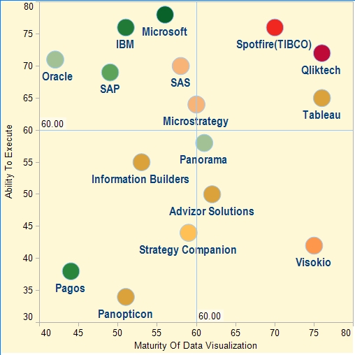 .
.
For reference purposes please see below the Magic Quadrant for BI, published by Gartner this month. As you can see our lists of Vendors are overlapping by 11 companies, but in my opinion their relative positioning is very different:
Data Visualization page on Google+
I started recently the new Data Visualization Google+ page as the extension of this blog here:
https://plus.google.com/111053008130113715119/posts
.
Internet has a lot of articles, pages, blogs, data, demos, vendors, sites, dashboards, charts, tools and other materials related to Data Visualization and this Google+ page will try to point to most relevant items and sometimes to comment on most interesting of them.
.
What was unexpected is a fast success of this Google+ page – in a very short time it got 200+ followers and that number keeps growing!
.
SpreadheetWEB 3.3 is released
New version 3.3 of SpreadsheetWEB with new features like Data Consolidation, User Groups, Advance Analytics and Interactive Charts, is released this month by Cambridge, MA-based Pagos, Inc.
SpreadsheetWEB is known as the best SaaS platform with unique ability to convert Excel spreadsheets to rich web applications with live database connections, integration with SQL Server, support for 336 Excel functions (see full list here http://wiki.pagos.com/display/spreadsheetweb/Supported+Excel+Formulas ), multiple worksheets, Microsoft Drawing, integration with websites and the best Data Collection functionality among BI tools and platforms.
SpreadsheetWEB supports Scripting (Javascript), has own HTML editor, has rich Data Visualization and Dashboarding functionality (32 interactive Chart types are supported, see http://spreadsheetweb.com/support_charts.htm ),
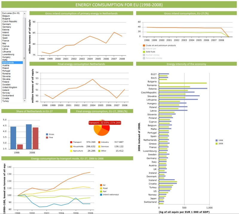 See the simple Video Tutorial about how to create a Web Dashboard with Interactive Charts by publishing your Excel Spreadsheet using SpreadsheetWEB 3.3 here:
SpreadsheetWEB supports Mapping for a while, see video showing how you can create Map application in less then 4 minutes:
as well as PivotTables, Web Services, Batch Processing, and many other new features, see it here: http://spreadsheetweb.com/features.htm
In order to create a SpreadsheetWEB application, all you need is Excel and free SpreadsheetWEB Add-in for Excel, see many impressive online Demos here: http://spreadsheetweb.com/demo.htm
Tableau 7.0 has 40+ new features, I wish 4 more
This is a repost from my Tableau-dedicated blog: http://tableau7.wordpress.com/2012/01/17/tableau-7/ …
2011 was the Year of Tableau with almost 100% (again!) Year-over-Year growth ($72M in sales in 2011, see interview with Christian Chabot here: http://www.xconomy.com/seattle/2012/01/27/tableaus-10th-year/ ), with 163+ new employees (total 350 employees as of the end of 2011) – below is the column chart I found on Tableau’s website:
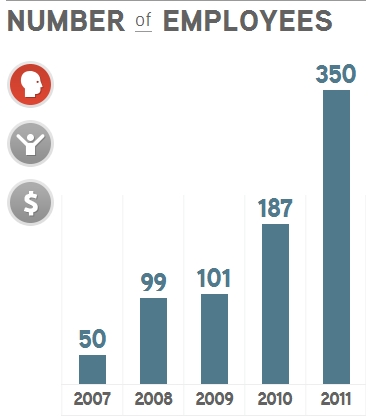 and with tremendous popularity of Tableau Public and Tableau Free Desktop Reader. In January 2012 Tableau Software disclosed the new plan to hire 300 more people in 2012, basically doubling its size in 2012 and all of these are great news!
Tableau 7.0 is released in January 2012 with 40+ new cool features, I like them, but I wish 4+ more “features”. Mostly I am puzzled what wizards from Seattle are thinking when they released (in 2012!) their Professional Desktop Client only as a 32-bit program?
Most interesting for me is the doubling of the performance and the scalability of Tableau Server with 100+ users deployments (while adding multi-tenancy, which is the sign of the maturing toward large enterprise customers):
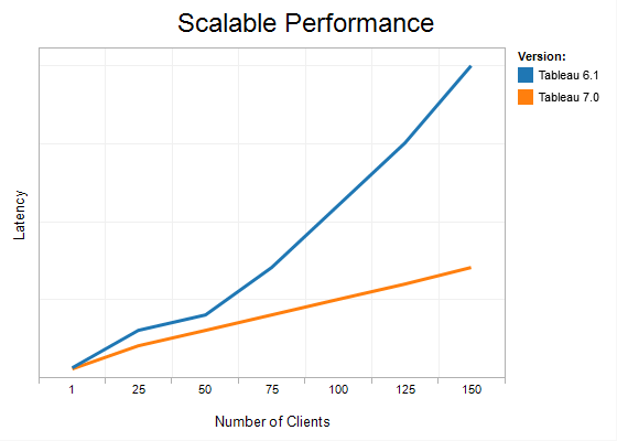 and adding “Data Server” features, like sharing data extracts (Tableau-optimized DB-independent file containers for datasets) and metadata across visualizations (Tableau applications called workbooks), automatic (through proxies) live reconnection to datasources, support for new datasources like Hadoop (since 6.1.4) and Vectorwise and new “Connect to Data” Tab:
Tableau’s target operating system is Windows 7 (both 64-bit and 32-bit but for Data Visualization purposes 64-bit is the most important), Tableau rightfully claims to complement Excel 2010 and PowerPivot (64-bit again), Access 2010 (64-bit), SQL Server 2012 (64-bit) and their competitors are supporting 64-bit for a while (e.g. Qlikview Professional has both 64-bit and 32-bit client for years).
Even Tableau’s own in-memory Data Engine (required to be used with Tableau Professional) is the 64-bit executable (if running under 64-bit Windows). I am confused and hope that Tableau will have 64-bit client as soon as possible (what is a big deal here? don’t explain, don’t justify, just do it! On Tableau site you can find attempts to explain/justify, like this: “There is no benefit to Tableau supporting 64-bit for our processing. The amount of data that is useful to display is well within the reach of 32 bit systems” but it was not my (Andrei’s) experience with competitive tools). I also noticed that under 64-bit Windows 7 the Tableau Professional client is using at least 4 executables: 32-bit tableau.exe (main Tableau program), 64-bit tdeserver64.exe (Tableau Data Engine) and two 32-bit instances of Tableau Protocol Server (tabprotosrv.exe ) – looks strange (at least) to me…
You also can find on Tableau’s site users are reporting that Tableau 6.X underuses multi-core processors: “Tableau isn’t really exploiting the capabilities of a multi-core architecture, so speed was more determined by relative speeds of one core of a core 2 duo vs 1 core of an i7 – which weren’t that different, plus any differences in disk and memory speed“. Good news: I tested Tableau 7.0 and it uses multi-core CPUs much better then 6.X !
Of course, most appealing and sexy new features in Tableau 7.0 are related to mapping. For example I was able quickly create Filled Map, showing the income differences between states of USA:
Other mapping features include wrapped maps, more synonyms and mixed mark types on maps (e.g. PIE instead of BUBBLE), the ability to edit locations and add new locationsas well as using Geography as Mark(s), like I did below:
etc.
Tableau 7.0 supports new types of Charts (e.g. finally Area Charts) and has new Main Menu, which actually causes a lot of changes where user can find menu items, see it here: http://kb.tableausoftware.com/articles/knowledgebase/new-locations
Tableau added many analytical and convenience features for users, like parameter-based Ref.lines, Top N filtering and Bins, Enhanced Summary Statistics (e.g. median, deviation, quartiles, kurtosis and skewness are added):
Trend models are greatly improved (added t-value, p-value, confidence bands, exponential trends, exporting of trends etc.). Tableau 7.0 has now 1-click and dynamic sorting, much better support for tooltips and colors.
I hope Tableau will implement my other 3+ wishes (in addition to my wish to have 64-bit Tableau Professional “client”) and will release API, will support the scripting (Python, JavaScript, VBScript, PowerShell, whatever) and will integrate with R Library as well.
QLIK: How to lose a Billion Dollars in 6 months
On Friday July 8, 2011, the closing price of Qliktech’s share (symbol QLIK) was $35.43. Yesterday January 6, 2012, QLIK closed with price $23.21. If you consider yesterday’s price as 100% than QLIK (blue line below) lost 52% of value in just 6 months, while Dow Jones (red line below) basically lost only 2-3% :
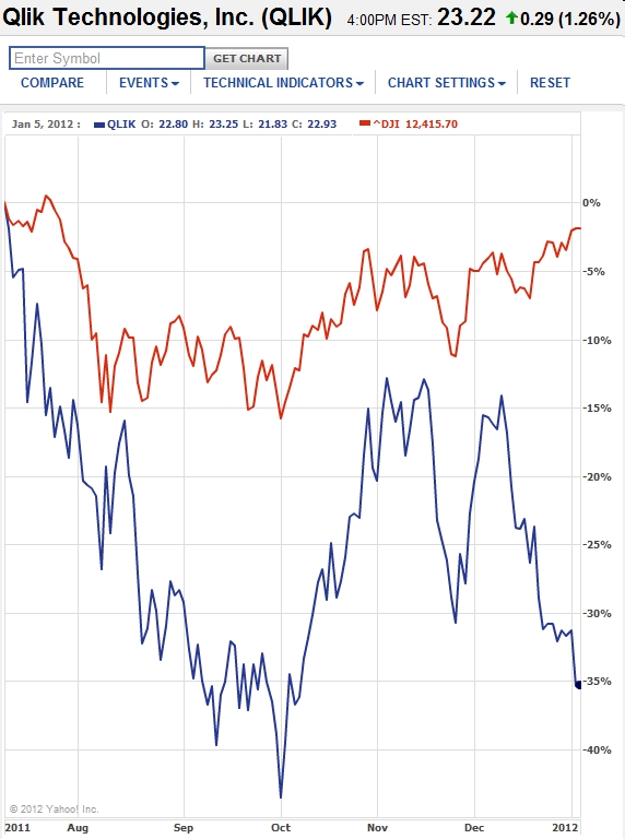 Since Qliktech’s Market Capitalization as of yesterday evening was about $1.94B, it means that Qliktech lost in last 6 month about 1 billion dollars in capitalization! That is a sad observation to make and made me wonder why it happened?
I see nothing wrong with Qlikview software, in fact everybody knows (and this blog is the prove for it) that I like Qlikview very much.
So I tried to guess for reasons (for that lost) below, but it just my guesses and I will be glad if somebody will prove me mistaken and explain to me the behavior of QLIK stock during last 6 months…
2011 supposed to be the year of Qliktech: it had successful IPO in 2010, it doubled the size of its workforce (I estimate it has more than 1000 employees by end of 2011), it sales grew almost 40% in 2011, it kept updating Qlikview and it generated a lot of interest to it’s products and to Data Visualization market. In fact Qlliktech dominated its market and its marketshare is about 50% (of Data Visualization market).
So I will list below my guesses about factors which influenced QLIK stock and I do not think it was only one or 2 major factors but rather a combination of them (I may guess wrong or miss some possible reasons, please correct me):
-
P/E Ratio (price-to-earnings) for QLIK is 293 (and it was even higher), which may indicate that stock is overvalued and investors expectations are too high.
-
Company insiders (Directors and Officers) were very active lately selling their shares, which may affected the prices of QLIK shares.
-
56% of Qliktech’s sales are coming from Europe and European market is not growing lately.
-
58% of Qliktech’s sales are coming from existing customers and it can limit the speed of growth.
-
Most new hires after IPO were sales, pre-sales, marketing and other non-R&D types.
-
Qliktech’s offices are too diversified for its size (PA, MA, Sweden etc.) and what is especially unhealthy (from my view) is that R&D resides mostly in Europe while Headquarters, marketing and other major departments reside far from R&D – in USA (mostly in Radnor, PA)
-
2011 turned to be a year of Tableau (as oppose to my expectation to be a year of Qlikview) and Tableau is winning the battle for mindshare with its Tableau Public web service and its free Desktop Tableau Reader, which allows to distribute Data Visualizations without any Web/Application Servers and IT personnel to be involved. Tableau is growing much faster then Qliktech and it generates a huge momentum, especially in USA, where Tableau’s R&D,QA, Sales, Marketing and Support all co-reside in Seattle, WA.
-
Tableau has the best support for Data Sources; for example, which is important due soon to be released SQL Server 2012, Tableau has the unique ability to read Multidimensional OLAP Cubes from SQL Server Analysis Services and from local Multidimensional Cubes from PowerPivot. Qlikview so far ignored Multidimensional Cubes as data sources and I think it is a mistake.
-
Tableau Software, while it is 3 or 4 times smaller then Qliktech, managed to be able to have more job openings then Qliktech and many of them in R&D, which is a key for a future growth! Tableau’s sales in 2011 reached $72M, workforce is 350+ now (160 of them were hired in 2011!), number of customers is more then 7000 now…
-
I am aware of more and more situations when Qlikview is starting to feel (and sometimes lose) a stiff competition; one of the latest cases documented (free registration may be required) here: http://searchdatamanagement.techtarget.co.uk/news/2240112678/Irish-Life-chooses-Tableau-data-visualisation-over-QlikView-Oracle and it happened in Europe, where Qlikview suppose to be stronger then competitors. My recent Data Visualization poll also has Tableau as a winner, while Qlikview only on 3rd place so far.
-
In case if you miss it, 2011 was successful for Spotfire too. In Q4 2011 Earnings Call Transcript, TIBCO “saw demand simply explode across” some product areas. According to TIBCO, “Spotfire grew over 50% in license revenue for the year and has doubled in the past two years”. If it is true, that means Spotfire Sales actually approached $100M in 2011.
-
As Neil Charles noted, that Qliktech does not have transparent pricing and “Qlikview’s reps are a nightmare to talk to. They want meetings; they want to know all about your business; they promise free copies of the software. What they absolutely will not do is give you a figure for how much it’s going to cost to deploy the software onto x analysts’ desktops and allow them to publish to a server.” I tend to agree that Qliktech’s pricing policies are pushing many potential customers away from Qlikview toward Tableau where almost all prices known upfront.
I hope I will wake up next morning or next week or next month or next quarter and Qliktech somehow will solve all these problems (may be perceived just by me as problems) and QLIK shares will be priced higher ($40 or above?) than today – at least it is what I wish to my Qliktech friends in new 2012…
Update on 3/2/12 evening: it looks like QLIK shares reading my blog and trying to please me: during last 2 months they regained almost $9 (more then 30%), ending the 3/2/12 session with $29.99 price and regaining more then $550M in market capitalization (qlik on chart to get full-size image of it):
I guess if QLIK will go in wrong direction again, I have to blog about it, and it will correct itself!
Happy new 2012!
My best wishes for 2012 to the members of Data Visualization community!
By conservative estimates, which includes registered and active users of Data Visualization (DV) tools, DV specialists from customers of DV vendors, consultants and experts from partners of DV vendors and employees of those vendors, the Data Visualization (DV) community exceeds 2 millions of people in 2011! I am aware of at least 35000 customers of leading DV vendors, at least 3000 DV consultants and experts and at least 2000 employees of leading DV vendors.
With this audience in mind and as the extension of this blog, I started in 2011 the Google+ page “Data Visualization” for DV-related news, posts, articles etc., see it here:
https://plus.google.com/u/0/b/111053008130113715119/
Due the popular demand and the tremendous success of Tableau in 2011 (basically you can say that 2011 was a year of Tableau) I started recently the new blog (as an extension of this blog), called … “Data Visualization with Tableau”, see it here:
http://tableau7.wordpress.com/ .
In 2011 I also started Google+ page for Tableau related news:
https://plus.google.com/u/0/b/112388869729541404591/
and I will start to use it soon in 2012
I also have some specific best wishes for 2012 to my favorite DV vendors.
-
To Microsoft: please stop avoiding DV market and build a real DV tool (as oppose to a nice BI stack) and integrate it with MS-Office the same way as you did with Visio.
- .
-
To Qliktech: I wish Qliktech will add a free Desktop Qlikview Reader, a free (limited of course) Qlikview Public Web Service and integrate Qlikview with R Library. I wish Qliktech will consider the consolidation of its offices and moving at least part of R&D into USA (MA or PA). I think that having too much offices and specifically having R&D far away from product management, marketing, consulting and support forces is not healthy. And please consider to hire more engineers as oppose to sales and marketing people.
- .
-
To TIBCO and Spotfire: please improve your partner program and increase the number of VAR and OEM partners. Please consider the consolidation of your offices and moving at least part of your R&D into USA (MA that is). And I really wish that TIBCO will follow the super-successful example from EMC (VMWare!) and spinoff Spotfire with public IPO. Having Spotfire as the part of larger parent corporation slows sales considerably.
- .
-
To Tableau: I wish Tableau will able to maintain its phenomenal 100% Year-over-Year growth in 2012. I wish Tableau will improve their partner program and integrate their products with R Library. And I wish Tableau will open/create API and add scripting to their products.
-
To Visokio: I wish you more customers, ability to hire more developers and other employees, more profit and please stay on your path!
- .
-
To Microstrategy, SAS, Information Builders, Advizor Solutions, Pagos, Panorama, Actuate, Panopticon, Visual Data Mining and many, many others – my best wishes in 2012!
Updated Comparison of Data Visualization tools
One of the most popular posts on this blog was a comparison of Data Visualization Tools, which originally was posted more then a year ago where I compared those best tools only qualitatively. However since then I got a lot of requests to compare those tools “quantitatively”. Justification for such update were recent releases of Spotfire 4.0, Qlikview 11, Tableau 7.0 and Microsoft’s Business Intelligence Stack (mostly SQL Server 2012 and PowerPivot V.2.)
.
However I quickly realized that such “quantitative” comparison cannot be objective. So here it is – the updated and very subjective comparison of best Data Visualization tools, as I see them at the end of 2011. I know that many people will disagree with my assessment, so if you do not like my personal opinion – please disregard it at “your own peril”. I am not going to prove “numbers” below – they are just my personal assessments of those 4 technologies – I love all 4 of them. Feel free to make your own comparison and if you can share it with me – I will appreciate it very much.
.
Please keep in mind that I reserve the right to modify this comparison overtime if/when I will learn more about all those technologies, their vendors and usage. Criterias used in comparison below listed in 1st column and they are grouped in 3 groups: business, visualization and technical. Columns 2-5 used for my assessments of 4 technologies, last column used for my subjective weights for each criteria and last row of this worksheet has Total for each Data Visualization technology I evaluated.
SQL Server 2012: good DV backend and BI stack
I said on this blog many times that 80% of Data Visualization (DV) is … Data.
SQL Server 2012 is here.
And technology and process of how these Data collected, extracted, transformed and loaded into DV backend and frontend is a key to DV success. It seems to me that one of the best possible technology for building DV backend is around the corner as SQL Server 2012 will be released soon – Release Candidate for it is out…
And famous Microsoft marketing machine is not silent about it. SQL Server 2012 Virtual Launch Event planned for March 7, 2012 and real release probably at the end of March 2012.
Columnstore Index.
I already mentioned on this blog the most interesting feature for me – the introduction of Columnstore Index (CSI) can transform SQL Server into Columnar Database (for DV purposes) and accelerates DV-relevant Queries by 10X or even 100X of times. Oracle does not have it!
.
Some reasonable rules and features applied to CSI: each table can have only one CSI; CSI has Row grouping (about million rows, like paging for columns); table with CSI cannot be replicated. New (unified for small and large memory allocations) memory manager optimized for Columnstore Indexes, supports Windows 8 maximum memory and logical processors.
Power View.
SSRS (Reporting Services) got massive improvements, including new Power View as Builder/Viewer of interactive Reports. I like this feature: “even if a table in the view is based on an underlying table that contains millions of rows, Power View only fetches data for the rows that are visible in the view at any one time” and UI features (some of them are standard for existing Data Visualization tools, like multiple views in Power View reports (see gallery of thumbnails in the bottom of screenshot below):
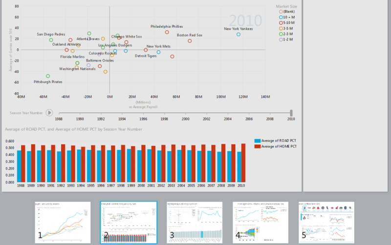 .
.
“2 clicks to results”, export to PowerPoint etc. See also video here:
.
.
PowerView is still far behind Tableau and Qlikview as a Visualizer, but at least it makes SSRS reports more interactive and development of them easier. Below are some thumbnails of Data Visualization samples produced with PowerView and presented by Microsoft:
Support for Big Data.
SQL Server 2012 has a lot new features like “deep” HADOOP support (including Hive ODBC Driver) for “big data” projects, ODBC drivers for Linux, grouping databases into Availability Group for simultaneous failover, Contained Databases (enable easy migration from one SQL Server instance to another) with contained Database users.
Parallel Data Warehouse, Azure, Data Explorer.
And don’t forget PDW (SQL Server-based Parallel Data Warehouse; massive parallel processing (MPP) provides scalability and query performance by running independent servers in parallel with up to 480 cores) and SQL Azure cloud services with it high availability features…
.
New Data Explorer allows discover data in the cloud and import them from standard and new data sources, like OData, Azure Marketplace, HTML etc. and visualize and publish your Data to the cloud.
LocalDB.
LocalDB is a new free lightweight deployment option for SQL Server 2012 Express Edition with fewer prerequisites that installs quickly. It is an embedded SQL Server database for desktop applications (especially for DIY DV apps) or tools. LocalDB has all of the same programability features as SQL Server 2012 Express, but runs in user mode with applications and not as a service. Application that use LocalDB simply open a file. Once a file is opened, you get SQL Server functionality when working with that file, including things like ACID transaction support. It’s not intended for multi-user scenarios or to be used as a server. (If you need that, you should install SQL Server Express.)
BIDS.
SQL Server 2012 is restoring a very desirable feature, which was missing in Visual Studio 2010 for 2+ years – something called BIDS (BI Development Studio was available as part of Visual Studio 2008 and SQL Server 2008). For that a developer needs VS2010 installed with SP1 and then install “SQL Server Data Tools” (currently it is in the state of CTP4, but I guess it will be a real thing when when SQL Server 2012 will be released to production).
SSAS, Tabular Mode, PowerPivot, DAX.
Most important improvement for BI and Data Analytics will be of course the changes in SSAS (SQL Server Analysis Services), including the addition of Tabular Mode, restoration of BIDS (see above), the ability to design local multidimensional cubes with PowerPivot and Excel and then deploy them directly from Excel as SSAS Cubes, the new DAX language shared between PowerPivot and SSAS, and availability of all those Excel Services directly from SSAS without any need for SharePoint. I think those DV tools who will able to connect to those SSAS and PowerPivot Cubes will have a huge advantage. So far only Tableau has it (and Omniscope has it partially).
Backend for Data Visualization.
All of these features making SQL Server 2012 a leading BI stack and backend for Data Visualization applications and tools. I just wish that Microsoft will develop an own DV front-end tool, similar to Tableau or Qlikview and integrate it with Office 201X (like they did with Visio), but I guess that DV market ( approaching $1B in 2012) is too small compare with markets for Microsoft Office and SQL Server.
Pricing.
Now is time for a “bad news”. The SQL Server 2012 CAL price will increase by about 27%. New pricing you can see below and I predict you will not like it:
Job openings as a KPI for DV vendors?
Some of visitors to this blog after reading of my recent post about $300K/employee/year as a KPI (Key Performance Indicator) suggested to me another Indicator of the health of Data Visualization vendors: a number of job openings and specifically a number and percentage of software development openings (I include software testers and software managers into this category) and use it also as a predictor of the future. Fortunately it is a public data and below is what I got today from respective websites:
-
56(!) positions at Tableau, 14 them of are developers;
-
46 openings at Qliktech, 4 of them are developers;
-
21 positions at Spotfire, 3 of them are developers;
-
3 positions at Visokio, 2 of them are developers.
Considering that Tableau is 4 times less in terms of sales then Qlikview and 3-4 times less (then Qliktech) in terms of workforce, this is an amazing indicator. If Tableau can sustain this speed of growth, we can witness soon the change of Data Visualization landscape, unless Qliktech can find the way to defend its dominant position (50% of DV market).
.
For comparison, you can use Microstrategy’s number of openings. While Microstrategy is not a Data Visualization vendor, it is close enough (as BI vendor) for benchmarking purposes: it has 281 openings, 38 of them are developers and current Microstrategy’s workforce is about 3069, basically 3 times more then Qliktech’s workforce…
.
In light of recent releases of Qlikview 11 and Spotfire 4.0 it makes (soon to be released) Tableau 7.0 is very interesting to compare… Stay tuned!
Breaking $300K barrier with Qlikview 11
I expected Qlikview 11 to be released on 11/11/11 but it was released today to Qliktech partners and customers. Since Qliktech is the public company, it releases regularly a lot of information which is not available (for now) from other DV leaders like Tableau and Visokio and more fuzzy from Spotfire, because Spotfire is just a part of larger successful public corporation TIBCO, which has many other products to worry about.
However I guessed a little and estimated for DV Leaders their 2011 sales and number of employees and got an interesting observation, which is true for a few last years: size of sales per employee (of DV leading vendor) is $300k/Year or less. I included for comparison purposes similar numbers for Apple, Microsoft and Google as well as for Microstrategy, which is a public company, established (22+ years) player in BI market, dedicated to BI and recently to Data Visualization (that is DV, thanks to it Visual Insight product).
Table below included 2 records related to Spotfire: 1 based on 2010 annual report from TIBCO (for TIBCO as whole; I know TIBCO sales for 2011 grew from $754M to $920M but do not know the exact number of TIBCO’s employees for 2011) and other record is my estimates (of a number of employees and sale) for Spotfire division of TIBCO. Update from 1/11/12: For Tableau’s 2011 I used the numbers from John Cook’s article here: http://www.geekwire.com/2012/tableau-software-doubles-sales-2011-hires-160-workers ) :
To me this is an interesting phenomena, because Qliktech thanks to its fast growing sales and recent IPO was able to double it’s sales in last 2 years while … doubling it’s number of employees so it still has its sales hovering around $300K/employee/year, while Software giants Apple, Microsoft and Google are way above this barrier and Microstrategy is 50% below it. I will also guess that Qliktech will try to break this $300K barrier and be closer to Apple/Microsoft/Google in terms of sales per employee.
Thanks to the public nature of Qliktech we know details of its annual Revenue growth and YoY (Year-over-Year) indicators:
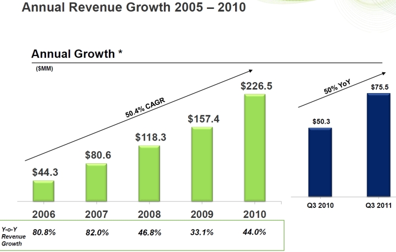 and with estimate of 2011 Revenue about $315M, YoY growth (2011 over 2010) will be around 39.4% which is an excellent result, making it difficult (but still possible) for other DV competitors to catch-up with Qliktech. Best chance for this belongs to Tableau Software, who probably will reach the same size of sales in 2011 as Spotfire (my estimate is around $70M-$75M for both), but for last 2 years Tableau has 100% (or more) YoY revenue growth… Qliktech also published the interesting info about major factors for its sales: Europe (56%), Existing Customers (58%), Licenses (61%), Partners(52%):
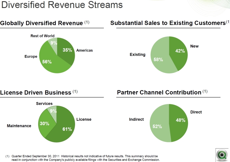 which means that the increase of sales in Americas, improving New sales (as oppose to sales to existing customer by using “Land and Expand” approach) and improving revenue from Services and Maintenance may help Qliktech to keep the pace. Qliktech has the tremendous advantage over its DV competitors because it has 1200+ partners, who contributed 52% to Qliktech sales (about $136K per partner and I can guess that Qliktech wish to see at least $200K/year contribution from each partner).
Observing the strengths of other DV competitors, I personally think that Qliktech will benefit from the “imitation” of some of their most popular and successful features in order to keep its dominance in Data Visualization market, including:
-
free public Qlikview service (with obvious limitations) like free SaaS from Tableau Public and free Spotfire Silver personal edition,
-
ability to distribute Data Visualization to desktops without Server by making available a free desktop Qlikview Reader (similar to free desktop readers from Tableau and Omniscope/Visokio),
-
integration with R library (Spotfire and recently Omniscope) to improve analytical power of Qlikview users,
-
ability to read multidimensional OLAP Cubes (currently only Tableau can do that), especially Cubes from Microsoft SQL Server 2012 Analysis Services and
-
scalability toward Big Data (currently Spotfire’s and Tableau’s data engines can use the disk space as Virtual Memory but Qlikview limited by size of RAM)
This is not a never ending “feature war” but rather a potential ability to say to customers: “why go to competitors, if we have all their features and much more”? Time will tell how DV competition will play out, I expect a very interesting 2012 for Data Visualization market and users and I hope that somebody will able to break $300K/employee/year barrier unless the major M&A will change the composition of DV market. I hope that the DV revolution will continue in new year…
Spotfire 4.0 is announced
I never liked pre-announcements of “new” products, especially if they are in state which will screw my PCs. But almost everybody doing it to us, starting with Microsoft SQL Server 2012 (Denali can be downloaded as “CTP3”), Tableau 7.0, Qlikview 11 (Qliktech partners and customers can download “Release candidate”) etc. Just a few months after releasing Spotfire 3.3, TIBCO announced that Spotfire 4.0 will be available in November 2011 with a lot of new features.
.
Some of them sound like buzzwords: “”free dimensional” analytics, collective intelligence, visual and social data discovery etc.” (we need that marketing will brainwash us, right?), but some of them can be very useful, like integration with TIBBR (that I like; in fact TIBCO has many other good products and they should be integrated with Spotfire) and SharePoint (sounds like a M$ bending to me, I don’t see too much DV money coming from SharePoint hole), support for dynamic icons, sparklines,
stepped linecharts, pop-over filters and legends, better font management, embedded actions and more. Some features I wish will be added, but I guess we need to wait more: I wish to be able to read with Spotfire the SSAS and PowerPivot multidimensional Cubes and support for some other Data Sources, like Tableau 6.1 does…
.
Spotfire and its Web Player Server support now the latest web browsers, .NET 4.0 and it dropped support for obsolete stuff like Internet Explorer 6 and Windows 2003 Server. I mentioned on this blog earlier that I like Spotfire Silver 2.0 and the wealth and depth of Spotfire Analytical Platform (S-Plus, Miner, S+FinMetrics, Spotfire Developer/API, Statistics, Data and Automation Services, Metrics, Network Analysis, Decision Site, Clinical Graphics and more, this list should make Qliktech and Tableau worry or at least try to add similar features…).
.
Spotfire updated their set of Demos to reflect Spotfire 4.0 features: Spotfire Demos and Templates. More to come later, especially when Spotfire 4.0 will be Released (as oppose to be announced).
Data, Story, View: Prototype and Refresh
Data, Story and Eye Candy.
Data Visualization has at least 3 parts: largest will be a Data, the most important part will be a Story behind those Data and a View (or Visualization) is just an Eye Candy on top of it. However only a View allows users to interact, explore, analyze and drilldown those Data and discover the Actionable Info, which is why Data Visualization (DV) is such a Value for business user in the Big (and even in midsized) Data Universe.
Productivity Gain.
One rarely covered aspect of advanced DV usage is a huge a productivity gain for application developer(s). I recently had an opportunity to estimate a time needed to develop an interactive DV reporting application in 2 different groups of DV & BI environments
Samples of Traditional and Popular BI Platforms.
- Open Source toolsets like Jaspersoft 4/ Infobright 4/ MySQL (5.6.3)
- MS BI Stack (Visual Studio/C#/.NET/DevExpress/SQL Server 2012)
- Tried and True BI like Microstrategy (9.X without Visual Insight)
Samples of Advanced DV tools, ready to be used for prototyping
- Spotfire (4.0)
- Tableau (6.1 or 7.0)
- Qlikview (11.0)
Results proved a productivity gain I observed for many years now: first 3 BI environments need month or more to complete and last 3 DV toolsets required about a day to complete entire application. The same observation done by … Microstrategy when they added Visual Insight (in attempt to compete with leaders like Qlikview, Tableau, Spotfire and Omniscope) to their portfolio (see below slide from Microstrategy presentation earlier this year, this slide did not count time to prepare the data and assume they are ready to upload):
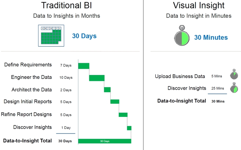 I used this productivity gain for many years not only for DV production but for Requirement gathering, functional Specifications and mostly importantly for a quick Prototyping. Many years ago I used Visio for interactions with clients and collecting business requirements, see the Visio-produced slide below as an approximate example:
DV is the best prototyping approach for traditional BI
This leads me to a surprising point: modern DV tools can save a lot of development time in traditional BI environment as … a prototyping and requirement gathering tool. My recent experience is that you can go to development team which is completely committed for historical or other reasons to a traditional BI environment (Oracle OBIEE, IBM Cognos, SAP Business Objects, SAS, Microstrategy etc.) and prototype for such team dozens and hundreds new (or modify existing) reports in a few days or weeks and give it to the team to port it to their traditional environment.
These DV-based prototypes have completely different behavior from previous generation of (mostly MS-Word and PowerPoint based) BRD (Business Requirement Documents), Functional Specification, Design Documents and Visio-based application Mockups and prototypes: they are living interactive applications with real-time data updates, functionality refreshes in a few hours (in most cases at the same day as new request or requirement is collected) and readiness to be deployed into production anytime!
However, my estimate that 9 out of 10 such BI teams, even they will be impressed by prototyping capabilities of DV tools (and some will use them for prototyping!), will stay with their environment for many years due political (can you say job security) or other (strange to me) reasons, but 1 out of 10 teams will seriously consider to switch to Qlikview/Tableau/Spotfire. I see this as a huge marketing opportunity for DV vendors, but I am not sure that they know how to handle such situation…
Example: using Tableau for Storytelling:
Qlikview 11 is anounced (10/11/11)
Qlikview 11
is announced on 10/11/11 – one year after 10/10/10, the release date of Qlikview 10! Qliktech also lunched new demo site with 12 demos of Qlikview 11 Data Visualizations: http://demo11.qlikview.com/ . Real release happened (hopefully) before end of 2011, my personal preference for release date will be 11/11/11 but it may be too much to ask…
QlikView 11 introduces the comparative analysis by enabling the interactive comparison of user-defined groupings. Also now with comparative analysis business users have the power of creating any (own) data (sub)sets and decide which dimensions and values would define the data sets. Users can then view the data sets they have created side by side in a single chart or in different charts:
Collaborative Data Visualization and Discovery.
Also Qlikview 11 enables Collaborative Workspaces – QlikView users can invite others – even those who do not have a license – to participate in live, interactive, shared sessions. All participants in a collaborative session interact with the same analytic app and can see others’ interactions live, see
QlikView users can engage each other in discussions about QlikView content. A user can create notes associated with any QlikView object. Other users can then add their own commentary to create a threaded discussion. Users can capture snapshots of their selections and include them in the discussion so others can get back to the same place in the analysis when reviewing notes and comments. QlikView captures the state of the object (the user’s selections), as well as who made each note and comment and when. Qliktech’s press release is here:
“Our vision for QlikView 11 builds on the fact that decisions aren’t made in isolation, but through social exchanges driven by real-time debate, dialog, and shared insight,” says Anthony Deighton, CTO and senior Vice President, Products at QlikTech. “QlikView 11’s social business discovery approach allows workgroups and teams to collaborate and make decisions faster by collectively exploring data, anywhere, anytime, on any device. Business users are further empowered with new collaborative and mobile capabilities, and IT managers will appreciate the unified management functionality that allows them to keep control and governance at the core while pushing usage out to the edges of the organization.”
New Features in Qlikview 11
Qlikview now is integrated (I think it is a big deal) with TFS – source control system from Microsoft. This makes me think that may be Donald Farmer (he left Microsoft in January 2011 and joined Qliktech) has an additional assignment to make it possible for Microsoft to buy Qliktech? [Dear Donald – please be careful: Microsoft already ruined ProClarity and some others after buying them]. Free QlikView 11 Personal Edition will be available for free download by the end of year at www.qlikview.com/download.
Also if you will check Demo “What is new in Qlikview 11” here:
http://us.demo11.qlikview.com/QvAJAXZfc/opendoc.htm?document=Whats%20New%20in%20QlikView11.qvw&host=demo11&anonymous=true , you can find the following new features:
- mentioned above Comparative Analysis
- Collaborative Data Visualization
- integration with TFS
- granular chart dimension control.
- Conditional Enabling (dynamic add/remove) dimensions and/or expressions/metrics
- Grid Container to show multiple objects, including another containers
- Metadata for Charts: annotations, tips, labels/keywords, comments, mouse-over pop-up labels
- some new actions (including Clear Field)
Oracle Exalytics In-Memory Machine
Oracle’s timing for “unveiling Exalytics In-Memory Machine” was unfortunate because it was in a shadow of Steve Jobs. In addition It was a lot of distraction between Larry Ellison’s and Mark Benioff’s egos.
Oracle is late to Analytics appliance game and have to fight already released products like Netezza/IBM (proven performer), SAP HANA (has large sales pipeline already), family of Teradata Appliances (Teradata Columnar coming in 2 months and sounds very good to me plus it packaged with Information Builders BI) , EMC/Greenplum Data Computing Appliance (doubled the sales during last year!), Microsoft Parallel Data Warehouse Appliance (Based on CTP3 I expect the great things from SQL Server 2011/2012/Denali) etc. They all are in-memory Machine, capable to store and process big data (exabytes? I guess depends on price…), almost all of them already have or will have soon columnar database.
Larry Ellison claimed during Oracle Openworld this week that “Exalytics is 10x faster than…just about everything.”
Yes, It runs a software stack that includes parallelized versions of Oracle’s TimesTen in-memory database and memory-optimized Essbase OLAP Server (“BI Foundation”), but it is not a columnar database, so I wonder how Oracle is going to prove Larry’s bold claims. However, Oracle TimesTen In-Memory Database for Exalytics supports columnar compression that reduces the memory footprint for in-memory data. Compression ratios of 5X are practical and help expand in-memory capacity (Qlikview, PowerPivot and Spotfire can do much better “columnar compression” then 5 times, claimed by Oracle)
Hardware itself looks impressive with four Intel Xeon© E7-4800 series processors (40 cores total) and 1TB of RAM but pricing is unclear. It has total 8 high speed ports:
- 2 quad-data rate (QDR) 40 GB/s InfiniBand ports. When connected to Oracle Exadata, Oracle Exalytics becomes an integral part of the Oracle Exadata private InfiniBand network and has high-speed, low latency access to the database servers. When multiple Oracle Exalytics machines are clustered together, the InfiniBand fabric also serves as the high-speed cluster interconnect.
- Exalytics has Two 10 GB/s Ethernet ports for connecting to enterprise data sources
- Exalytics has Four 1 GB/s Ethernet ports are available for client access
Exalytics includes 3.6TBs of raw disk capacity. Optionally, clusters of Oracle Exalytics machines can leverage network attached storage.
Hardware portion of it probably below $100000 (I saw a guesstimate of $87000) but most expensive probably will be the Essbase (Business Intelligence Foundation Suite with in-memory Cubes now and ability to replicate entire data warehouse into TimesTen in-memory database) with list price about $450000, so we are talking here about millions of dollars, which is (let’s wait and see the final pricing) will definitely reduce the number of potential buyers, especially considering weak Data Visualization and average BI functionality of Oracle’s software stack. According to Larry Ellison, Exalytics has 1TB of RAM but can hold five to 10TB of data in memory thanks to COLUMNAR compression.
Oracle Exalytics promotes self service analytics and makes it easier to develop analytics content by introducing a Presentation Suggestion Engine (PSE) which provides recommendations on type of visualizations to use to best represent a data set.
I do not expect anything spectacular from this “PSE”. For example Oracle proudly introduced “new micro charts and multi-panel trellis charts to visualize dense multi-dimensional, multi-page data on a single screen. The multi-panel trellis charts are particularly effective at displaying multiple visualizations across a common axis scale for easy comparison, to see a trend and quickly gain insights”:
but this micro charts available in much better shape and form for many years from Spotfire, Qlikview, Tableau etc. and relatively recently even from Excel.
In any case, Exalytics suppose to be well integrated with Oracle’s Exadata database machine and Exalogic application server. Mr. Ellison did some other bold claims like:
- “For a given task, it will cost you less on an Exadata than it would on a plain old commodity server.”
- “we move data around a hundred times faster than anyone else in this business”
- “1,000 Exadata machines have been installed and 3,000 more will be sold this year”
- “Java applications’ response times are 10 times as fast on Exalogic, and companies can serve many more users at once”
Special Note about Java.
I am not sure why Java is advantage for Oracle. Java is not welcome at Apple (can you say Objective C?), at Microsoft (can you cay C# ?) and recently even at Google (after Oracle sued Google for “misuse” of Java, which reminded me the Sun, disappearing after it sued Microsoft for … “misuse” of … Java). Together those 3 companies have almost all cash (almost $200B if you exclude Oracle as a Java Owner) software companies have worldwide (Apple has $76B+ in a bank, Microsoft has $60B+ and Google has about $40B – may be less after buying Motorola Mobility) and I am simply following the money here. If Oracle wishes to have the Java-based advanced Data Visualization, they are better buy Visokio and integrate their Omniscope with Exalytics and Exalogic instead of the inventing the wheel with PSE.
Omniscope 2.6 (wait is over!)
Do you want the 1st class Data Visualization on your cool Mac without any Virtual Machine with Windows? If so, your best choice will be the Omniscope 2.6 which is finally about to be released (after more then 2 years of delays) by Visokio, located in UK. Of course the Omniscope will run on Windows (most customers use it on Windows anyway) too: all it needs is Java (if needed, a private copy of Java will be installed on your computer as part of Omniscope package). You can get Omniscope Viewer on Linux workstation as well but if you need a full Omniscope 2.6 on Linux, you will have to ask Visokio about special license for you.
Java was the problem for me, when I first heard about Omniscope, but more about that in a Special note at the end of this post. Visokio is a tiny company, started in 2002. Because of its size and private funding it took 3 years to release Omniscope 1.0 in 2005 and another 4 years to release Omniscope 2.5 in 2009,
which is what Visokio currently is still shipping. Visokio obviously have rich customers in financial (13+ clients), publishing and marketing(10+), and many other industries and some of them in love with Apple’s Macs, but most customers prefer Windows. Omniscope is a Desktop Java application but completely integrated with internet. It has 4 editions (in both 32-bit and 64-bits versions), which are identical as far a deployment file-set concern, so all you need is buy an appropriate license. The installation process requires about 5 clicks, and user can get started by simply dragging in an Excel file and data will immediately appear and can be explored organically.

Omniscope Editions: Viewer, Desktop, Server, Server Plus.
Free Viewer allows server-less distribution of all Data Visualizations and interact fully (explore, select, filter and drill-down among other interactions) with all data, charts and reports, which are all can be easily exported to PDF, PPT, XLS and JPG files. Omniscope has zero-install “Web Start online version of free Viewer.
Omniscope Desktop/Professional ($4000 with discount for volume orders) in addition to all Viewer functionality, acts as a Development Studio for Data Visualizations (so called IOK applications are secure and compressed files, ready for easy internet delivery) and as a ETL wizard (using Drag-and-Drop Data Manager) for data:
Omniscope Desktop creates, edits and continuously refreshes all involved datasets, formulas, filters, views, layouts, even assumption-driven models, designs and export interactive Flash Data Players, embeddable into websites and into documents. Desktop able to read multidimensional cubes, just like Tableau and PowerPivot, which is a big advantage over Qlikview and Spotfire.
Omniscope Server (about $16000) adds to Desktop functionality: enables 64-bit IOK files behave (even remotely) as Central Datamarts (multi-source data assembly), as Timeslices (auto-refreshable proxies for datasources: one per each datasource), as Master Report IOK (automatically refreshed from Central Datamart IOK) and as Distributed Report IOK(s) (automatically distributed and live-refreshed from Master Report IOK), automates the refreshing of data, enables batch and scheduled distribution of customized IOK files.
Server Plus (about $24000) includes all Server functionality and adds ability to empower selected actions in free Omniscope Viewers (e.g. continuous data refreshing from Datamart IOK files, export to XLS, PPT, PDF, add/edit/save comments and queries etc.), permits unrestricted publishing of IOK visualizations, enables white labeling and branding Viewers and IOK files to customers specifications, allows multiple servers work as one.
Data Engine.
Omniscope is using in-memory Columnar Database, as all best Data Visualizers do but its architecture is different. For example, all datasets are collection of Cells (organized in column, rows and tables). Each Cell with String or Text is a separate Java Object and it leads to a large overhead in terms of memory usage (I always blame Java, which allows only 1.2GB of addressable memory for 32-bit Windows). Some usage statistics prompting that 32-bit Omniscope Desktop/Professional thinks that 5 millions cells is a large dataset and 15 millions cells is a very large dataset. According to Visokio, average client data file is around 40 fields and 50,000 records (2 million cells).
With Omniscope 2.6, experts from Visokio was able to run on 32-bit Windows PC (with 2GB of RAM) the Data Visualization with 70 millions of cells. For comparison with Qlikview I was able to fit 600+ millions of (data) cells into the same 32-bit PC, basically 9 times more data then with Omniscope and overall Omniscope is slower then competitors. As of now, Omniscope will try to use as much memory as possible in order to accelerate performance. I expect in near future the version of Omniscope with large performance and memory management improvements.
64-bit Installations of Omniscope are far more scalable, for example with 8GB of RAM 120 millions of cells was not a problem; largest known installation of Omniscope has 34 million Rows (about half of billion of cells) running on 64-bit Windows/Java PC with 16GB of RAM
For full list of Omniscope features please check this: http://www.visokio.com/omniscope-features and for new features in version 2.6 please review this: http://www.visokio.com/omniscope-new-in-2-6 .
The original foundation of exportable Flash DataPlayer “generation” was totally re-written (for Omniscope 2.6) in ActionScript 3, which increased the scalability of DataPlayer and added new view types/features. DataPlayers available as an experimental feature in Omniscope 2.6, and fully feature-complete in Omniscope 2.7 (I personally think that the time for Flash is gone/over and it is time to port DataPlayers into HTML5).
Visokio is confident that Omniscope 2.7 will come soon after release of Omniscope 2.6 and it will be integrated with super-popular Open Source Statistical R Library, and hopefully will contain HTML5-based DataPlayer, integration with Salesforce etc. If customers will demand, I also expect the Linux version of Omniscope at some future point.
By the way, my recent Poll is confirming that Omniscope is among Data Visualization Leaders and it got respectable 6% of votes so far! You can vote on this poll, just click here!
Special Note about Java.
While Java gave Omniscope the unique ability to run everywhere, it also gave a performance disadvantage to it, compare with my favorites Qlikview, Spotfire, Tableau and PowerPivot (all 4 written as native Windows applications).
Teradata Columnar sounds good
Teradata sounds good and smells like money, especially today. I already mentioned that they received U.S. Patent #7966340 on June 21, 2011. The patent is about SQL-MapReduce technology: the data analytic framework that combines the popular MapReduce™ software with the enterprise friendliness of SQL. (Also see article about “multi-structured data sources” from Aster Data).
Today Teradata Columnar is announced (available in December 2011 as a component of Teradata Database 14) and Teradata Database 14 is released. The new columnar capability from Teradata allows users to mix-and-match (“hybrid”) columnar and row-based physical storage when it best suits an application. Teradata Columnar is integrated with the row-based storage and relational database software. Only the data in the columns required for a query are pulled into memory for processing, reducing the time-constraining input/output of a row-based approach that would read data from all the columns.
Teradata Columnar brings traditional “columnar” benefit: the flexible data compression. Teradata Columnar dynamically adjusts the compression mechanisms for optimal storage depends on type and size of data involved, automatically chooses from among six types of compression: run length, dictionary, trim, delta on mean, null and UTF8 based on the column demographics.
Again, these are just a good sound bites until Teradata Columnar will be released. Teradata may be trying to out-market Microsoft with its SQL Server 2011 (or Denali; as of today available as CTP3 community release) which already has the Columnstore Index, integrated with row-based storage and relational database.
I am wondering if Tableau will able timely and natively support Teradata Columnar as it supports now the Teradata Database (important for Data Visualization applications):
Proliferation of useless Dashboards
This is a guest post from, Marc Gedansky, a well-known sales and marketing consultant in the Business Intelligence space. Marc writes and speaks frequently on a variety of issues that influence technology providers and users, and is based in Cambridge, MA. I am fortunate to know Marc as Business Intelligence and Data Visualization expert and as my friend for many years.
Recently I noticed that internet (thanks to big data waves and to easy to use Data Visualization tools) is polluted with a lot of useless Dashboards and I spoke with Marc about this topic. Turned out he has a a very good explanation for it and he was kind enough to share his opinion on this blog as a guest blogger. Marc’s post reminded me the old story:
“An admirer asked Michelangelo how he sculpted the famous statue of David that now sits in the Academia Gallery in Florence. How did he craft this masterpiece of form and beauty? Michelangelo’s offered this strikingly simple description: He first fixed his attention on the slab of raw marble. He studied it and then “chipped away all that wasn’t David.”
________________________________________
Dashboards – why are so many useless?
Marc Gedansky, http://marc1717.blogspot.com/
“Perfection is achieved, not when there is nothing more to add, but when there is nothing left to take away.” – Antoine de Saint-Exupery
Most dashboards are designed with no clue as to the meaning and/or importance of this quote.
(BTW, even though this is a blog about data visualization, I (M.G.) won’t show any poorly designed dashboard examples, as they are ubiquitous. Trying to find them is about as difficult as trying to find leaves
on the ground in New England during the Fall).
I view dashboards every day; on software company sites, news sites, financial sites, and blogs. Since dashboards can distill so much information and display it in such a small space, they hold the potential of quickly delivering valuable insights; of cutting through the “data clutter” to immediately reveal important trends or truths.
So why then, are most dashboards crammed with so many charts, dials, and graphs that they overwhelm you? Just because you can fit a half-dozen on a screen, why is there a need to do it? (This approach reminds me of my friend Geoff, who, upon hearing that Hellmann’s was coming out with mayonnaise that had half the calories remarked, “great, now I can eat twice as much”.)
I think there can only be two reasons.
1. The designer/developer wants to show off their expertise with Qlikview, or Spotfire, or Tableau, or X product.
2. The designer/developer does not care about the average person, and wants to build smart software for brilliant users.
That attitude reminds me of a meeting I attended at a software company a few years ago. The head of development was upset because he was being asked to make his software “easy to use”. He called it “dumbing down”, and complained that it would be less challenging for his development team to build “software for idiots”. At this point, the President of the company interjected, “if our customers are smart enough to write us a check, then they are smart enough to use our software. And the onus for them to be able to use our software is on us, not on them.”
For Continuation of this post please see it on this blog’s page: http://apandre.wordpress.com/dataviews/dashboard/proliferation-of-useless-dashboards/
Old Excel Online Chart Templates with 12-Color Scheme
“>
Spotfire Silver 2.0
Spotfire Silver version 2.0 is available now on https://silverspotfire.tibco.com/us/home and it will be officially announced at TIBCO User Conference 2011 (9/27-9/29/11) at http://tucon.tibco.com/
Spotfire Silver available in 4 Editions, see Product Comparison Chart here: https://silverspotfire.tibco.com/us/product-comparison-chart and Feature List at Feature Matrix here: https://silverspotfire.tibco.com/us/get-spotfire/feature-matrix
Update 9/27/11: TIBCO officially released Silver 2.0, see http://www.marketwatch.com/story/tibco-unveils-silver-spotfire-20-to-meet-growing-demand-for-easy-to-use-cloud-based-analytics-solutions-2011-09-27 “TIBCO Silver Spotfire 2.0 gives users the ability to embed live dashboards into their social media applications, including business blogs, online articles, tweets, and live feeds, all without complex development or corporate IT resources… Overall, the software’s capabilities foster collaboration, which allows users to showcase and exchange ideas and insights — either internally or publicly. In addition, it allows users to share solutions and application templates with customers, prospects, and other members of the community.”
Spotfire Silver Personal Edition is Free (Trial for one year, can be “renewed” with other email address for free) and allows 50MB (exactly the same amount as Tableau Public) and allows 10 concurrent read-only web users of your content. If you wish more then Personal Edition you can buy Personal Plus ($99/year) or Publisher ($99/month or $1000/year) or Analyst ($399/month) Account.
In any case you will GET for your Account needs a real Spotfire Desktop Client and worry-free and hassle-free web hosting (by TIBCO) of your Data Visualization applications – you do not need to buy any hardware, software or services for web hosting, it is all part of your Spotfire Silver account.
To test Spotfire Silver 2.0 Personal Edition I took Adventure Works dataset from Microsoft (60398 rows, which is 6 times more than Spotfire’s own estimate of 10000 rows for 50MB Web storage). Adventure Works dataset requires 42MB as Excel XLS file (or 16M as XLSX with data compression) and only 5.6MB as Spotfire DXP file (Tableau file took approximately the same disk space, because both Spotfire and Tableau are doing a good data compression job). This 5.6MB size of DXP file for Adventure Works is just 11% of web storage allowed by Spotfire (50MB for Personal Edition) to each user of free Spotfire Silver 2.0 Personal Edition.
Spotfire Silver 2.0 is a very good and mature Data Visualization product with excellent Web Client, with Desktop Client development tool and with tutorials online here: https://silverspotfire.tibco.com/us/tutorials . Functionally (and Data Visualization-wise) Spotfire Silver 2.0 has more to offer then Tableau Public. However Tableau Public account will not expire after 1 year of “trial” and will not restrict number of simultaneous users to 10.
Spotfire Silver 2.0 Publisher and Analyst Accounts can compete successfully with Tableau Digital and they have much clear licensing then Tableau Digital (see http://www.tableausoftware.com/products/digital#top-10-features-of-tableau-digital ), which is based on number of “impressions” and can be confusing and more expensive then Spotfire Silver Analyst Edition.
Data Visualization Poll (Fall 2011)
7 months ago I published a poll on LinkedIn and got a lot of responses, 1340 votes (in average 1 vote per hour) and comments. People asked me many times to repeat this poll from time to time. I guess it is time to re-Poll. I added 2 more choices (LinkedIn allows maximum 5 choices in their polls and it is clear not enough for this poll), based on a feedback I got: Omniscope and Visual Insight/Microstrategy. I also got some angry voters complaining that certain vendors are funding this poll. This is completely FALSE, I am unaffiliated with any of vendors, mentioned in this poll and I am working for completely independent (from those vendors) software company, see the About page of this Blog.
Old Excel Online Dashboard with "slicers"
Tableau 6.1 is released
Today Tableau 6.1 is released (and client for iPad and Tableau Public for iPad), that includes the full support for incremental Data updates whether they are scheduled or on demand:
New in Tableau 6.1
- Incremental Data updates scheduled or on demand
- Text parser faster, can parse any text files as data source (no 4GB limit)
- Files larger than 2GB can now be published to Tableau Server (more “big data” support)
- Impersonation for SQL Server and Teradata; 4 times faster Teradata reading
- Tableau Server auto-enables touch, pinch, zoom, gesture UI for Data Views
- Tableau iPad app is released, it browses and filters a content on Server
- Any Tableau Client sees Server-Published View: web browser, mobile Safari, iPad
- Server enforces the same (data and user) security on desktop, browser, iPad
- Straight links from an image on a dashboard, Control of Legend Layout etc.
Here is a Quick demo of how to create Data Visualization with Tableau 6.1 Desktop, how easy to publish it on Tableau server 6.1 and how it is instantly visible, accessible and touch optimized on the iPad:
New since Tableau 6.0, more then 60 features, including:
- Tableau now has in-memory Data Engine, which greatly improves I/O speed
- Support for “big” data
- Data blending from multiple sources
- Unique support for local PowerPivot Multidimensional Cubes as Data Source
- Support for Azure Datamarket and OData (Open Data Protocol) as Data Sources
- Support for parameters in Calculations
- Motion Charts and Traces (Mark History)
- In average 8 times faster of rendering of Data Views (compare with previous version)
Tableau Product Family
- Desktop: Personal ($999), Professional ($1999), Digital, Public.
- Server: Standard, Core Edition, Digital, Public Edition.
- Free Client: Web Browser, Desktop/Offline Tableau Reader.
- Free Tableau Reader enables Server-less distribution of Visualizations!
- Free Tableau Public served 20+ millions visitors since inception
Tableau Server
- Easy to install: 13 minutes + optional 10 minutes for firewall configuration
- Tableau has useful command line tools for administration and remote management
- Scalability: Tableau Server can run (while load balancing) on multiple machines
- Straightforward licensing for Standard Server (min 10 users, $1000/user)
- With Core Edition Server License: unlimited number of users, no need for User Login
- Digital Server Licensing based on impressions/month, allows unlimited data, Tableau-hosted.
- Public Server License: Free, limited (100000 rows from flat files) data, hosted by Tableau.
Widest (and Tableau optimized) Native Support for data sources
- Microsoft SSAS and PowerPivot: Excel Add-in for PowerPivot, native SSAS support
- Native support for Microsoft SQL Server, Access, Excel, Azure Marketplace DataMarket
- Other Enterprise DBMSes: Oracle, IBM DB2, Oracle Essbase
- Analytical DBMSes: Vertica, Sybase IQ, ParAccel, Teradata, Aster Data nCluster
- Database appliances: EMC/GreenPlum, IBM/Netezza
- Many Popular Data Sources: MySQL, PostgreSQL, Firebird, ODBC, OData, Text files etc.
Some old problems I still have with Tableau
- No MDI support in Dashboards, all charts share the same window and paint area
- Wrong User Interface (compare with Qlikview UI) for Drilldown Functionality
- Tableau’s approach to Partners is from stone ages
- Tableau is 2 generations behind Spotfire in terms of API, Modeling and Analytics
Tabular Model, Columnstore, new BIDS
Microsoft finally released SQL Server 11 “Denali” as CTP3 (Community Technology Preview) for public … Preview. Microsoft is (these are politeness words I can type) stubbornly refusing to have/build own Data Visualization Product. I doubt Crescent “experience” can be considered as a product, especially because it is Silverlight-base, while world already moved to HTML5.
If you have 7 minutes, you can watch Crescent Demo from WPC11, which is showing that while trailing a few years behind DV Leaders and Google, Microsoft is giving to its die hard followers something to cheer about:
I have to admit, that while there is nothing new (for DV expert) in video above, it is a huge progress compare with Excel-based Data Visualizations, which Microsoft tried to promote as a replacement of ProClarity and PerformancePoint Server. Even Microsoft itself positions Crescent (which is 32-bit only!) as a replacement for SSRS Report Builder, so DV Leaders can sleep well another night.
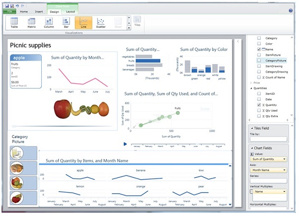 However, Microsoft’s BI Stack is the number 4 or 5 on my list of DV Leaders and CTP3 is so rich with new cool functionality, that it deserves to be covered on this blog.
Of course major news is availability of Tabular Data Model, which means VertiPaq in-memory columnar Engine, similar to PowerPivot Engine but running on Server without any SharePoint (which is a slow virus, as far as I am concerned) and without stupid SharePoint UI and limitations and I quote Microsoft: ” In contrast with the previous release, where VertiPaq was only available via in PowerPivot for SharePoint, you can now use VertiPaq on a standalone Analysis Services instance with no dependency on SharePoint.“!
SSAS (SQL Server Analysis Services) has new (they may existed before, but before CTP3 – ALL who knew that were under NDA) features like memory paging (allows models to be larger than the physical memory of the server, means unlimited scalability and BIG Data support), row level security (user identity used to hide/show visible data), KPI, Partitions; CTP3 removes the maximum 4GB file size limit for string storage file, removes the limit of 2 billion rows per table (each column is still limited to a maximum of 2 billion distinct values, but in columnar database it is much more tolerable restriction!).
New version of PowerPivot is released with support of Tabular Model and I quote: “You can use this version of the add-in to author and publish PowerPivot workbooks from Excel 2010 to Microsoft SQL Server” and it means no SharePoint involvement again! As Marco Russo put it: “Import your existing PowerPivot workbooks in a Tabular project (yes, you can!)” and I agreed 100% with Marco when he said 4 times: Learn DAX!
After 3 years of delays, Microsoft is finally has BIDS for Visual Studio 2010 and that is huge too, I quote again: “The Tabular Model Designer … is now integrated with Microsoft SQL Server “Denali” (CTP 3) Business Intelligence Development Studio.” It means that BIDS now is not just available but is the main unified development interface for both Multidimensional and Tabular Data Models. Now we can forget about Visual Studio 2008 and finally use more modern VS2010!
Another extremely important for Data Visualization feature is not in SSAS but in SQL Server itself: Columnstore index is finally released and I a quote 1 more time again: “The … SQL Server (CTP 3) introduces a new data warehouse query acceleration feature based on a new type of index called the columnstore. This new index … improves DW query performance by hundreds to thousands of times in some cases, and can routinely give a tenfold speedup for a broad range of decision support queries… columnstore indexes limit or eliminate the need to rely on pre-built aggregates, including user-defined summary tables, and indexed (materialized) views. Furthermore, columnstore indexes can greatly improve ROLAP performance” (ROLAP can be used for real-time Cubes and real-time Data Visualizations).
All these cool SQL Server 11 new stuff is coming soon into Azure Cloud and this can be scary for any DV vendor, unless it knows (Tableau does; Qliktech and Spotfire still ignore SSAS) how to be friendly with Microsoft.
As we know now the newly coined by Microsoft term BISM (Business Intelligence Semantic Model) was a marketing attempt to have a “unified” umbrella
for 2 different Data Models and Data Engines: Multidimensional Cubes (invented by Mosha Pasumansky 15 years ago and the foundation for SSAS and MDX – SQL Server Analysis Services) and Tabular Model (used in PowerPivot and VertiPaq in-memory columnar Database with new DAX Language which is going to be very important for future Data Visualization projects).
New CTP3-released BIDS 2010 (finally almighty Visual Studio 2010 will have a “Business Intelligence Development Studio” after 3+ years of unjustified delays!) UI-wise will able to handle these 2 Data Models, but it is giving me a clue why Mosha left Microsoft for Google. And lack of DV product is a clue for me why Donald Farmer (face of Microsoft BI) left Microsoft for Qliktech.
Even more: if you need both Data Models to be present, you need to install 2 (TWO!) different instances of “Analysis Services”: one with Multidimensional Engine and one with new Tabular (VertiPaq/PowerPivot) Engine. It seems to me not as ONE “BI” architecture but TWO “BI” Architectures, interface-glued on Surface by BIDS 2010 and on back-end by all kind of Data Connectors. Basically Microsoft is in confused BI state now because financially it can afford 2 BI Architectures and NO Data Visualization Product!
I cannot believe I am saying this, but I wish Bill Gates back from retirement (it will be good for Microsoft shares and good for Microsoft market capitalization too – just ask Apple’s shareholders about Steve and they will say he is a god)!
Permalink: http://apandre.wordpress.com/2011/07/14/tabular-model/
3-in-1: PCM, SQL-MapReduce patent, DV is new BI
In last few days something (3 news covered here in one post below) important for the future of Data Visualization and Big Data Analytics happened. IBM recently had 100th Birthday and almost at the same time their engineers published new invention, based on PCM (Phase-Change Memory).
- PCM will not lose data when when power is turned off.
- PCM 100 times faster (10 microseconds latency!) then flash and HDD.
- PCM can endure at least 10 million write cycles (Flash maxed-out @30000)
- PCM is cheap, has huge capacity and will be mass-produced before 2016.
- PCM can be used everywhere from huge servers to smartphones
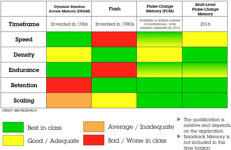
This invention is changing the approach to how to store and access “Big Data” and what portion of “Big Data” need to be in-memory (RAM) for Data Visualization purposes as oppose to outside of RAM (say on hard disk, flash or PCM). IBM may have a keys to Big Data kingdom…
To some people it may be unrelated, but not to me: Teradata just got the Patent on SQL-MapReduce technology they got from Aster Data acquisition. This technology allows also to integrate with Apache Hadoop and derived database systems, used in many Big Data applications.
And last but not least is a recent acknowledgment (for some reason it came from India’s branch of IBM Software and I am wondering why, but finally it came “Straight from the horse’s mouth”! ) from IBM that Data Visualization is the future of Business Intelligence (I said THIS many years ago and still repeating it from time to time: DV is new BI or in other words: the BI is dead, all hails to DV!). IBM is very proudly saying that Cognos 10 supports “enormous” number of Charts (I guess it will make Qlikview, Spotfire and Tableau people laughing)
 and that the most discussed feature in Cognos 10 is Active Reports. This functionality allows the report authors to create interactive reports (apparently it is a big deal for IBM!).
IBM even is spreading rumors for weeks (through people who signed NDA with them) about Cognos TM1-based “new visualization tool”, which will “disrupt” DV market… I guess because IBM knows that BI is dead (and IBM wasted $14+B buying 24 BI companies lately) and DV is new BI.
Since IBM improved PCM (see above) and had 100th birthday, I really wish good luck to them, but I wish IBM to stay focused on what they good at instead of spreading all over the high-tech. All these 3 “news” were published yesterday and today and somehow connected in my mind to Data Visualization’s future and forced me to publish this “eclectic” post…
Excel as a BI Platform – Part 3
Below is a Part 3 of the Guest Post by my guest blogger Dr. Kadakal, (CEO of Pagos, Inc.). This article is about of how to build Dashboards and Data Visualizations with Excel. The topic is large, and the first portion of article (published on this blog 3 weeks ago) contains the the general Introduction and the Part 1 “Use of Excel as a BI Platform Today“. The Part 2 – “Dos and Don’ts of building dashboards in Excel“ published 2 weeks ago and Part 3 – “Publishing Excel dashboards to the Internet“ is started below and its full text is here.
As I said many times, BI is just a marketing umbrella for multiple products and technologies and Data Visualization became recently as one of the most important among those. Data Visualization (DV) so far is a very focused technology and article below shows how to publish Excel Data Visualizations and Dashboards on Web. Actually a few Vendors providing tools to publish Excel-based Dashboards on Web, including Microsoft, Google, Zoho, Pagos and 4+ other vendors:
- www.securesheet.com
- www.spreadsheetconverter.com
- www.jedox.com
- www.bonavistasystems.com
- plus of course Microsoft, Google, Zoho and Pagos (SpreadsheetWEB)
I leave to the reader to decide if other vendors can compete in business of publishing Excel-based Dashbaords on Web, but the author of the artcile below provides a very good 3 criterias of how to select the vendor, tool and technology for it (and when I used it myself it left me only with 2 choices – the same as described in article).
Author: Ugur Kadakal, Ph.D., CEO and founder of Pagos, Inc.
Publishing of Excel Dashboards on the Internet
Introduction
In previous article (see “Excel as BI Platform” here) I discussed Excel’s use as a Business Intelligence platform and why it is exceedingly popular software among business users. In 2nd article (“Dos&Don’ts of Building Successful Dashboards in Excel“) I talked about some of the principles to follow when building a dashboard or a report in Excel. Together this is a discussion of why Excel is the most powerful self-service BI platform.
However, one of the most important facets of any BI platform is web enablement and collaboration. It is important for business users to be able to create their own dashboards but it is equally important for them to be able to distribute those dashboards securely over the web. In this article, I will discuss two technologies that enable business users to publish and distribute their Excel based dashboards over the web.
Selection Criteria
The following criteria were selected in order to compare the products:
- Ability to convert a workbook with most Excel-supported features into a web based application with little to no programming.
- Dashboard management, security and access control capabilities that can be handled by business users.
- On-premise, server-based deployment options.
Criteria #3 eliminates online spreadsheet products such as Google Docs or Zoho. As much as I support cloud based technologies, in order for a BI product to be successful it should have on-premise deployment options. Without on-premise you neglect the possibility of integration with other data sources within an organization.
There are other web based Excel conversion products on the market but none of them meet the criteria of supporting most Excel features relevant to BI; therefore, they were not included in this article about how to publish Excel Dashboard on Web .
Excel as a BI Platform – Part 2
Below is a Part 2 of the Guest Post by my guest blogger Dr. Kadakal, (CEO of Pagos, Inc.). This article is about of how to build Dashboards and Data Visualizations with Excel. The topic is large, and the first portion of article (published on this blog last week) contains the the general Introduction and the Part 1 “Use of Excel as a BI Platform Today“.
The Part 2 – “Dos and Don’ts of building dashboards in Excel“ is below and Part 3 – “Publishing Excel dashboards to the Internet“ is coming soon. It is easy to fall into a trap with Excel, but if you avoid those risks as described in article below, Excel can become of one of the valuable BI and Data Visualization (DV) tool for user. Dr. Kadakal said to me recently: “if the user doesn’t know what he is doing he may end up spending lots of time maintaining the file or create unnecessary calculation errors”. So we (Dr. Kadakal and me) hope that article below can save time for visitors of this blog.
BI in my mind is a marketing umbrella for multiple products and technologies, including RDBMS, Data Collection, ETL, DW, Reporting, Multidimensional Cubes, OLAP, Columnar and in-Memory Databases, Predictive and Visual Analytics, Modeling and DV.
Data Visualization (aka DV), on other hand, is a technology, which enabling people to explore, drill-down, visually analyze their data and visually search for data patterns, like trends, clusters, outliers, etc. So BI is marketing super-abused term, while DV so far is focused technology and article below shows how to use Excel as a great Dashboard builder and Data Visualization tool.
Dos&Don’ts of Building Successful Dashboards in Excel
Introduction (click to see the full article here)
In previous week’s post (see also article “Excel as BI Platform” here) I discussed Excel’s use as a Business Intelligence platform and why it is exceedingly popular software among business users. In this article I will talk about some of the principles to follow when building a dashboard or a report in Excel.
One of the greatest advantages of Excel is its flexibility: it puts little or no constraints on the user’s ability to create their ideal dashboard environments. As a result, Excel is being used as a platform for solving practically any business challenge. You will find individuals using Excel to solve a number of business-specific challenges in practically any organization or industry. This makes Excel the ultimate business software.
On the other hand, this same flexibility can lead to errors and long term maintenance issues if not handled properly. There are no constraints on data separation, business logic or the creation of a user interface. Inexperienced users tend to build their Excel files by mixing them up. When these facets of a spreadsheet are not properly separated, it becomes much harder to maintain those workbooks and they become prone to errors.
In this article, I will discuss how you can build successful dashboards and reports by separating data, calculations and the user interface. The rest of this post you can find in this article
“Dos and Don’ts of building dashboards in Excel” here.
It discusses how to prepare Data (both static and external) for dashboards, how to build formulas and calculation models, UI and Input Controls for Dashboards and of course – Pivots,Charts, Sparklines and Conditional Formatting for innovative and powerful Data Visualizations in Excel.
Excel as a Business Intelligence Platform – Part 1
This is a Part 1 of surprise Guest post. My guest is Ugur Kadakal, Ph.D., he is the CEO and founder of Pagos, Inc., which he started almost 10 years ago.
Dr. Kadakal is an expert in Excel, Business Intelligence, Data Analytics and Data Visualization. His comprehensive knowledge of Excel, along with his ambitious inventions and ideas, supply the foundation for all Pagos products, which include SpreadsheetWEB (which converts Excel spreadsheets into web applications), SpreasheetLIVE (a fully-featured, browser-based spreadsheet application environment) and Pagos Spreadsheet Component (which integrates Excel spreadsheets into enterprise web applications).
Pagos started and hosted the largest free collection and repository of professional templates of Excel spreadsheets on the web: http://spreadsheetzone.com . 3 Excel-based Dashboard below can be found on this very popular repository and done by Dr. Kadakal:
Dashboard 1 : Human Resources Dashboard: http://spreadsheetzone.com/templateview.aspx?i=498
Dashboard 2 : Business Activity Dashboard in EuroZone: http://spreadsheetzone.com/templateview.aspx?i=490
Dashboard 3 : Energy Dashboard for Euro Zone: http://spreadsheetzone.com/templateview.aspx?i=491
The topic is large, so this Guest article is splitted on 3 blog posts. The first portion of article contains the Introduction and Part 1 “Use of Excel as a BI Platform Today“, then I expect Dr. Kadakal will do at least 2 more posts: Part 2 – “Dos and Don’ts of building dashboards in Excel“, Part 3 – “Moving Excel dashboards to the Web“.
Excel as a Business Intelligence Platform – Part 1
Introduction
Electronic spreadsheets were one of the very first Business Intelligence (BI) software. While the availability of spreadsheet software and it use as a tool for data analysis dates back to the 1960s, its application in the BI field began with the integration of OLAP and pivot tables. In 1991, Lotus released Improve, followed by Microsoft’s release of PivotTable in 1993. However, Essbase was the first scalable OLAP software to handle large data sets that the early spreadsheet software was incapable of. This is where its name comes from: Extended Spread Sheet Database.
There is no doubt that Microsoft Excel is the most commonly used software for BI purposes. While Excel is general business software, its flexibility and ease of use makes it popular for data analysis with millions of users worldwide. Excel has an install base of hundreds of millions of desktops: far more than any other BI platform. It has become a household name. From educational utilization to domestic applications and enterprise implementation, Excel has been proven incredibly indispensable. Most people with commercial or corporate backgrounds have developed a proficient Excel skillset. This makes Excel the ultimate self-service BI platform. However, like all systems, Excel has some weaknesses that make it difficult to use as a BI tool under certain conditions.
Use of Excel as a BI Platform Today
Small Businesses
Traditionally, small businesses are not considered as an important market segment by most BI vendors. Their data analysis and reporting needs are limited primarily due to their smaller commercial volumes. However, this is changing quickly as smaller organizations begin to collect large amounts of data, thanks to the Internet and social media, and require tools to manage that data. However, what is not changing is the limited financial resources available to them. Small businesses cannot spare to spend large amounts of money on BI software or consultants to aid them in the creation of the applications. That’s why Excel is the ideal platform for them and will most probably remain that way for a foreseeable future. The reasons are clear: (1) most of them already have Excel licenses, (2) most of their users know how to use Excel and (3) their needs are simpler and can be met with Excel.
Mid-Range Businesses
Mid-range businesses are a quickly growing market segment for BI vendors. Traditionally, Excel as a BI platform has been more popular among these businesses. Cost and availability are the primary factors in this. However, two aspects have been steering them to searching for alternatives: (1) Excel can no longer handle their growing data volumes and (2) other BI vendors started offering cost-effective alternatives.
As a result, Excel’s market share in this field is in decline although it still remains the most popular. On the other hand, with the release of Office 2010 and its extended capabilities for handling very large data sets, Excel stands a good chance at reversing this decline.
Large Enterprises
The situation with large enterprises is rather complex. Most of them already have large-scale a BI implementation in place. Those implementations often connect various databases and data warehouses within the organizations. They have made significant investments and continue doing so to expand and maintain their BI systems. They already have a number of dashboards and reports designed to serve their business units. However, business users always need new and different dashboards and reporting tools. The only software that gives them the ultimate flexibility in creating their own reports is Excel. As a result, even in large Enterprises, usage of Excel for BI purposes is common. Business users often go to their data warehouses or BI tools and get a data extract to bring into Excel. They can then prepare their analysis and build their reports in Excel.
Enterprises will continue using their existing platforms because they have made huge investments building those systems. However, Excel use by business users as their secondary BI and reporting tool will continue to rise unless the alternative vendors significantly improve their self-servicing capabilities.
Summary
Excel is one of the ultimate business platforms and offers unparalleled features and capabilities to non-programmers. This makes it an ideal self-service BI platform. In this article, we examined the use of Excel as a BI platform in companies of different sizes. In the next article of this series, we will discuss how to use Excel more efficiently as a BI platform, from handling data to calculations and visual interactions.
Footprint Comparison for DV Leaders
Comparison of DV Tools is the most popular page (and post) of this site, visited by many thousands of people. Some of them keep asking to append this comparison with different additional features, one of them is a comparison of requirements of leading DV tools for file and memory footprint and also for reading and saving time.
I took mid-sized dataset (428999 rows and 135 columns), exported it into CSV and compressed it to ZIP format, because all native DV formats (QVW by Qlikview, DXP by Spotfire, TWBX by Tableau and XLSX by Excel and PowerPivot) are compressed one way or another. My starting filesize (of ZIPped dataset) was 56 MB. Here is what I got, see for yourself:
One comment is that numbers above are all relative to configuration of hardware used for tests and also depend on other software I ran during tests, because that software also requires RAM, CPU cycles, disk I/O and even on speed of repainting applications windows on screen, especially for Excel. I probably will add more comments to this post/page, but my first impression from this comparison is that new Tableau’s Data Engine (released in version 6.0 and soon will be updated in 6.1) made Tableau more competitive. Please keep in mind, that comparison of in-memory footprint was much less significant in above test, because Qlikview, Excel and PowerPivot putting all dataset into RAM, while Tableau and Spotfire can leave some (unneeded for visualization) data on disk, treating it as “virtual memory”. Also Tableau using 2 executables (not just one EXE as others): tableau.exe (or tabreader.exe) and tdserver64.exe
Since Tableau is the only DV Leading software, capable to read from SSAS Cubes and from PowerPivot (local SSAS) Cubes, I also took large SSAS Cube and for testing purposes I selected SSAS Sub-Cube with 3 Dimensions, 2 Measures and 156439 “rows”, measured the Time and Footprint, needed for Tableau to read Sub-Cube, Refresh it in Memory, Save to local application file, and also measurted “Cubical” Footprint of it in Memory and on Disk and then compared all results with the same tests while running Excel 2010 alone and Excel 2010 with PowerPivot:
While Tableau’s ability to read and visualize Cubes is cool, performance-wise Tableau is far behind of Excel and PowerPivot, especially in Reading department and memory footprint. In Saving department and File footprint Tableau is doing nothing because it is not saving cube locally in its local application TWBX file (and it keeps data in SSAS cube outside of Tableau) so Tableau’s file footprint for SSAS Cubes is not an indicator but for PowerPivot-based local Cubes Tableau does better job (saving data into local application file) then both Excel and PowerPivot!
Spotfire 3.3: mature, scalable, social
TIBCO released Spotfire 3.3 and first (see what is new here) that jumped to my eyes was how mature this product is. For example, among new features is improved scalability – each additional simultaneous user of a web analysis initially claims very little additional system memory:
Many Spotfire customers will be able to support a greater number of web users on their existing hardware by upgrading to 3.3. Spotfire Web Player 3.3 includes significant improvements in memory consumption (as shown above for certain scenarios). Theoretically goal is to minimize the amount of system memory needed to support larger numbers of simultaneous users on the same analysis file. Main use case here: the larger the file and the greater the number of simultaneous web users on that file, then less initial system memory required to support each additional user: it is greatly reduced compared to version 3.2.1 and earlier.
Comparison with competition and thorough testing of new Spotfire scalability has to be done (similar to what Qliktech done with Qlikview here), but my initial reaction is as I said in a Title: we are witnessing a very mature software. Apparently the Defense Intelligence Agency (DIA) agrees with me and Defense Intelligence Agency Selects TIBCO Spotfire Analytics Solutions for Department of Defense Intelligence Information System Community. “With more than 16,500 military and civilian employees worldwide, DIA is a major producer and manager of foreign military intelligence”
Spotfire 3.3 also includes collaborative bookmarking, which enables all Spotfire users to capture a dashboard – its complete configuration, including markings, drop down selections, and filter settings and share that visualization immediately with other users of that same dashboard, regardless of client in use. Spotfire actually not just a piece of Data Visualization Software, but a real Analytical Platform with large portfolio of products, including completely integrated S-PLUS (commercial version of R Library which has million of users), best Web Client (you can go Zero-footprint with Spotfire Web Player or/and partially free Spotfire Silver), free iPad Client version 1.1.1 (requires iTunes, so be prepared for Apple intrusion), very rich API, SDK, integration with Visual Studio, support of IronPython and JavaScript , well-thought Web Architecture, set of Extension Points etc.
System requirements for Spotfire 3.3 can be found here. Coincidentally with 3.3 Release Spotfire VAR Program got expansion too. Spotfire has a very rich set of training options, see it here. You can also find set of good Spotfire videos from Colin White’s Screencast Library, especially 2011 Webcasts.
My only and large concern with Spotfire is its focus, since it is part of a large corporation TIBCO, which has 50+ products and 50+ reasons to focus on something else. Indirectly it can be confirmed with sales: my estimate that Tableau is growing much faster than Spotfire (sales-wise) and Qlikview Sales probably 3 times larger (dollar-wise) than Spotfire sales. Since TIBCO bought Spotfire in 2007, I expected Spotfire will be integrated with other great TIBCO products, but after 4 years it is still not a case… And TIBCO has no reason to change its corporate policies, since its busines is good and stock is doing well:
(at least 500% increase of share price since end of 2008!). Also see article written by Ted Stamas for SeekingAlpha and comparison of TIBX vs. ETF here:
Good week for Qliktech
Last week of April 2011 was good for Qliktech. It released the results for a First Quarter 2011 and they are very positive.
Revenue is up (does not look like it is slowing down) 44% YoY, if compared with 1Q2010 with revenue $63M and projection for total 2011 now about $300M (up from preliminary projection of $280M before Q1 happened). Ended the first quarter of 2011 with an active customer count of approximately 19,000 (means about 900000 licensed, paying Data Visualization and BI users now and number of Qlikview users may exceed 1 million in 2011!), up from approximately 14,000 active customers at the end of the first quarter of 2010! Among other news:
- Qliktech hired 103 new employees in Q1 of 2011 and currently employed 883 people (a 43% increase year-over-year).
- Qliktech signed a strategic alliance with Deloitte, starting with Netherlands and planning expansion of alliance to Deloitte worldwide.
- About 2 weeks ago Qliktech unveils one of the first HTML5-based full client application: Qlikview on iPad (free [user will need license to access Qlikview Server anyway] – and delivered it through the Safari mobile Web browser) – Qliktech claims that it is “every bit as rich as a native app.”
I guess most of DV Client applications should have HTML5 reincarnation soon… As a result of all these positive sound bites, Qliktech shares ended this week above $32, more than tripled in 9 months:
and I compared Qliktech’s relative growth in above Annotated Timeline chart with Microstrategy, TIBCO and Apple (yes, Qliktech is growing at least twice faster than … Apple). I cannot include Tableau in comparison, because Tableau Software is still … a private company.
Qliktech’s capitalization as of today, 4/30/11 is $2.5B, $1B more than Microstrategy and only twice less than TIBCO’s capitalization. I know at least 3 software vendors, who are focused only on BI and DV: Tableau (it is still a private company; BTW, Tableau 6.1 will be released soon) – growing faster (114% YoY- see it here) than anybody, Qliktech (share price has tripled in last 9 months) and Microstrategy (it’s share price almost doubled in last 9 months). I consider the dedication to DV and BI as very important for future success in DV market; for example TIBCO’s Spotfire is only one of 50+ TIBCO’s products… and it dangers the future of one of the most advanced and mature DV products – Spotfire (version 3.3 is coming soon) .
One of reasons for Qliktech growth is its 1000+ partners and extensive Partner Programs for OEM Partners, Solution Providers, Business Consultants and System Integrators. Those overdeveloped Partner Programs required mandatory commitments from Partners in terms of Revenue Targets, Membership Fees, Qlikview Certifications and Minimum number of Trained employees. Lately Qliktech unreasonably raised those requirements and it may backfire and slowdown Qliktech growth and will help competitors like Tableau (Tableau actually opposite to Qliktech: their partnership program is underdeveloped – in my opinion – and requires big improvements) and recently Microstrategy (which seems learning from own and competitors mistakes and catching up lately).
Permalink: http://apandre.wordpress.com/2011/04/30/good-week-for-qliktech/
Visual Insight from Microstrategy
Microstrategy is a famous and BI-dedicated company, operating for 22+ years, recently released Visual Insight (as part of the release of Microstrategy 9.2 this week) and joint the DV race. A couple of years ago, I advised to some local company in terms of choosing Data Visualization Partner and final 3 choices were Qlikview, Spotfire and Microstrategy. Microstrategy was most competitive pricing-wise, but their Data Visualization functionality was not ready yet. They are ready now, see it here (from webcast this week):
Visual Insight as part of Microstrategy 9.2 targets so called “self-service BI”, and transition (they acknowledged that) from “old BI” (tabular reports: published static and OLAP reports) to “new BI” (Data Visualization and Dashboards), from Desktop to Mobile Clients (that is a forward looking statement for sure), from Physical to Cloud.
Microstrategy is claiming that Visual Insight allows to visualize Data in 30 minutes (that is good to know, but DV Leaders already have it for a while, welcome to the club!) compare with 30 days for the same process with “traditional BI”:
(I am saying this for 6 years now and on this blog since inception of it; does it mean that old BI is useless now and too pricey? Microstrategy presenters saying that answer is yes! and I want to thank Microstrategy for the validation of my 6-years old conclusion). For full set of Microstrategy 9.2 slides click here.
Microstrategy 9.2 has a full BI product portfolio, fast in-memory Data Engine, free mobile and tablet clients, has even Free Reporting Suite . Microstrategy (like Qliktech, Tableau and Visokio) is completely focused on Business Intelligence and Data Visualization functionality unlike its giant competitors like SAP, IBM, Oracle and Microsoft.
Trend Analysis: see it 1st
Data Visualization can be a good thing for Trend Analysis: it allows to “see this” before “analyze this” and to take advantage of human eye ability to recognize trends quicker than any other methods. Dr. Ahlberg started (after selling Spotfire to TIBCO and claiming that “Second place is first loser”) a “Recorded Future” to basically sell … future trends in form (mostly) of Sparklines; he succeeded at least in selling RecordedFuture to investors from CIA and Google. Trend analysis is an attempt to “spot” a pattern, or trend, in data (in most cases well-ordered set of datapoints, e.g. by timestamps) or predict future events.
Visualizing Trends means in many cases either Time Series Chart (can you spot a pattern here with your naked eye?):
or Motion Chart (both best done by … Google, see it here http://visibledata.blogspot.com/p/demos.html ) – can you predict the future here(?):
or Sparklines (I like Sparkline implementations by Qlikview and Excel 2010) – sparklines are scale-less visualization of “trends”:
may be Scatter (Excel is good for it too):
and in some cases Stock Chart (Volume-Open-High-Low-Close, best done with Excel) – for example Microsoft stock is fluctuating near the same level for many years, so I guess there is no visible trend here, which may be spells a trouble for Microsoft future (compare with visible trend of Apple and Google stocks):
Or you can see Motion, Timeline, Sparkline and Scatter charts alive/online below: for Motion Chart Demo, please Choose a few countries (e.g. check checkboxes for US and France) and then Click on “Right Arrow” button in the bottom left corner of the Motion Chart below:
In statistics trend analysis often refers to techniques for extracting an underlying pattern of behavior in well-ordered dataset which would otherwise be partly hidden by “noise data”. It means that if one cannot “spot” a pattern by visualizing such a dataset, then (and only then) it is time to apply regression analysis and other mathematical methods (unless you smart or lucky enough to remove a noise from your data). As I said in a beginning: try to see it first! However, extrapolating the past to the future can be a source for very dangerous mistakes (just check a history of almost any empire: Roman, Mongol, British, Ottoman, Austrian, Russian etc.)
Visual BI with Vizubi
Since many people will use Excel regardless of how good other BI and DV tools are, I am regularly comparing abilities of Excel to solve Data Visualization problems I discussed on this site. In most cases Excel 2003 is completely inappropriate and obsolete (especially visually), Excel 2007 is good only for limited DV tasks like Infographics, Data Slides, Data Presentations, Static Dashboards and Single-Chart Visualizations. Excel 2010 has some features relevant to Data Visualizations, including one of the best columnar in-memory databases (PowerPivot as free add-in), an ability to synchronize multiple Charts through slicers, a limited ability to drilldown data using slicers and even the support for both 64-bit and 32-bit. However, when comparing with Qlikview, Spotfire and Tableau the Excel 2010 feels like a stone-age tool or at least 2 generation behind as far as Data Visualization (and BI) is a concern…
That was my impression until I started to use the Excel Plugin, called Visubi (from company with the same name, see it here ). Suddenly my Excel 2003 and Excel 2007 (I keep them for historical purposes) started to be almost as capable as Excel 2010, because Visubi adding to all those versions of Excel a very capable columnar in-memory database, slicers and many features you cannot find in Excel 2010 and PowerPivot and in addition is greatly improving the functionality of Excel PivotTables and Tables! Vizubi enables me to read (in addition to usual data sources like ODBC, CSV, XLS, XLSX etc.) even my QVD files (Qlikview Data files)! Visubi, unlike PowerPivot, will create Time Dimension(s) the same way as SSAS does. All above means that users are not forced to migrate to Office 2010, but they will have many PowerPivot features with their old version of Excel. In addition Vizubi added to my Excel tables and Pivots uniques feature: I can easily switch back and forth between Table and PivotTable presentation of my data.
Most important Visubi’s feature is that all Vizubi’s tables and pivots are interactive and each piece of data is clickable and enables me to drill down/up/through my entire dataset:
It is basically equivalent or exceeded the drilldown ability of Qlikview, with one exception: Qlikview allows to do it through charts, but Vizubi does it through Tables and PivotTables. Visubi enables Excel user creates large databases with millions of rows (e.g. test database has 15 millions of rows) and enables ordinary users (non-developers) easily create Tables, Reports, Charts, Graphs and Dashboards with such database – all within familiar Excel environment using easy Drag-and-Drop UI:
Vizubi’s Database(s) enables users to share data over central datastore, while keeping Excel as a personal desktop DV (or BI) client. See Vizubi videos here and tutorials here.
Vizubi is a small (15 employees) profitable Italian company and it is a living prove that size does not matter – Vizubi did something extremely valuable and cool for Excel users that giant Microsoft failed to do for many years, even with PowerPivot. Prices for Vizubi is minimal considering the value it adds to Excel: between $99 and &279, depends on the version and the number of seats (discounts are available, see it here ).
Vizubi is not perfect (they just at version 1.21, less then one year old product), for example I wish they will support a graphical drilldown like Qlikview does (outlining rectangles right on Charts and then instant selection of appropriate subset of data ), a web client (like Spotfire) and web publishing for their functionality (even Excel 2010 supports Slicers on a web in Office Live environment), 64-bit Excel (32-bits is so 20th century), the ability to read and use SSAS and PowerPivot directly (like Tableau does), some scripting (Javascript or VBScript like Qlikview) and”formula” language (like PowerPivot with DAX) etc.
I suggest to review these articles about Vizubi: in TDWI by Stephen Swoyer and relatively old article from Marco Russo at SQLBlog .
Deloitte: me DV too (it wishes…)
Last week Deloitte suddenly declared that 2011 will be a year of Data Visualization (DV for short, at least on this site) and main technology trend in 2011 will be a Data Visualization as “Emerging Enabler”. It took Deloitte many years to see the trend (I advise to them to re-read posts by observers and analysts like Stephen Few, David Raab, Boris Evelson, Curt Monash, Mark Smith, Fern Halper and other known experts). Yes, I am welcoming Deloitte to DV Party anyway: better late then never. You can download their “full” report here, in which they allocated first(!) 6 pages to Data Visualization. I cannot resist to notice that “DV Specialists” at Deloitte just recycling (using own words!) some stuff (even from this blog) known for ages and from multiple places on Web and I am glad that Deloitte knows how to use the Internet and how to read.
However, some details in Deloitte’s report amazed me of how they are out of touch with reality and made me wondering in what Cave or Cage (or Ivory Tower?)
these guys are wasting their well-paid time? On a sidebar of their “Visualization” Pages/Post they published a poll: “What type of visualization platform is most effective in supporting your organization’s business decision making?”. Among most laughable options to choose/vote you can find “Lotus” (hello, people, are you there? 20th century ended many years ago!), Access (what are you smoking people?), Excel (it cannot even have interactive charts and proper drilldown functionality, but yes, everybody has it), Crystal Reports (static reports are among main reasons why people looking for interactive Data Visualization alternatives), “Many Eyes” (I love enthusiasts, but it will not help me to produce actionable data views) and some “standalone options” like SAS and ILOG which are 2 generations behind of leading DV tools. What is more amazing that “BI and Reporting option” (Crystal, BO etc.) collected 30% of voters and other vote getters are “standalone option” (Deloitte thinks SAS and ILOG are there) – 19% and “None of the Above” option got 22%!
In the second part of their 2011 Tech Trends report Deloitte declares the “Real Analytics” as a main trend among “Disruptive Deployments”. Use of word “Real Analytics” made me laugh again and reminds me some other funny usage of the word “real”: “Real Man”, Real Woman” etc. I just want to see what it will be as an “unreal analytics” or “not real analytics” or whatever real antonym for “real analytics” is.
Update: Deloitte and Qliktech form alliance in last week of April of 2011, see it here.
Permalink: https://visibledata.files.wordpress.com/2010/10/powerpivotarchitecture.jpg2011/03/29/deloitte-too/
Deloitte: me DV too (it wishes…)
Last week Deloitte suddenly declared that 2011 will be a year of Data Visualization (DV for short, at least on this site) and main technology trend in 2011 will be a Data Visualization as “Emerging Enabler”. It took Deloitte many years to see the trend (I advise to them to re-read posts by observers and analysts like Stephen Few, David Raab, Boris Evelson, Curt Monash, Mark Smith, Fern Halper and other known experts). Yes, I am welcoming Deloitte to DV Party anyway: better late then never. You can download their “full” report here, in which they allocated first(!) 6 pages to Data Visualization. I cannot resist to notice that “DV Specialists” at Deloitte just recycling (using own words!) some stuff (even from this blog) known for ages and from multiple places on Web and I am glad that Deloitte knows how to use the Internet and how to read.
However, some details in Deloitte’s report amazed me of how they are out of touch with reality and made me wondering in what Cave or Cage (or Ivory Tower?)
these guys are wasting their well-paid time? On a sidebar of their “Visualization” Pages/Post they published a poll: “What type of visualization platform is most effective in supporting your organization’s business decision making?”. Among most laughable options to choose/vote you can find “Lotus” (hello, people, are you there? 20th century ended many years ago!), Access (what are you smoking people?), Excel (it cannot even have interactive charts and proper drilldown functionality, but yes, everybody has it), Crystal Reports (static reports are among main reasons why people looking for interactive Data Visualization alternatives), “Many Eyes” (I love enthusiasts, but it will not help me to produce actionable data views) and some “standalone options” like SAS and ILOG which are 2 generations behind of leading DV tools. What is more amazing that “BI and Reporting option” (Crystal, BO etc.) collected 30% of voters and other vote getters are “standalone option” (Deloitte thinks SAS and ILOG are there) – 19% and “None of the Above” option got 22%!
In the second part of their 2011 Tech Trends report Deloitte declares the “Real Analytics” as a main trend among “Disruptive Deployments”. Use of word “Real Analytics” made me laugh again and reminds me some other funny usage of the word “real”: “Real Man”, Real Woman” etc. I just want to see what it will be as an “unreal analytics” or “not real analytics” or whatever real antonym for “real analytics” is.
Update: Deloitte and Qliktech form alliance in last week of April of 2011, see it here.
More updates: In August 2011 Deloitte opened “”The Real Analytics website”” here: http://realanalyticsinsights.com/ and on 9/13/11 they “Joined forces in US with Qliktech: http://investor.qlikview.com/releasedetail.cfm?ReleaseID=604843
Permalink: http://apandre.wordpress.com/2011/03/29/deloitte-too/
Win $3M (if you have nothing better to do)
The algorithm contest, the largest of its kind so far, is an attempt (also see Slate article here) to help find the best answers to complicated data-analysis questions. Previous known was the $1 million Netflix Inc. prize awarded in 2009 for a model to better predict what movies people would like. In 2009, a global team of seven members consisting of statisticians, machine-learning experts and computer engineers was awarded the $1 Million contest prize and Netflix replaced its legacy recommendation system with the team’s new algorithm (2nd Netflix’s competition was stopped by FTC and lawyers). I personally think that this time Data Visualization will be a large part of winning solution.
The training dataset includes several thousand anonymized patients and will be made available, securely and in full, to any registered team for the purpose of developing effective screening algorithms. The quiz/test dataset is a smaller set of anonymized patients. Teams will only receive the Historical Data section of these datasets and the two datasets will be mixed together so that teams will not be aware of which de-identified patients are in which set.
Teams will make predictions based on these data sets and submit their predictions to HPN through the official Heritage Health Prize web site. HPN will use the Quiz Dataset for the initial assessment of the Team’s algorithms. HPN will evaluate and report back scores to the teams through the prize website’s leader board.
Scores from the final Test Dataset will not be made available to teams until the accuracy thresholds are passed. The test dataset will be used in the final judging and results will be kept hidden. These scores are used to preserve the integrity of scoring and to help validate the predictive algorithms. You can find more about Online Testing and Judging here.
Pagos Released SpreadsheetWEB 3.2
Pagos released this week SpreadsheetWEB 3.2 (PSW for short) with new Data Visualization features (Pagos Data Visualizer or PDV for short). Among those features is an ability to drill-down any Visible Data through synchronized filters, which immediately made the SpreadsheetWEB a player in Data Visualization Market.
Tools like Tableau, Qlikview or Spotfire allow people to visualize data, but have very limited ability to collect and update data. PSW (Pagos SpreadsheetWEB), on other hand, since versions 1.X was able to convert any Excel Spreadsheet into Web Application and Web-based Data Collector, to save collected data into SQL Server (including latest SQL Server 2008 R2) Database, and to Report or Visualize the Data online through SaaS web-based spreadsheet, which looks and behaves as Excel Spreadsheet! SpreadsheetWEB has unique ability to collect data in a Batch Process and run large datasets against SpreadsheetWEB application. This video demonstrates data collection and data management and collaborations utilizing workflow capabilities and SpreadsheetWEB Control Panel interface. SpreadsheetWEB can use Web-Service as Data Source (like Excel does) and allows web-based spreadsheets to function as Web Service too:
One of the reasons why most people still use and like Excel as a BI tool is that they can use many of the built-in worksheet formulas to process data in real-time while filtering the dashboard. SpreadsheetWEB converts those formulas and can execute them on the server. Database-driven SpreadsheetWEB applications support most features in Excel, including worksheet formulas, 333+ Excel functions, formatting, 33+ types of Excel charts as well as Sparklines,
also see video here:
as well as pivot tables, validation, comments, filters and hyperlinks, while almost completely eliminating the need for application and database developers, as well as need for IT services. Basically if person knows Excel, than he knows how to use SpreadsheetWEB. SpreadsheetWEB (both 64-bit and 32-bit) has HTML Editor and Scripting Support (JavaScript), similar to what macros do for Excel (be aware that it is not port of VBA):
Among 3 DV Leaders only Tableau is able to read Microsoft SQL Server Analysis Services (SSAS) data sources, which is a must for long-term success in Visual Analytics market. SpreadhseetWEB has this functionality the same way as Excel does and therefore ahead of Qlikview and Spotfire in this extremely important department. Among other advanced Data Visualization Features SpreadsheetWEB supports Maps in Dashboards
and multi-page Dashboard reports. I like Version Control for applications and Server Monitoring features – they can be very attractive for enterprise users. SpreadsheetWEB does not require SharePoint Server to execute Excel workbooks on the server. Pagos developed proprietary spreadsheet technology to achieve that independence from SharePoint Server (I personally consider SharePoint as a Virus). This makes Pagos very attractive to cost conscious small to medium size organizations. Installing SpreadsheetWEB only requires Windows Server and Microsoft SQL Server. In addition, SpreadsheetWEB works with free SQL Express Edition, which is an additional savings for Customers with small datasets.
For advanced Data Visualization functionality, Pagos established the OEM partnership with TIBCO and integrates SpreadsheetWEB with TIBCO Spotfire Analytic Platform. For advanced SaaS features, including strictest security and hosting requirements and SAS70 Compliance, Pagos partners with Rackspace.
SpreadsheetWEB is one of the few players in the market that offer Software-as-a-Service (SaaS) licensing along with traditional server licensing. Pagos has very attractive SaaS fees and extremely competitive pricing for those who want to buy own SpreadsheetWEB server: $4900 per SpreadsheetWEB server for 50 named users and 25 web applications and dashboards; that price at least 10 times better than prices from Qlikview, Spotfire and Tableau. Pagos provides 44+ Video Tutorials, 53+ online Demos, free non-expiring trial and Wiki-based full Documentation for SpreadsheetWEB, so people can review, browse and evaluate SpreadsheetWEB way before they will buy it.
Pagos is in BI business since 2002, profitable and fully self-funded since inception, with hundreds of customers. Pagos has other advanced BI-related products, like SpreadsheetLIVE (it offers a fully featured spreadsheet application environment within a web browser) and Pagos Spreadsheet Component (allows software developers to create web and desktop applications that can read, execute, and create Excel spreadsheets without requring Microsoft Excel). If you will compare SpreadsheetWEB with Microsoft’s own attempt to webify Excel and Microsoft’s own Long List of Unsupported Excel features, you can easily appreciate the significance of what Pagos achieved!
Permalink: http://apandre.wordpress.com/2011/03/13/spreadsheetweb/
Dimensionality of Visible Data
Human eye has own Curse of Dimensionality (term suggested in 1961 by R.Bellman and described independently by G. Hughes in 1968). In most cases the data (before they visualized) usually organized in multidimensional Cubes (n-Cubes) and/or Data Warehouses and/or speaking more cloudy – in Data Cloud – need to be projected into less-dimensional datasets (small-dimensional Cubes, e.g. 3d-Cubes) before they can be exposed through (preferably interactive and synchronized set of charts, sometimes called dashboards) 2-dimensional surface of computer monitor in form of Charts.
During last 200+ years people kept inventing all type of charts to be printed on paper or shown on screen, so most charts showing 2- or 3-dimensional datasets. Prof. Hans Rosling led Gapminder.org to create the web-based, animated 6-dimensional Color Bubble Motion Chart (Trendalyzer) ,
which he used in his famous demos: http://www.gapminder.org/world/ , where 6 dimensions in this specific Chart are (almost a record for 2-dimensional chart to carry):
- X coordinate of the Bubble = Income per person,
- Y coordinate of the Bubble = Life expectancy,
- Size of the Bubble = Population of the Country,
- Color of the Bubble = Continent of the Country,
- Name of the Bubble = Country,
- Year = animated 6th Dimension/Parameter as time-stamp of the Bubble.
Trendalyzer was bought from Gapminder in 2007 by Google and was converted into Google Motion Chart, but Google somehow is not in rush to enter the Data Visualization (DV) market.
Dimensionality of this Motion Chart can be pushed even further to 7 dimensions (dimension as an expression of measurement without units) if we will use different Shapes (in addition to filled Circles we can use Triangles, Squares etc.) but it will be literally pushing the limit of what human eye can handle. If you will add to the consideration a tendency of DV Designers to squeeze more than one chart on a screen (how about overcrowded Dashboards with multiple synchronized interactive Charts?), we are literally approaching the limits of both human eye and human brain, regardless of the dimensionality of the Data Warehouse in backend.
Below I approximately assessed the dimensionality of datasets for some popular charts (please feel free to send me the corrections). For each Dataset and respective Chart I estimated the number of measures (usually real or integer number, can be a calculation from other dimensions of dataset), the number of attributes (in many cases they are categories, enumerations or have string as datatype) and 0 or 1 parameter (presenting a well-ordered set, like time (for time series), date, year, sequence (can be used for Data Slicing), natural, integer or real number) and Dimensionality (the number of Dimensions) as a total number of measures, attributes and parameters in a given dataset.
| Chart | Measures | Attributes | Parameter | Dimensionality |
| Gauge, Bullet, KPI | 0 | 0 | ||
| Monochromatic Pie | 1 | 1 | ||
| Colorful Pie | 1 | 1 | 2 | |
| Bar/Column | 1 | 1 | 2 | |
| Sparkline | 1 | 1 | 2 | |
| Line | 1 | 1 | 2 | |
| Area | 1 | 1 | 2 | |
| Radar | 1 | 1 | 2 | |
| Stacked Line | 1 | 1 | 1 | 3 |
| Multiline | 1 | 1 | 1 | 3 |
| Stacked Area | 1 | 1 | 1 | 3 |
| Overlapped Radar | 1 | 1 | 1 | 3 |
| Stacked Bar/Column | 1 | 1 | 1 | 3 |
| Heatmap | 1 | 2 | 3 | |
| Combo | 1 | 2 | 3 | |
| Mekko | 2 | 1 | 3 | |
| Scatter (2-d set) | 2 | 1 | 3 | |
| Bubble (3-d set) | 3 | 1 | 4 | |
| Shaped Motion Bubble | 3 | 1 | 1 | 5 |
| Color Shaped Bubble | 3 | 2 | 5 | |
| Color Motion Bubble | 3 | 2 | 1 | 6 |
| Motion Chart | 3 | 3 | 1 | 7 |
The diversity of Charts and their Dimensionality adding another complexity for DV Designer: what Chart(s) choose. You can find on web some good suggestions about that. Dr. Andrew Abela created Chart Chooser Diagram
and it was even converted into online “application“!
Permalink: http://apandre.wordpress.com/2011/03/02/dimensionality/
“Quadrant” for Data Visualization Platforms
For many years, Gartner keeps annoying me every January by publishing so called “Magic Quadrant for Business Intelligence Platforms” (MQ4BI for short) and most vendors (mentioned in it; this is funny, even Donald Farmer quotes MQ4BI) almost immediately re-published it either on so-called reprint (e.g. here – for a few months) area of Gartner website or on own website; some of them also making this “report” available to web visitors in exchange for contact info – for free. To channel my feeling toward Gartner to a something constructive, I decided to produce my own “Quadrant” for Data Visualization Platforms (DV “Quadrant” or Q4DV for short) – it is below and is a work in-progress and will be modified and republished overtime:
3 DV Leaders (green dots in upper right corner of Q4DV above) compared with each other and with Microsoft BI stack on this blog, as well as voted in DV Poll on LinkedIn. MQ4BI report actually contains a lot of useful info and it deserved to be used as a one of possible data sources for my new post, which has more specific target – Data Visualization Platforms. As I said above, I will call it Quadrant too: Q4DV. But before I will do that, I have to comment on Gartner’s annual MQ4BI.
MQ4BI customer survey included vendor-provided references, as well as survey responses from BI users in Gartner’s BI summit and inquiry lists. There were 1,225 survey responses (funny enough, almost the same number of responces as on my DV Poll on LinkedIn), with 247 (20%) from non-vendor-supplied reference lists. Magic Quadrant Customer Survey’s results the Gartner promised to publish in 1Q11. The Gartner has a somewhat reasonable “Inclusion and Exclusion Criteria” (for Data Visualization Q4DV I excluded some vendors from Gartner List and included a few too), almost tolerable but a fuzzy BI Market Definition (based on 13 loosely pre-defined capabilities organized into 3 categories of functionality: integration, information delivery and analysis).
I also partially agree with the definition and the usage of “Ability to Execute” as one (Y axis) of 2 dimensions for bubble Chart above (called the same way as entire report “Magic Quadrant for Business Intelligence Platforms”). However I disagree with Gartner’s order of vendors in their ability to execute and for DV purposes I had to completely change order of DV Vendors on X axis (“Completeness of Vision”).
For Q4DV purposes I am reusing Gartner’s MQ as a template, I also excluded almost all vendors, classified by Gartner as niche players with lower ability to execute (bottom-left quarter of MQ4BI), except Panorama Software (Gartner put Panorama to a last place, which is unfair) and will add the following vendors: Panopticon, Visokio, Pagos and may be some others after further testing.
I am going to update this DV “Quadrant”, using the method suggested by Jon Peltier: http://peltiertech.com/WordPress/excel-chart-with-colored-quadrant-background/ – Thank you Jon! I hope I will have time before end of 2011 for it…
"Quadrant" for Data Visualization Platforms
For many years, Gartner keeps annoying me every January by publishing so called “Magic Quadrant for Business Intelligence Platforms” (MQ4BI for short) and most vendors (mentioned in it; this is funny, even Donald Farmer quotes MQ4BI) almost immediately re-published it either on so-called reprint (e.g. here – for a few months) area of Gartner website or on own website; some of them also making this “report” available to web visitors in exchange for contact info – for free. To channel my feeling toward Gartner to a something constructive, I decided to produce my own “Quadrant” for Data Visualization Platforms (DV “Quadrant” or Q4DV for short) – it is below and is a work in-progress and will be modified and republished overtime:
3 DV Leaders (green dots in upper right corner of Q4DV above) compared with each other and with Microsoft BI stack on this blog, as well as voted in DV Poll on LinkedIn. MQ4BI report actually contains a lot of useful info and it deserved to be used as a one of possible data sources for my new post, which has more specific target – Data Visualization Platforms. As I said above, I will call it Quadrant too: Q4DV. But before I will do that, I have to comment on Gartner’s annual MQ4BI.
MQ4BI customer survey included vendor-provided references, as well as survey responses from BI users in Gartner’s BI summit and inquiry lists. There were 1,225 survey responses (funny enough, almost the same number of responces as on my DV Poll on LinkedIn), with 247 (20%) from non-vendor-supplied reference lists. Magic Quadrant Customer Survey’s results the Gartner promised to publish in 1Q11. The Gartner has a somewhat reasonable “Inclusion and Exclusion Criteria” (for Data Visualization Q4DV I excluded some vendors from Gartner List and included a few too), almost tolerable but a fuzzy BI Market Definition (based on 13 loosely pre-defined capabilities organized into 3 categories of functionality: integration, information delivery and analysis).
I also partially agree with the definition and the usage of “Ability to Execute” as one (Y axis) of 2 dimensions for bubble Chart above (called the same way as entire report “Magic Quadrant for Business Intelligence Platforms”). However I disagree with Gartner’s order of vendors in their ability to execute and for DV purposes I had to completely change order of DV Vendors on X axis (“Completeness of Vision”).
For Q4DV purposes I am reusing Gartner’s MQ as a template, I also excluded almost all vendors, classified by Gartner as niche players with lower ability to execute (bottom-left quarter of MQ4BI), except Panorama Software (Gartner put Panorama to a last place, which is unfair) and will add the following vendors: Panopticon, Visokio, Pagos and may be some others after further testing.
Google keeps own Data Visualizations options open
Recently I had a few reasons to review Data Visualization technologies in Google portfolio. In short: Google (if it decided to do so) has all components to create a good visualization tool, but the same thing can be said about Microsoft and Microsoft decided to postpone the production of DV tool in favor of other business goals.
I remember a few years ago Google bought a Gapminder (Hans Rosling did some very impressive Demos with it a while ago)
and converted it to a Motion Chart “technology” of its own. Motion Chart (For Motion Chart Demo I did below, please Choose a few countries (e.g. check checkboxes for US and France) and then Click on “Right Arrow” button in the bottom left corner of the Motion Chart below)
(see also here a sample I did myself, using Google’s motion Chart) allows to have 5-6 dimensions crammed into 2-dimensional chart: shape, color and size of bubbles, Axes X and Y as usual (above it will be Life Expectancy and Income per Person) and animated time series (see light blue 1985 in background above – all bubbles will move as “time” goes by). Google uses this and other own visualization technologies in its very useful Public Data Explorer.
Google Fusion Tables is a free service for sharing and visualizing data online. It allows you to upload and share data, merge data from multiple tables into interesting derived tables, and see the most up-to-date data from all sources, it has Tutorials, User’s Group, Developer’s Guide and sample code, as well as examples. You can check a video here:
Everybody knows about Google Web Analytics for your web traffic, visitors, visits, pageviews, length and depth of visits, presented by very simple charts and dashboard, see sample below:
Less people know that Panorama Software has OEM partnership with Google, enabling Google Spreadsheets with SaaS Data Visualizations and Pivot Tables.
Google has Visualization API (and interactive Charts, including all standard Charts, GeoMap, Intensity Map, Map, DyGraph, Sparkline, WordCloud and other Charts) which enables developers to expose own data, stored on any data-store that is connected to the web, as a Visualization compliant datasource. The Google Visualization API also provides a platform that can be used to create, share and reuse visualizations written by the developer community at large. Google provides samples, Chart/API Gallery (Javascript-based visualizations) and Gadget Gallery.
And last but not least, Google has excellent back-end technologies needed for big Data Visualization applications, like BigTable (BigTable is a compressed, high performance, and proprietary database system built on Google File System (GFS), Chubby Lock Service, and a few other Google programs; it is currently not distributed or used outside of Google, although Google offers access to it as part of their Google App Engine) and MapReduce. Add to this list Google Maps and Google Earth
and ask yourself then: what is stopping Google to produce a Competitor for the Holy Trinity (of Qlikview+Spotfire+Tableau) of DV?
Permalink: http://apandre.wordpress.com/2011/02/08/dvgoogle/
Poll about Data Visualization tools
On New Year Eve I started on LinkedIn the Poll “What tool is better for Data Visualization?“ and 1340 people voted there (which is unusually high return for LinkedIn polls, most of them getting less then 1000 votes), in average one vote per hour during 8 weeks, which is statistically significant as a reflection of the fact that the Data Visualization market has 3 clear leaders (probably at least a generation ahead of all other competitors: Spotfire, Tableau and Qlikview. Spotfire is a top vote getter: as of 2/27/11, 1pm EST: Spotfire got 450 votes (34%), Tableau 308 (23%), Qlikview 305 (23% ; Qlikview result improved during last 3 weeks of this poll), PowerPivot 146 (11%, more votes then all “Other” DV Tools) and all Others DV tools got just 131 votes (10%). Poll got 88 comments (more then 6% of voters commented on poll!) , will be open for more unique voters until 2/27/11, 7pm and its results consistent during last 5 weeks, so statistically it represents the user preferences of the LinkedIn population:
URL is http://linkd.in/f5SRw9 but you need to login to LinkedIn.com to vote. Also see some demographic info (in somewhat ugly visualization by … LinkedIn) about poll voters below:
Interesting that Tableau voters are younger then for other DV tools and more then 82% voters in poll are men. Summary of some comments:
- – poll’s question is too generic – because an answer partially depends on what you are trying to visualize;
- – poll is limited by LinkedIn restrictions, which allows no more than 5 possible/optional answers on Poll’s question;
- – poll’s results may correlate with number of Qlikview/Tableau/Spotfire groups (and the size of their membership) on LinkedIn and also ability of employees of vendors of respective tools to vote in favor of the tool, produced by their company (I don’t see this happened). LinkedIn has 85 groups, related to Qlikview (with almost 5000 members), 34 groups related to Tableau (with 2000+ members total) and 7 groups related to Spotfire (with about 400 members total).
- Randall Hand posted interesting comments about my poll here: http://www.vizworld.com/2011/01/tool-data-visualization/#more-19190 . I disagreed with some of Randall’s assessments that “Gartner is probably right” (in my opinion Gartner is usually wrong when it is talking about BI, I posted on this blog about it and Randall agreed with me) and that “IBM & Microsoft rule … markets”. In fact IBM is very far behind (of Qlikview, Spotfire and Tableau) and Microsoft, while has excellent technologies (like PowerPivot and SSAS) are behind too, because Microsoft made a strategic mistake and does not have a visualization product, only technologies for it.
- Spotfire fans from Facebook had some “advise” from here: http://www.facebook.com/TIBCOSpotfire (post said “TIBCO Spotfire LinkedIn users: Spotfire needs your votes! Weigh in on this poll and make us the Data Visualization tool of choice…” (nothing I can do to prevent people doing that, sorry). I think that the poll is statistically significant anyway and voters from Facebook may be added just a couple of dozens of votes for … their favorite tool.
- Among Other Data Visualization tools, mentioned in 88 comments so far were JMP, R, Panopticon, Omniscope (from Visokio), BO/SAP Explorer and Excelsius, IBM Cognos, SpreadsheetWEB, IBM’s Elixir Enterprise Edition, iCharts, UC4 Insight, Birst, Digdash, Constellation Roamer, BIme, Bissantz DeltaMaster, RA.Pid, Corda Technologies, Advizor, LogiXml,TeleView etc.
Big Data Analytics: Signal-to-Noise ratio even lower then in BI?
“Big Data Analytics” (BDA) is going to be a new buzzword for 2011. The same and new companies (and in some cases even the same people) who tried for 20+ years to use the term BI in order to sell their underused software now trying to use the new term BDA in hope to increase their sales and relevancy. Suddenly one of main reasons why BI tools are underused is a rapidly growing size of data.
Now new generation of existing tools (Teradata, Exadata, Netezza, Greenplum, PDW etc.) and of course “new” tools (can you say VoltDB, Aster Data (Teradata now!), Hadoop, MapReduce, Cassandra, R, HANA, Paradigm4, MPP appliances etc. which are all cool and hot at the same time) and companies will enable users to collect, store, access and manipulate much larger datasets (petabytes).
For users, the level of noise will be now much bigger than before (and SNR – Signal-to-Noise ratio will be lower), because BDA is solving a HUGE (massive amounts of data are everywhere, from genome to RFID to application and network logfiles to health data etc.) backend problem, while users interact with front-end and concern about trends, outliers, clusters, patterns, drilldowns and other visually intensive data phenomenas. However, SNR can be increased if BDA technologies will be used together and as supporting tools to the signal-producing tools which are … Data Visualization tools.
Example of that can be a recent partnership between Tableau Software and Aster Data (Teradata bought Aster Data in March 2011!). I know for sure that EMC trying to partner Greenplum with most viable Data Visualizers, Microsoft will integrate its PDW with PowerPivot and Excel and I can assume of how to integrate Spotfire with BDA. Integration of Qlikview with BDA can be more difficult, since Qlikview currently can manipulate only data in own memory. In any case, I see DV tools as the main attraction and selling point for end-users and I hope BDA vendors can/will understand this simple truth and behave accordingly.
Donald Farmer moved from Microsoft to Qliktech
I never saw before when one man moved from one company to another, then 46+ people will almost immediately comment on it. But this is what happened during last few days, when Donald Farmer, the Principal Program Manager for Microsoft BI Platform for 10 years, left Microsoft for Qliktech. Less than one year ago, Donald compared Qlikview and PowerPivot and while he was respectful to Qlikview, his comparison favored PowerPivot and Microsoft BI stack. I can think/guess about multiple reasons why (and I quote him: “I look forward to telling you more about this role and what promises to be a thrilling new direction for me with the most exciting company I have seen in years”) he did it, for example:
- Microsoft does not have a DV Product (and one can guess that Donald wants to be the “face” of the product),
- Qliktech had a successful IPO and secondary offering (money talks, especially when 700-strong company has $2B market capitalization and growing),
- lack of confidence in Microsoft BI Vision (one can guess that Donald has a different “vision”),
- SharePoint is a virus (SharePoint created a billion dollar industry, which one can consider wasted),
- Qlikview making a DV Developer much more productive (a cool 30 to 50 times more productive) than Microsoft’s toolset (Microsoft even did not migrate the BIDS 2008 to Visual Studio 2010!),
- and many others (Donald said that for him it is mostly user empowerment and user inspiration by Qlikview – sounds like he was underinspired with Microsoft BI stack so is it just a move from Microsoft rather then move to Qliktech? – I guess I need a better explanation),
but Donald did explain it in his next blog post: “QlikView stands out for me, because it not only enables and empowers users; QlikView users are also inspired. This is, in a way, beyond our control. BI vendors and analysts cannot prescribe inspiration“. I have to be honest – and I repeat it again – I wish a better explanation… For example, one my friend made a “ridiculous guess” that Microsoft sent Donald inside Qliktech to figure out if it does make sense to buy Qliktech and when (I think it is too late for that, but at least it is an interesting thought: good/evil buyer/VC/investor will do a “due diligence” first, preferably internal and “technical due diligence” too) to buy it and who should stay and who should go.
I actually know other people recently moved to Qliktech (e.g. from Spotfire), but I have a question for Donald about his new title: “QlikView Product Advocate”. According to http://dictionary.reference.com/ the Advocate is a person who defends, supports and promotes a cause. I will argue that Qlikview does not need any of that (no need to defend it for sure, Qlikview has plenty of Supporters and Promoters); instead Qlikview needs a strong strategist and visionary
 (and Donald is the best at it) who can lead and convince Qliktech to add new functionality in order to stay ahead of competition with at least Tableau, Spotfire and Microsoft included. One of many examples will be an ability to read … Microsoft’s SSAS multidimensional cubes, like Tableau 6.0 and Omniscope 2.6 have now.
Almost unrelated – I updated this page: http://apandre.wordpress.com/market/competitors/qliktech/
Permalink: http://apandre.wordpress.com/2011/01/09/farmer_goes_2_qlikview/
Happy New 2011 Year!
Happy holidays to visitors of this blog and my best wishes for 2011! December 2010 was so busy for me, so I did not have time to blog about anything. I will just mention some news in this last post of 2010.
Tableau sales will exceed $40M in 2010 (and they planning to employ 300+ by end of 2011!), which is almost 20% of Qliktech sales in 2010. My guesstimate (if anybody has better data, please comment on it) that Spotfire’s sales in 2010 are about $80M. Qliktech’s market capitalization exceeded recently $2B, more than twice of Microstrategy ($930M as of today) Cap!
I recently noticed that Gartner trying to coin the new catch phrase because old (referring to BI, which never worked because intelligence is attribute of humans and not attribute of businesses) does not work. Now they are saying that for last 20+ years when they talked about business intelligence (BI) they meant an intelligent business. I think this is confusing because (at least in USA) business is all about profit and Chief Business Intelligent Dr. Karl Marx will agree with that. I respect the phrase “Profitable Business” but “Intelligent Business” reminds me the old phrase “Crocodile tears“. Gartner also saying that BI projects should be treated as a “cultural transformation” which reminds me a road paved with good intentions.
I also noticed the huge attention paid by Forrester to Advanced Data Visualization and probably for 4 good reasons (I have the different reasoning, but I am not part of Forrester) :
- – data visualization can fit much more (tens of thousands) data points into one screen or page compare with numerical information and datagrid ( hundreds datapoints per screen);
- – ability to visually drilldown and zoom through interactive and synchronized charts;
- – ability to convey a story behind the data to a wider audience through data visualization.
- – analysts and decision makers cannot see patterns (and in many cases also trends and outliers) in data without data visualization, like 37+ years old example, known as Anscombe’s quartet, which comprises four datasets that have identical simple statistical properties, yet appear very different when visualized. They were constructed by F.J. Anscombe to demonstrate the importance of Data Visualization (DV):
| I | II | III | IV | ||||
|---|---|---|---|---|---|---|---|
| x | y | x | y | x | y | x | y |
| 10.0 | 8.04 | 10.0 | 9.14 | 10.0 | 7.46 | 8.0 | 6.58 |
| 8.0 | 6.95 | 8.0 | 8.14 | 8.0 | 6.77 | 8.0 | 5.76 |
| 13.0 | 7.58 | 13.0 | 8.74 | 13.0 | 12.74 | 8.0 | 7.71 |
| 9.0 | 8.81 | 9.0 | 8.77 | 9.0 | 7.11 | 8.0 | 8.84 |
| 11.0 | 8.33 | 11.0 | 9.26 | 11.0 | 7.81 | 8.0 | 8.47 |
| 14.0 | 9.96 | 14.0 | 8.10 | 14.0 | 8.84 | 8.0 | 7.04 |
| 6.0 | 7.24 | 6.0 | 6.13 | 6.0 | 6.08 | 8.0 | 5.25 |
| 4.0 | 4.26 | 4.0 | 3.10 | 4.0 | 5.39 | 19.0 | 12.50 |
| 12.0 | 10.84 | 12.0 | 9.13 | 12.0 | 8.15 | 8.0 | 5.56 |
| 7.0 | 4.82 | 7.0 | 7.26 | 7.0 | 6.42 | 8.0 | 7.91 |
| 5.0 | 5.68 | 5.0 | 4.74 | 5.0 | 5.73 | 8.0 | 6.89 |
In 2nd half of 2010 all 3 DV leaders released new versions of their beautiful software: Qlikview, Spotfire and Tableau. Visokio’s Omniscope 2.6 will be available soon and I am waiting for it since June 2010… In 2010 Microsoft, IBM, SAP, SAS, Oracle, Microstrategy etc. all trying hard to catch up with DV leaders and I wish to all of them the best of luck in 2011. Here is a list of some other things I still remember from 2010:
- Microsoft officially declared that it prefers BISM over OLAP and will invest into their future accordingly. I am very disappointed with Microsoft, because it did not include BIDS (Business Intelligence Development Studio) into Visual Studio 2010. Even with release of supercool and free PowerPivot it is likely now that Microsoft will not be a leader in DV (Data Visualization), given it discontinued ProClarity and PerformancePoint and considering ugliness of SharePoint. Project Crescent (new visualization “experience” from Microsoft) was announced 6 weeks ago, but still not too many details about it, except that it mostly done with Silverlight 5 and Community Technology Preview will be available in 1st half of 2011.
- SAP bought Sybase, released new version 4.0 of Business Objects and HANA “analytic appliance”
- IBM bought Netezza and released Cognos 10.
- Oracle released OBIEE 11g with ROLAP and MOLAP unified
- Microstrategy released its version 9 Released 3 with much faster performance, integration with ESRI and support for web-serviced data
- EMC bought Greenplum and started new DCD (Data Computing Division), which is obvious attempt to join BI and DV market
- Panorama released NovaView for PowerPivot, which is natively connecting to the PowerPivot in-memory models.
- Actuate’s BIRT was downloaded 10 million times (!) and has over a million (!) BIRT developers
- Panopticon 5.7 was released recently (on 11/22/10) and adds the ability to display real-time streaming data.
David Raab, one of my favorite DV and BI gurus, published on his blog the interesting comparison of some leading DV tools. According to David’ scenario, one of possible ranking of DV Tools can be like that: Tableau is 1st than Advizor (version 5.6 available since June 2010), Spotfire and Qlikview (seems to me David implied that order). In my recent DV comparison “my scenario” gave a different ranking: Qlikview is slightly ahead, while Spotfire and Tableau are sharing 2nd place (but very competitive to Qlikview) and Microsoft is distant 4th place, but it is possible that David knows something, which I don’t…
In addition to David, I want to thank Boris Evelson, Mark Smith, Prof. Shneiderman, Prof. Rosling, Curt Monash, Stephen Few and others for their publications, articles, blogs and demos dedicated to Data Visualization in 2010 and before.
This DV blog is a work in progress (as a website)
This blog was started just a few weeks ago and it is a work in progress, because in addition to blog’s posts it has multiple webpages and most of them will be completed over time, approximately 1 post or page per week. After a few weeks of blogging I really started to appreciate what E.M. Forster (in “Aspects of the Novel”), Graham Wallas (in “The art of thought”) and Andre Gide said almost 90 years ago: “How do I know what I think until I see what I say?”.
So yes, it is under construction as a website and it is mostly a weekly blog.
Update for 3/24/2011: This site got 22 posts since first post (since 10/12/2010, roughly one post per week), 43 (and still growing) pages (some of them incomplete and all are work in progress), 20 comments and getting in last few weeks (in average) almost 200 (this number actually growing steadily) visitors per day. I am starting to get a lot of feedback and some of new posts actually was prompted by questions and requests from visitors and by phone conversations with some of them (they asked to keep their confidentiality).
Permalink: http://apandre.wordpress.com/2010/12/03/dvblogasworkinprogress/
Columnstore index in SQL Server 11.0 will accelerate DW queries by 100X
Microsoft reused its patented VertiPaq column-oriented DB technology in upcoming SQL Server 11.0 release by introducing columnstore indexes, where each columns stored in separate set of disk pages. Below is a “compressed” extraction from Microsoft publication and I think it is very relevant to the future of Data Visualization techologies. Traditionally RDBMS uses “row store” where
heap or a B-tree contains multiple rows per page. The columns are stored in different groups of pages in the columnstore index. Benefits of this are:
- only the columns needed to solve a query are fetched from disk (this is often fewer than 15% of the columns in a typical fact table),
- it’s easier to compress the data due to the redundancy of data within a column, and
- buffer hit rates are improved because data is highly compressed, and frequently accessed parts of commonly used columns remain in memory, while infrequently used parts are paged out.
“The columnstore index in SQL Server employs Microsoft’s patented Vertipaq™ technology, which it shares with SQL Server Analysis Services and PowerPivot. SQL Server columnstore indexes don’t have to fit in main memory, but they can effectively use as much memory as is available on the server. Portions of columns are moved in and out of memory on demand.” SQL Server is the first major database product to support a pure Columnstore index. Columnstore recommended for fact tables in DW in datawarehouse, for large dimensions (say with more than 10 millions of records) and any large tables designated to be used as read-only.
“In memory-constrained environments when the columnstore working set fits in RAM but the row store working set doesn’t fit, it is easy to demonstrate thousand-fold speedups. When both the column store7and the row store fit in RAM, the differences are smaller but are usually in the 6X to 100X range for star join queries with grouping and aggregation.” Your results will of course depend on your data, workload, and hardware. Columnstore index query processing is most heavily optimized for star join queries. OLTP-style queries, including point lookups, and fetches of every column of a wide row, will usually not perform as well with a columnstore index as with a B-tree index.
Columnstore compressed data with a factor of 4 to a factor of 15 compression with different fact tables. The columnstore index is a secondary index; the row store is still present, though during query processing it is often not need, and ends up being paged out. A clustered columnstore index, which will be the master copy of the data, is planned for the future. This will give significant space savings.
Tables with columnstore indexes can’t be updated directly using INSERT, UPDATE, DELETE, and MERGE statements, or bulk load operations. To move data into a columnstore table you can switch in a partition, or disable the columnstore index, update the table, and rebuild the index. Columnstore indexes on partitioned tables must be partition-aligned. Most data warehouse customers have a daily, weekly or monthly load cycle, and treat the data warehouse as read-only during the day, so they’ll almost certainly be able to use columnstore indexes.You can also create a view that uses UNION ALL to combine a table with a column store index and an updatable table without a columnstore index into one logical table. This view can then be referenced by queries. This allows dynamic insertion of new data into a single logical fact table while still retaining much of the performance benefit of columnstore capability.
Most important for DV systems is this statement: “Users who were using OLAP systems only to get fast query performance, but who prefer to use the T-SQL language to write queries, may find they can have one less moving part in their environment, reducing cost and complexity. Users who like the sophisticated reporting tools, dimensional modeling capability, forecasting facilities, and decision-support specific query languages that OLAP tools offer can continue to benefit from them. Moreover, they may now be able to use ROLAP against a columnstore-indexed SQL Server data warehouse, and meet or exceed the performance they were used to in the past with OLAP, but save time by eliminating the cube building process“. This sounds like Microsoft finally figured out of how to compete with Qlikview (technology-wise only, because Microsoft still does not have – may be intentionally(?) – DV product).
Permalink: http://apandre.wordpress.com/2010/12/03/columnstore-index/
SAP HANA scales linearly
SAP released HANA today which does in-memory computing with in-memory database. Sample appliance with 10 blades with 32 cores (using XEON 7500) each; sample (another buzzword: “data source agnostic”) appliance costs approximately half-million of dollars. SAP claimed that”Very complex reports and queries against 500 billion point-of-sale records were run in less than one minute” using parallel processing. SAP HANA “scales linearly” with performance proportional to hardware improvements that enable complex real-time analytics.
Pricing will likely be value based and that it is looking for an all-in figure of around $10 million per deal. Each deal will be evaluated based upon requirements and during the call, the company confirmed that each engagement will be unique (so SAP is hoping for 40-60 deals in pipeline).
I think with such pricing and data size the HANA appliance (as well as other pricey data appliances) can be useful mostly in 2 scenarios:
- when it integrates with mathematical models to enable users to discover patterns, clusters, trends, outliers and hidden dependencies and
- when those mountains of data can be visualized, interactively explored and searched, drilled-down and pivot…
Permalink: http://apandre.wordpress.com/2010/12/01/sap-hana/
Microsoft BI: Roadmap to where?
Microsoft used to be a greatest marketing machine in software industry. But after loosing search business to Google and smartphone business to Apple and Google they lost their winning skills. It is clear now that this is also true in so called BI Market (Business Intelligence is just a marketing term). Microsoft bought ProClarity and it disappeared, they released PerformancePoint Server and it is disappearing too. They have (or had?) the best BI Stack (SQL Server 2008 R2 and its Analysis Services, Business Intelligence Development Studio 2008 (BIDS), Excel 2010, PowerPivot etc.) and they failed to release any BI or Data Visualization Product, despite having all technological pieces and components. Microsoft even released Visual Studio 2010 without any support for BIDS and recently they talked about their Roadmap for BI and again – they delayed the mentioning of BIDS 2010 and they declared NO plans for BI or DV products! Instead they are talking about “new ad hoc reporting and data visualization experience codenamed “Project Crescent””!
And than they have a BISM model as a part of Roadmap: “A new Business Intelligence Semantic Model (BISM) in Analysis Services that will power Crescent as well as other Microsoft BI front end experiences such as Excel, Reporting Services and SharePoint Insights”.
Experience and Model instead of Product? What Microsoft did with PowerPivot is clear: they gave some users the reason to upgrade to Office 2010, and as a result, Microsoft preserved and protected (for another 2 years?) their lucrative Office business but diminished their chances to get a significant pie of $11B (and growing 10% per year) BI Market. new BISM (Business Intelligence Semantic Model) is a clear sign of losing technological edge:

I have to quote (because they finally admitted that BIDS will be replaced by BISM – when “Project Juneau” will be available): “The BI Semantic Model can be authored by BI professionals in the Visual Studio 2010 environment using a new project type that will be available as part of “Project Juneau”. Juneau is an integrated development environment for all of SQL Server and subsumes the Business Intelligence Development Studio (BIDS). When a business user creates a PowerPivot application, the model that is embedded inside the workbook is also a BI Semantic Model. When the workbook is published to SharePoint, the model is hosted inside an SSAS server and served up to other applications and services such as Excel Services, Reporting Services, etc. Since it is the same BI Semantic Model that is powering PowerPivot for Excel, PowerPivot for SharePoint and Analysis Services, it enables seamless transition of BI applications from Personal BI to Team BI to Organizational (or Professional) BI.”
Funniest part of this quote above that Microsoft is honestly believe that SharePoint is not a Virus but a viable Product and it will escape the fate of its “step-brother” – PerfromancePoint Server. Sweet dreams! It is clear that Microsoft failed to understand that Data Visualization is the future of BI market and they keep recycling for themselves the obvious lie “Analysis Services is the industry leading BI platform in this space today“! Indirectly they acknowledged it in a very next statement : “With the introduction of the BI Semantic Model, there are two flavors of Analysis Services – one that runs the UDM (OLAP) model and one that runs the BISM model”. Hello?
Why we need 2 BI Models instead of 1 BI product? BIDS 2008 itself is already buggy and much less productive development environment than Qlikview, Spotfire and Tableau, but now Microsoft wants us to be confused with 2 co-existing approaches: OLAP and BISM? And now get this: “you should expect to see more investment put into the BISM and less in the UDM(OLAP)”!
Dirty Harry will say in such situation: “Go ahead, make my day!” And I guess that Microsoft does not care that Apple’s Market CAP is larger than Microsoft now.
Afterthought (looking at this from 2011 point of view): I am thinking now that I know why Donald Farmer left Microsoft 2 months after BISM announcement above.
p010: http://wp.me/pCJUg-7r
Tableau 6 reads local PowerPivot, does Motion Chart
It looks like honeymoon for Qlikview after Qliktech’s IPO is over. In addition to Spotfire 3.2/Silver, now we have the 3rd great piece of software in form of Tableau 6. Tableau 6.0 released today (both 32-bit and 64-bit) with new in-memory data engine (very fast, say 67 millions of rows in 2 seconds) and quick data blending from multiple data sources while normalizing across them. Data Visualization Software available as a Server (with web browsers as free Clients) and as a Desktop (Pro for $1999, Personal for $999, Reader for free).
New Data Sources include local PowerPivot files(!), Aster Data ; new Data Connections include OData , (recently released) Windows Azure Marketplace Datamarket; Data Connection can be Direct/Live or to in-memory data engine. Tableau 6 does full or partial automatic data updates; supports parameters for calculations, what-if modeling, and selectability of Displaying fields in Chart’s axis; combo charts of any pair of charts; has new project views, supports Motion Charts (a la Hans Rosling) etc. Also see Ventana Research and comments by Tableau followers.
This post can be expanded, since it is officially 1st day of release.
EMC / Greenplum, IBM / Netezza and DW as an appliance
DV (Data Visualization) makes more sense when you trying to Visualize huge datasets, which indirectly implies the eventual need for DW (Data Warehouses) and DW appliances (DWA). Among pioneers for DWA we can name the Teradata . This was not a very hot area until 7/6/10, when EMC bought Greenplum with its own MPP architecture. On 9/20/10 IBM bought Netezza for $1.7B and DWA market became officially hot in anticipation of need of DV and BI users for a lot of DWA for their “big data”. Teradata claimed 2 years ago that Netezza are far behind performance-wise, but apparently IBM disagrees or does not care… Please note that Netezza, before it was bought, pro-actively partnered with DV vendors, using them as a way to expand their market share and this points us to the future.
With “big data” buzz everywhere, I suspect a large wave of partnerships between DWA (EMC DCA (Data Computing Appliance), IBM, Teradata, Microsoft / DATAlegro, Oracle / Exadata, SAP ( HANA + Sybase IQ ) vendors, as well as vendors of virtual DWAs) and DV vendors is coming in 2011. Data Visualization making DWA much more attractive for end users with huge datasets! Microsoft’s PDW was released on 11/9/10 and SAP HANA will be released in November 2010 too
p008: http://wp.me/sCJUg-dwa
Spotfire 3.2 released on 7/8/10
This blog did not exist 3 month ago, but since I commented on recent releases of competing DV products (Qlikview, Tableau, Cognos, Business Objects etc.) I feel the need to post about Spotfire 3.2. For me the most important new feature in 3.2 is the availability of all functionality of Spotfire THICK client in Spotfire 3.2 WebPlayer, specfically Spotfire WebPlayer now can do the same visual drill-down as Qlikview does for a while. Overall the 3.2 Release enabled Spotfire to catch-up with Qlikview and become a co-leader in DV market. Also SPotfire Clinical 3.2 was released, which enables Spotfire to connect with Oracle Clinical Databases. TIBCO Spotfire offers a unique memory-swapping or paging feature, which lets it analyze models that are larger than a single available memory space.
Among new features ability to export any Pages and Visualizations to PDF, improved integration with S-Plus and IronPython, ability to embed more than 4GB (actually unlimited) of application’s data into application file (and TIBCO Spotfire Binary Data Format file) and other improvements, like subtotals in Cross Table, SSO with NTLMv2 (Vista, Win7), Lists Tools and LDAP synchronization, Multiple Localizations for major Asian and European languages. Update on 11/2/10: TIBCO released Spotfire WebPlayer 3.2.1, which now fully supports iPad and its native multi-touch interface.
A few days later on 7/14/10, TIBCO released Spotfire Silver as a fully SaaS/ZFC version of Spotfire 3.2, designated for Self-Serviced BI users, who prefer to minimize their interactions with own IT/MIS departments. Spotfire Silver ahead of all DV competitors in terms of fully web-based but fully functional DV environment.
In case if users prefer behind-firewall Clustering and Fail-over configuration for Spotfire deployment, it may look like this:
Cognos 10 is here too
BI and DV vendors do not want me to relax and keep releasing new stuff too often. I feel guilty now and I will (3+ months after it was released) comment on Spotfire 3.2 release soon. But today I have to comment on Cognos 10 Release (which will be available Oct. 30; everybody now does pre-announcement: 2 weeks ago Qlikview 10, yesterday BO4, today Cognos 10). I quote: “IBM acquired Cognos in early 2008 during a five year buying spree that saw it swallow over 24 analytics companies in five years for a total bill of US$14 billion”. Rob Ashe, general manager for BI at IBM, said: ““Analytics is a key part of our 2015 roadmap. Last year, analytics contributed $9 billion to our revenues, and we expect to see that grow to $16 billion in 2015.”
The Cognos 10 embeds SSPS and Lotus Connections, supports SaaS, active/interactive reports via email (no need to install anything), mobile devices such as iPhones, iPads and BlackBerrys (as well as Symbian phones, and Windows Mobile devices), real-time updates, has “modern” Web 2.0 user interface. Cognos TM1 (from Applix) is a multidimensional, 64-bit, in-memory OLAP engine which provides fast performance for analyzing complex and sophisticated models, large data sets and even streamed data.
Personally I think Cognos 10 compares favorably against BO4, SAS 9.2, OBIEE 11g , but all 4 have at least 2 common problems: they are all engaged too much with Java and they are far (of Qlikview, Spotfire, Omniscope, Tableau etc.) behind in Data Visualization…
n006: http://wp.me/pCJUg-4Z
SAP pre-announced BO4
“Business Objects 4.0 will be available this year” – SAP teases own customers at ASUG. It became a habit for SAP – to say something about a product they did not release yet. For example they did pre-announcement of HANA (in-memory analytics appliance) in May 2010, see http://www.infoworld.com/d/applications/sap-build-new-in-memory-database-appliances-392 and now they are saying that HANA will be released in November 2010: http://www.infoworld.com/d/applications/saps-in-memory-analytics-boxes-set-november-release-117 . It is very funny to see how 3 (SAP, IBM, Oracle) or 4 (if you include the mindshare leader SAS) BI behemoths trying to compete (using money instead of creativity) with DV leaders like Qlikview and Spotfire who has in-memory columnar DB for years. E.g. IBM recently bought Netezza, SSPS and Applix and trying to marry Applix with Cognos. Or Oracle (after buying Sun) releasing Exadata and Exalogic to compete with… IBM’s Netezza and SAP’s HANA. SAP actually owns now (after they recently bought Sybase) the best collection of BI and DV-related technologies, like best columnar DB Sybase IQ (ok, Vertica too, but Qlikview, PowerPivot and Spotfire have it in-memory).
Back to BO4: it will be 64-bit only, Desktop Intelligence will not be included in this release, BO4 will be more dependent on Java (SAP, IBM, Oracle and SAS – all 4 making a strategic mistake by integrating their product with dying Java), BO4 will have “data federation”, BO4 will be integrated with SAP Portfolio (e.g. NetWeaver), Bo4 has now multi-dimensional analytical ability,
SAP Explorer allows in-memory Analytics etc. It took SAP 4+ months from pre-anouncement to release of BO4 – I guess they learn from Microsoft (I am not sure it helps).
Enterprise Deployment of SAP BO may look like this:
n005: http://wp.me/pCJUg-4o
Tableau is growing 123% YoY
Tableau added 1500 new customers during last year (5500 total, also it is used by Oracle on OEM basis as Oracle Hyperion Visual Explorer), had $20M in sales in 2009, Q3 of 2010 showing 123% growth over the same period a year ago, claiming to be a fastest growing software company in BI market (faster than Qliktech), see http://www.tableausoftware.com/press_release/tableau-massive-growth-hiring-q3-2010
Tableau 6.0 will be released next month, they claiming it is 100 times faster than previous version (5.2) with in-memory columnar DB, 64-bit support and optional data compression. They are so confident (due increasing sales) so they put 40 job openings last week (they had 99 employees in 2009, 180 now and plan to have 200 by end of 2010). Tableau is raising (!) prices for their Tableau Desktop Professional from $1800 to $1999 in November 2010, while Personal will stay at $999. They aim directly at Qliktech saying (through their loyal customer) this: “Competitive BI software like QlikView from QlikTech is difficult to use without a consultant or IT manager by your side, a less than optimal allocation of our team’s time and energy. Tableau is a powerful tool that’s easy to use, built to last, and continues to impress my customers.”
In Tableau’s new sales pitch they claiming (among other 60 new features):
- New super-fast data engine that can cross-tab 10 million rows in under 1 second
- The ability to blend data from multiple sources in just a click
- Create endless combination graphs such as bars with lines, circles with bars, etc.
n004: http://wp.me/pCJUg-3Z
DV Comparison: Qlikview, Spotfire, Tableau, MS BI Stack
Published the comparison of 4 leading DV Products, see http://wp.me/PCJUg-1T
I did not included into comparison the 5th leading product – Visokio’s Omniscope, because it has very limited scalability due the specifics of it’s implementation: Java does not allow to visualize too much data. Among factors to considered when comparing DV tools:
- – memory optimization [Qlikview is the leader in in-memory columnar database technology];
- – load time [I tested all products above and PowerPivot is the fastest];
- – memory swapping [Spotfire is only who can use a disk as a virtual memory, while Qlikview limited by RAM only];
- – incremental updates [Qlikview probably the best in this area];
- – thin clients [Spotfire has the the best THIN/Web/ZFC (zero-footprint) client, especially with their recent release of Spotfire 3.2 and Spotfire Silver];
- – thick clients [Qlikview has the best THICK client] ,
- – access by 3rd party tools [PowerPivot’s integration with Excel 2010, SQL Server 2008 R2 Analysis Services and SharePoint 2010 is a big attraction];
- – interface with SSAS cubes [PowerPivot has it, Tableau has it, Omniscope will have it very soon, Qlikview and Spotfire do not have it],
- – GUI [3-way tie, it is heavily depends on personal preferences, but in my opinion Qlikview is more easy to use than others];
- – advanced analytics [Spotfire 3.2 is the leader here with its integration with S-PLUS and support for IronPython and other add-ons]
- – the productivity of developers involved with tools mentioned above. In my experience Qlikview is much more productive tool in this regard.
p003: http://wp.me/pCJUg-3R
Qlikview 10 released near 10/10/10
Qliktech released as planned the new version 10 of Qlikview last week, see http://www.qlikview.com/us/company/press-room/press-releases/2010/us/1012-qlikview-10-delivers-consumer-bi-software and delivered a lot of new functionality, see
https://visibledata.files.wordpress.com/2010/10/ds-whats-new-in-qlikview-10-en2.pdf
to its already impressive list, like in-memory columnar database, the leading set of visual controls (pie/10, bar/7, column/7, line/6, combo/6, area/4, radar/4, scatter/5, bubble/3, heat-map/block/5, gauge/7, pivot/12, table/12, funnel/2, mekko, sparkline, motion charts etc.) totaling more than 80 different charts (almost comparable with Excel 2010 diversity-wise). Qlikview enjoying the position of the DV Leader in Data Visualization market for last few years, thanks to above functionality and to its charts, functioning as visual filters with interactive drill-down functionality, with best productivity for developers, with easiest UI and with multitude of clients (desktop, IE plugin, Java, ajax, most smartphones). Also take a look on this: http://www.ventanaresearch.com/blog/commentblog.aspx?id=4006 and this: http://customerexperiencematrix.blogspot.com/2010/12/qlikviews-new-release-focuses-on.html
Qliktech recently had a successful IPO and secondary offering, see http://www.google.com/finance?q=Qlik which made capitalization of the Qliktech approaching $2B. DV competition is far from over: recently Qlikview got very strong competition from Spotfire 3.2, PowerPivot and upcoming (this or next month) releases of Tableau 6 and Omniscope 2.6. And don’t forget DV misleaders with a bunch of money, trying to catch-up: SAP, IBM, Oracle, Microsoft, Microstrategy, even Google and others trying very hard to be a DV contenders (n002: http://apandre.wordpress.com/2010/10/19/qlikview10/)
Qliktech uses this Diagram to present its current set of Components and DataFlow between them:
Blog as a thought saver
“How do I know what I think until I see what I say?” Or let me rephrase Mr. E.M. Forster: “How do YOU know what I think until I will blog about it“?
I resisted to an idea to have a blog since 1996, because I perceived the blogging as very similar to a fasting in desert (actually after a few months of blogging I am amazed – according to WordPress Statistics – that my blog has hundreds and hundreds of visitors every day!). But recently I got a few excellent pushes to start my own blog because when I posted comments on somebody’s blog they got deleted against my will. Turned out that owners of those blogs can delete my comments and thoughts anytime if he/she/they do not like what I said. It happened to me on one of Forrester’s Blogs and it happened to me on my own profile on LinkedIn – when I posted so called “update” and some of LinkedIn employees decided to delete it. In both cases above administrators even did not bother to send me my own thoughts for archiving purposes – they just disappear!
So I decided to start the blog about Data Visualization (DV),
because I am doing DV for many years and accumulated many DV implementations and thoughts about DV, DV tools, DV Vendors, DV Market etc. For now I will have 8 main pages (and they will be used as root pages for hierarchy of sub-pages):
- Home Page of this blog is a place where all posts and comments will go,
- Visualization Page (with sub-pages) is for DV Samples and Demos,
- DataViews Page (and it’s sub-pages) is about … Data Views, Charts and Chartology,
- Tools Page designated for DV Software and comparison of DV Tools,
- Solutions Page will describe possible DV solutions, DV System, products and DV services I can provide,
- Market Page dedicated to DV Vendors and DV market news and analyses,
- Data Page is about ETL processes, Data Collection and Data Sources
- About page can give you an info about me
p001: http://wp.me/pCJUg-3
This DV blog is a work in progress (as a website)
This blog was started just a few weeks ago and it is a work in progress, because in addition to blog’s posts it has multiple webpages and most of them will be completed over time, approximately 1 post or page per week. After a few weeks of blogging I really started to appreciate what E.M. Forster (in “Aspects of the Novel”), Graham Wallas (in “The art of thought”) and Andre Gide said almost 90 years ago: “How do I know what I think until I see what I say?”.
So yes, it is under construction as a website and it is mostly a weekly blog.
Update for 3/24/2011: This site got 22 posts since first post (since 10/12/2010, roughly one post per week), 43 (and still growing) pages (some of them incomplete and all are work in progress), 20 comments and getting in last few weeks (in average) almost 200 (this number actually growing steadily) visitors per day. I am starting to get a lot of feedback and some of new posts actually was prompted by questions and requests from visitors and by phone conversations with some of them (they asked to keep their confidentiality).
Permalink: http://apandre.wordpress.com/2010/12/03/dvblogasworkinprogress/
DV Comparison: Qlikview, Spotfire, Tableau, MS BI Stack
Published the comparison of 4 leading DV Products, see http://wp.me/PCJUg-1T
I did not included into comparison the 5th leading product – Visokio’s Omniscope, because it has very limited scalability due the specifics of it’s implementation: Java does not allow to visualize too much data. Among factors to considered when comparing DV tools:
- – memory optimization [Qlikview is the leader in in-memory columnar database technology];
- – load time [I tested all products above and PowerPivot is the fastest];
- – memory swapping [Spotfire is only who can use a disk as a virtual memory, while Qlikview limited by RAM only];
- – incremental updates [Qlikview probably the best in this area];
- – thin clients [Spotfire has the the best THIN/Web/ZFC (zero-footprint) client, especially with their recent release of Spotfire 3.2 and Spotfire Silver];
- – thick clients [Qlikview has the best THICK client] ,
- – access by 3rd party tools [PowerPivot’s integration with Excel 2010, SQL Server 2008 R2 Analysis Services and SharePoint 2010 is a big attraction];
- – interface with SSAS cubes [PowerPivot has it, Tableau has it, Omniscope will have it very soon, Qlikview and Spotfire do not have it],
- – GUI [3-way tie, it is heavily depends on personal preferences, but in my opinion Qlikview is more easy to use than others];
- – advanced analytics [Spotfire 3.2 is the leader here with its integration with S-PLUS and support for IronPython and other add-ons]
- – the productivity of developers involved with tools mentioned above. In my experience Qlikview is much more productive tool in this regard.
p003: http://wp.me/pCJUg-3R
Spotfire 3.2 released on 7/8/10
Since I commented on recent releases of competing DV products (Qlikview, Tableau, Cognos, Business Objects etc.) I feel the need to post about Spotfire 3.2. For me the most important new feature in 3.2 is the availability of all functionality of Spotfire THICK client in Spotfire 3.2 WebPlayer, specfically Spotfire WebPlayer now can do the same visual drill-down as Qlikview does for a while. Overall the 3.2 Release enabled Spotfire to catch-up with Qlikview and become a co-leader in DV market. Also SPotfire Clinical 3.2 was released, which enables Spotfire to connect with Oracle Clinical Databases. TIBCO Spotfire offers a unique memory-swapping or paging feature, which lets it analyze models that are larger than a single available memory space.
Among new features ability to export any Pages and Visualizations to PDF, improved integration with S-Plus and IronPython, ability to embed more than 4GB (actually unlimited) of application’s data into application file (and TIBCO Spotfire Binary Data Format file) and other improvements, like subtotals in Cross Table, SSO with NTLMv2 (Vista, Win7), Lists Tools and LDAP synchronization, Multiple Localizations for major Asian and European languages. Update on 11/2/10: TIBCO released Spotfire WebPlayer 3.2.1, which now fully supports iPad and its native multi-touch interface.
A few days later on 7/14/10, TIBCO released Spotfire Silver as a fully SaaS/ZFC version of Spotfire 3.2, designated for Self-Serviced BI users, who prefer to minimize their interactions with own IT/MIS departments. Spotfire Silver ahead of all DV competitors in terms of fully web-based but fully functional DV environment.
In case if users prefer behind-firewall Clustering and Fail-over configuration for Spotfire deployment, it may look like this:
Google keeps own Data Visualizations options open
Recently I had a few reasons to review Data Visualization technologies in Google portfolio. In short: Google (if it decided to do so) has all components to create a good visualization tool, but the same thing can be said about Microsoft and Microsoft decided to postpone the production of DV tool in favor of other business goals.
I remember a few years ago Google bought a Gapminder (Hans Rosling did some very impressive Demos with it a while ago)
and converted it to a Motion Chart “technology” of its own. Motion Chart (For Motion Chart Demo I did below, please Choose a few countries (e.g. check checkboxes for US and France) and then Click on “Right Arrow” button in the bottom left corner of the Motion Chart below)
(see also here a sample I did myself, using Google’s motion Chart) allows to have 5-6 dimensions crammed into 2-dimensional chart: shape, color and size of bubbles, Axes X and Y as usual (above it will be Life Expectancy and Income per Person) and animated time series (see light blue 1985 in background above – all bubbles will move as “time” goes by). Google uses this and other own visualization technologies in its very useful Public Data Explorer.
Google Fusion Tables is a free service for sharing and visualizing data online. It allows you to upload and share data, merge data from multiple tables into interesting derived tables, and see the most up-to-date data from all sources, it has Tutorials, User’s Group, Developer’s Guide and sample code, as well as examples. You can check a video here:
Everybody knows about Google Web Analytics for your web traffic, visitors, visits, pageviews, length and depth of visits, presented by very simple charts and dashboard, see sample below:
Less people know that Panorama Software has OEM partnership with Google, enabling Google Spreadsheets with SaaS Data Visualizations and Pivot Tables.
Google has Visualization API (and interactive Charts, including all standard Charts, GeoMap, Intensity Map, Map, DyGraph, Sparkline, WordCloud and other Charts) which enables developers to expose own data, stored on any data-store that is connected to the web, as a Visualization compliant datasource. The Google Visualization API also provides a platform that can be used to create, share and reuse visualizations written by the developer community at large. Google provides samples, Chart/API Gallery (Javascript-based visualizations) and Gadget Gallery.
And last but not least, Google has excellent back-end technologies needed for big Data Visualization applications, like BigTable (BigTable is a compressed, high performance, and proprietary database system built on Google File System (GFS), Chubby Lock Service, and a few other Google programs; it is currently not distributed or used outside of Google, although Google offers access to it as part of their Google App Engine) and MapReduce. Add to this list Google Maps and Google Earth
and ask yourself then: what is stopping Google to produce a Competitor for the Holy Trinity (of Qlikview+Spotfire+Tableau) of DV?
Permalink: http://apandre.wordpress.com/2011/02/08/dvgoogle/
Trend Analysis: see it 1st
Data Visualization can be a good thing for Trend Analysis: it allows to “see this” before “analyze this” and to take advantage of human eye ability to recognize trends quicker than any other methods. Dr. Ahlberg started (after selling Spotfire to TIBCO and claiming that “Second place is first loser”) a “Recorded Future” to basically sell … future trends in form (mostly) of Sparklines; he succeeded at least in selling RecordedFuture to investors from CIA and Google. Trend analysis is an attempt to “spot” a pattern, or trend, in data (in most cases well-ordered set of datapoints, e.g. by timestamps) or predict future events.
Visualizing Trends means in many cases either Time Series Chart (can you spot a pattern here with your naked eye?):
or Motion Chart (both best done by … Google, see it here http://visibledata.blogspot.com/p/demos.html ) – can you predict the future here(?):
or Sparklines (I like Sparkline implementations by Qlikview and Excel 2010) – sparklines are scale-less visualization of “trends”:
may be Scatter (Excel is good for it too):
and in some cases Stock Chart (Volume-Open-High-Low-Close, best done with Excel) – for example Microsoft stock is fluctuating near the same level for many years, so I guess there is no visible trend here, which may be spells a trouble for Microsoft future (compare with visible trend of Apple and Google stocks):
Or you can see Motion, Timeline, Sparkline and Scatter charts alive/online below: for Motion Chart Demo, please Choose a few countries (e.g. check checkboxes for US and France) and then Click on “Right Arrow” button in the bottom left corner of the Motion Chart below:
In statistics trend analysis often refers to techniques for extracting an underlying pattern of behavior in well-ordered dataset which would otherwise be partly hidden by “noise data”. It means that if one cannot “spot” a pattern by visualizing such a dataset, then (and only then) it is time to apply regression analysis and other mathematical methods (unless you smart or lucky enough to remove a noise from your data). As I said in a beginning: try to see it first! However, extrapolating the past to the future can be a source for very dangerous mistakes (just check a history of almost any empire: Roman, Mongol, British, Ottoman, Austrian, Russian etc.)
Dimensionality of Visible Data
Human eye has own Curse of Dimensionality (term suggested in 1961 by R.Bellman and described independently by G. Hughes in 1968). In most cases the data (before they visualized) usually organized in multidimensional Cubes (n-Cubes) and/or Data Warehouses and/or speaking more cloudy – in Data Cloud – need to be projected into less-dimensional datasets (small-dimensional Cubes, e.g. 3d-Cubes) before they can be exposed through (preferably interactive and synchronized set of charts, sometimes called dashboards) 2-dimensional surface of computer monitor in form of Charts.
During last 200+ years people kept inventing all type of charts to be printed on paper or shown on screen, so most charts showing 2- or 3-dimensional datasets. Prof. Hans Rosling led Gapminder.org to create the web-based, animated 6-dimensional Color Bubble Motion Chart (Trendalyzer) ,
which he used in his famous demos: http://www.gapminder.org/world/ , where 6 dimensions in this specific Chart are (almost a record for 2-dimensional chart to carry):
- X coordinate of the Bubble = Income per person,
- Y coordinate of the Bubble = Life expectancy,
- Size of the Bubble = Population of the Country,
- Color of the Bubble = Continent of the Country,
- Name of the Bubble = Country,
- Year = animated 6th Dimension/Parameter as time-stamp of the Bubble.
Trendalyzer was bought from Gapminder in 2007 by Google and was converted into Google Motion Chart, but Google somehow is not in rush to enter the Data Visualization (DV) market.
Dimensionality of this Motion Chart can be pushed even further to 7 dimensions (dimension as an expression of measurement without units) if we will use different Shapes (in addition to filled Circles we can use Triangles, Squares etc.) but it will be literally pushing the limit of what human eye can handle. If you will add to the consideration a tendency of DV Designers to squeeze more than one chart on a screen (how about overcrowded Dashboards with multiple synchronized interactive Charts?), we are literally approaching the limits of both human eye and human brain, regardless of the dimensionality of the Data Warehouse in backend.
Below I approximately assessed the dimensionality of datasets for some popular charts (please feel free to send me the corrections). For each Dataset and respective Chart I estimated the number of measures (usually real or integer number, can be a calculation from other dimensions of dataset), the number of attributes (in many cases they are categories, enumerations or have string as datatype) and 0 or 1 parameter (presenting a well-ordered set, like time (for time series), date, year, sequence (can be used for Data Slicing), natural, integer or real number) and Dimensionality (the number of Dimensions) as a total number of measures, attributes and parameters in a given dataset.
| Chart | Measures | Attributes | Parameter | Dimensionality |
| Gauge, Bullet, KPI | 0 | 0 | ||
| Monochromatic Pie | 1 | 1 | ||
| Colorful Pie | 1 | 1 | 2 | |
| Bar/Column | 1 | 1 | 2 | |
| Sparkline | 1 | 1 | 2 | |
| Line | 1 | 1 | 2 | |
| Area | 1 | 1 | 2 | |
| Radar | 1 | 1 | 2 | |
| Stacked Line | 1 | 1 | 1 | 3 |
| Multiline | 1 | 1 | 1 | 3 |
| Stacked Area | 1 | 1 | 1 | 3 |
| Overlapped Radar | 1 | 1 | 1 | 3 |
| Stacked Bar/Column | 1 | 1 | 1 | 3 |
| Heatmap | 1 | 2 | 3 | |
| Combo | 1 | 2 | 3 | |
| Mekko | 2 | 1 | 3 | |
| Scatter (2-d set) | 2 | 1 | 3 | |
| Bubble (3-d set) | 3 | 1 | 4 | |
| Shaped Motion Bubble | 3 | 1 | 1 | 5 |
| Color Shaped Bubble | 3 | 2 | 5 | |
| Color Motion Bubble | 3 | 2 | 1 | 6 |
| Motion Chart | 3 | 3 | 1 | 7 |
The diversity of Charts and their Dimensionality adding another complexity for DV Designer: what Chart(s) choose. You can find on web some good suggestions about that. Dr. Andrew Abela created Chart Chooser Diagram
and it was even converted into online “application“!
Permalink: http://apandre.wordpress.com/2011/03/02/dimensionality/
Blog as a thought saver
“How do I know what I think until I see what I say?” Or let me rephrase Mr. E.M. Forster: “How do YOU know what I think until I will blog about it“?
I resisted to an idea to have a blog since 1996, because I perceived the blogging as very similar to a fasting in desert (actually after a few months of blogging I am amazed – according to WordPress Statistics – that my blog has hundreds and hundreds of visitors every day!). But recently I got a few excellent pushes to start my own blog because when I posted comments on somebody’s blog they got deleted against my will. Turned out that owners of those blogs can delete my comments and thoughts anytime if he/she/they do not like what I said. It happened to me on one of Forrester’s Blogs and it happened to me on my own profile on LinkedIn – when I posted so called “update” and some of LinkedIn employees decided to delete it. In both cases above administrators even did not bother to send me my own thoughts for archiving purposes – they just disappear!
So I decided to start the blog about Data Visualization (DV),
because I am doing DV for many years and accumulated many DV implementations and thoughts about DV, DV tools, DV Vendors, DV Market etc. For now I will have 8 main pages (and they will be used as root pages for hierarchy of sub-pages):
- Home Page of this blog is a place where all posts and comments will go,
- Visualization Page (with sub-pages) is for DV Samples and Demos,
- DataViews Page (and it’s sub-pages) is about … Data Views, Charts and Chartology,
- Tools Page designated for DV Software and comparison of DV Tools,
- Solutions Page will describe possible DV solutions, DV System, products and DV services I can provide,
- Market Page dedicated to DV Vendors and DV market news and analyses,
- Data Page is about ETL processes, Data Collection and Data Sources
- About page can give you an info about me
And finally, I have to mention this 500-years old story in hope it will help me to filter out from this blog unneeded pieces: “An admirer asked Michelangelo how he sculpted the famous statue of David that now sits in the Academia Gallery in Florence. How did he craft this masterpiece of form and beauty? Michelangelo’s offered this strikingly simple description: He first fixed his attention on the slab of raw marble. He studied it and then “chipped away all that wasn’t David.”
p001: http://wp.me/pCJUg-3


